Style combination · Pairs well
Phototype Expressive Typography × Vyaz
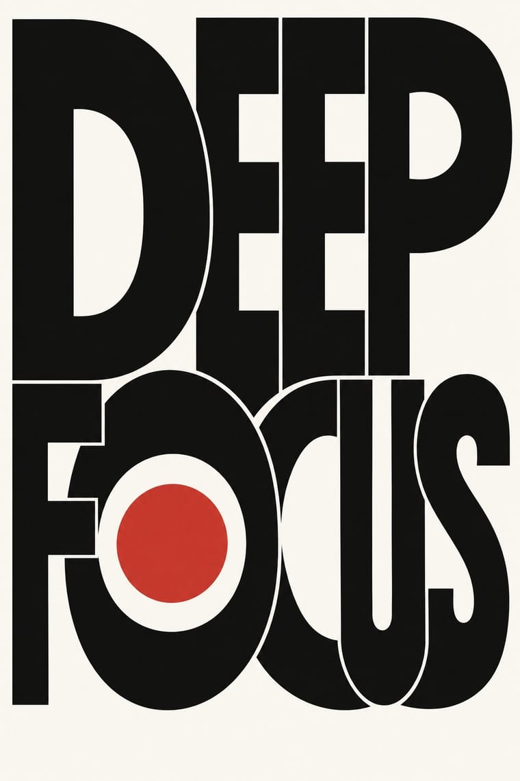
Lubalin's phototype logotypes also merge neighbouring letters into ligatures and crowd them into a single shape; borrow vyaz's shared stems and nested small letters for a Cyrillic logotype, and keep it to one or two words so it stays readable.
Mix them and make something Phototype Expressive Typography Vyaz
01
What each style brings
Each part of the design comes from the style with the stronger say in it, and each style gives at least two.
Phototype Expressive Typography (Lubalin & U&lc) Vyaz (Ornamental Slavonic Lettering)
- Type from Phototype Expressive Typography
- Colour from Phototype Expressive Typography
- Form from Vyaz
- Composition from Vyaz
- Surface from Vyaz
02
The type
Open fonts standing in for each style’s own type, which is often hand-drawn or commercial.
Display · Phototype Expressive Typography
Yay!
Josefin Sans, standing in for ITC Avant Garde Gothic (Herb Lubalin and Tom Carnase, 1970; 33 alternate characters and interlocking capital ligatures)
Text · Vyaz
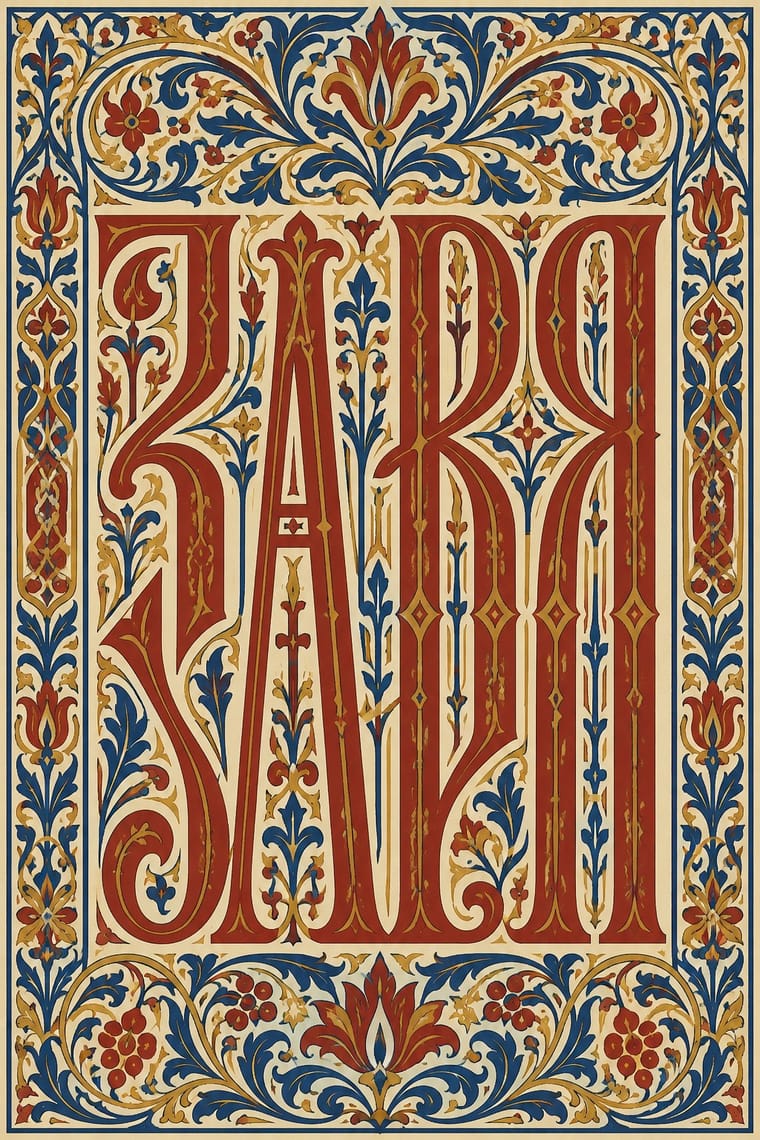
Cyrillic letters bound into one even band of ornament. Tall, narrow letters share stems, nest small letters inside tall ones, and fill gaps with twigs, curls and leaves, so the line reads first as texture. Formed in Byzantium, dated among South Slavs from 1230 and in Rus' from 1380, it peaked in mid-16th-century Moscow and Novgorod and lived on among Old Believers. It titles books in cinnabar or gold and runs on icons, bells, church plate, embroidery and gravestones. Russian-style illustrators revived it about 1900 for books, posters and menus; icon painters and calligraphers still write it.
Oswald; Vyaz used Manuscript vyaz in the three manners Shchepkin distinguished and Moscow geometric vyaz of the calligraphic school of Metropolitan Makary and Ivan IV (1550s–1560s), with short verticals (half-stems) in place of curves and diagonals, and the 17th-century 'stem' (shtambovyi) style of upright masts and breaks that Shchepkin also called the fraktur style
03
The colours
The ground and leading colours come from Phototype Expressive Typography, with a counter-accent from Vyaz. The ink reads on the ground at 4.5:1 or more.
Phototype Expressive Typography (Lubalin & U&lc) Vyaz (Ornamental Slavonic Lettering)
-
#f8f6f1ground · 36% -
#111111ink · 14% -
#d1322baccent · 18% -
#8a8479accent · 14% -
#c39a3eaccent · 10% -
#2c4c93accent · 8%
As CSS
:root {
  --ground: #f8f6f1;
  --ink: #111111;
  --accent-1: #d1322b;
  --accent-2: #8a8479;
  --accent-3: #c39a3e;
  --accent-4: #2c4c93;
  --font-display: "Josefin Sans", sans-serif;
  --font-text: "Oswald", sans-serif;
}
Use it with care
Vyaz (Ornamental Slavonic Lettering): Most vyaz carries sacred text: prayers, holy names, the titles of Gospels and service books, and inscriptions on icons, bells, church vessels, shrouds and graves. Do not fill a band with invented pseudo-Cyrillic or scramble real Church Slavonic as texture, keep holy names and prayers off throwaway products, and have any text written or checked by a reader of Church Slavonic. For Old Believers the pre-reform book and its lettering remain a matter of faith, so credit and involve their communities rather than lifting their headings as decoration. Vyaz is not only Russian: Bulgarian and Serbian scribes used it before Russia, Romanian scribes from the 15th century, and western and south-western Rus' in the Grand Duchy of Lithuania (today's Belarus and Ukraine, with Supraśl in Poland) kept its own plant-derived manner, so credit the book culture a model comes from. Since Russia's full-scale invasion of Ukraine in 2022, check whether your audience will read Old Russian display lettering as Russian state or nationalist branding; vyaz is also part of Belarusian and Ukrainian book and icon heritage, so ask how that audience reads it rather than assuming either.
04
The two styles
05
More combinations
With Phototype Expressive Typography
- Hipster Artisanal Revival Contrasts · Both pair a script with a geometric sans, but the craft badge tracks its capitals wide in a centred one-ink frame, while Lubalin kerns the same pairing until the letters touch and join. Set one against the other to decide whether the letters should breathe or fuse.
- Push Pin Style Pairs well · Push Pin revives old styles through drawn figures and Lubalin through the letters themselves; pair a Push Pin illustration with a swash, tightly kerned Lubalin headline for full 1970s New York warmth.
- Blue Note Jazz Sleeve Modernism Pairs well · Same New York years and the same belief that the title can be the picture; give a Miles-style tinted photograph a Lubalin logotype whose letters touch and interlock instead of a plain blown-up grotesque.
- Emigre & Early Digital Type Contrasts · Both were made by a new type technology; Emigre's bitmap and PostScript faces end the phototype era, so set a Lubalin ligature against a coarse bitmap word to show how the tool shapes the letter.
- International Typographic Style Contrasts · Even spacing, flush-left grotesque and a grid against letters squeezed until they fuse into one centred logotype: put the two side by side to decide whether type should stay neutral or carry the joke.
- Di Tella Graphic Design (Instituto Torcuato Di Tella) Pairs well · Both made the word the picture in the same years; add Lubalin's tight, playful letter-joins to Di Tella's blunt flat-ink title for a headline-led identity.
- Post-Binary Typography (Bye Bye Binary and Inclusive French Type) Contrasts · Both make new meaning by interlocking letters into ligatures, but Lubalin's phototype ligatures are tight-set display wit for headlines and logotypes, while post-binary ligatures carry gender inside the word, in running French text as well as on banners; choose Lubalin for a witty headline, post-binary glyphs when the grammar of the word is the message.
- Fluxus Graphics (Maciunas) Contrasts · Same New York years and the same habit of locking letters together until they touch, but Lubalin kerned polished phototype for advertising while Maciunas pressed leftover dry-transfer letters into puzzle monograms on kraft; choose between the commercial ligature and the scavenged one.
With Vyaz
- Mir iskusstva Book Art Pairs well · Bilibin's circle drew titles and initials in an Old Russian manner into bordered fairy-tale books; put a newly drawn vyaz title under a folk-ornament headpiece for a Russian Revival page rather than copying a liturgical heading.
- International Typographic Style Contrasts · Its opposite: airy, flush-left sans-serif on a grid against a dense, centred band of stretched calligraphic letters and plant filler; a single vyaz title can warm an otherwise strict grid.
- Square Kufic (Bannāʾī) Contrasts · Both turn sacred words into a dense band that reads first as pattern, but square Kufic snaps letters to an orthogonal grid of equal stroke and gap, while vyaz stretches free pen-drawn letters upward and plugs the gaps with plant filler; choose the grid or the calligraphic interlace, and never blend the two sacred scripts into a generic 'ancient' texture.
- Edo-moji Commercial Lettering (Kanteiryū, Yose-moji, Sumō-ji) Contrasts · Both are crowded display hands that leave no gap in the band they fill, but edo-moji fills it with plump, heavy strokes, as in Kanteiryū or sumō-ji, and vyaz with tall, interlocked stems and plant filler: two answers to the same demand for a full, dense line, so pick weight or height rather than mixing them.
- Gothic Blackletter & Fraktur Tradition Contrasts · Both pack tall, upright strokes into a dark rhythm, and Shchepkin even called 17th-century vyaz the fraktur style; but blackletter darkens a whole justified page of running text, while vyaz binds one title line into ornament by joining letters on shared stems and nesting small ones between them. Use blackletter for text and vyaz for a single heading band.
- Armenian Manuscript Illumination Pairs well · Another Eastern Christian book culture in which titles and initials carry the ornament; set a vyaz title in gold and azurite beside a canon-table arcade to compare a heading built from joined letters with an initial built from birds.