Style combination · Pairs well
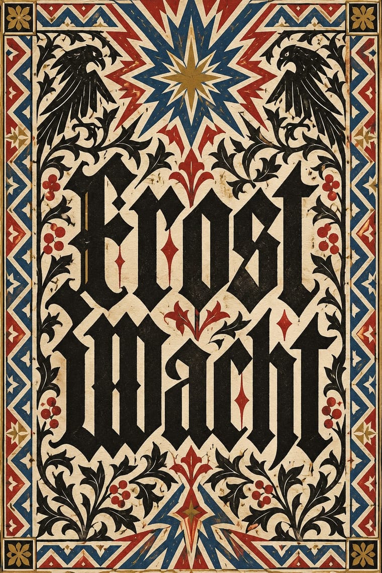
Gothic Blackletter × German Book Art Movement
Its artists drew new Frakturen beside their romans, so a Fraktur text with a broad-pen title stays within the movement's own range.
Mix them and make something Gothic Blackletter German Book Art Movement
01
What each style brings
Each part of the design comes from the style with the stronger say in it, and each style gives at least two.
Gothic Blackletter & Fraktur Tradition German Book Art Movement (Buchkunstbewegung)
- Type from Gothic Blackletter
- Colour from Gothic Blackletter
- Form from Gothic Blackletter
- Composition from German Book Art Movement
- Surface from German Book Art Movement
02
The type
Open fonts standing in for each style’s own type, which is often hand-drawn or commercial.
Display · Gothic Blackletter
Notice
UnifrakturMaguntia, standing in for Gutenberg's 42-line Bible textura (Mainz, c. 1454–55)
Text · German Book Art Movement
The German reform of the book, from the magazine Pan (1895) to the private presses that ended around 1933. After Morris's Kelmscott Press, artists, printers and publishers treated a book as one work in which text, type, illustration, paper, presswork and binding agree. A Jugendstil start of floral borders and Beardsley-like drawing gave way, from about 1900, to a typographic phase: artist-drawn romans and Frakturen, hand-press printing on handmade paper, and drawn titles and woodcut initials as the only ornament. After 1918 illustration returned, as at the Cranach-Presse.
EB Garamond; German Book Art Movement used Behrens-Schrift (Peter Behrens, Gebr. Klingspor, 1902; semibold 1901), followed by Behrens-Antiqua and Behrens-Kursiv and Ehmcke-Antiqua and Ehmcke-Kursiv (Flinsch, 1908–1910; the Antiqua is dated 1908 or 1909/10) and Ehmcke-Fraktur
03
The colours
The ground and leading colours come from Gothic Blackletter, with a counter-accent from German Book Art Movement. The ink reads on the ground at 4.5:1 or more.
Gothic Blackletter & Fraktur Tradition German Book Art Movement (Buchkunstbewegung)
-
#efe6cfground · 36% -
#1b1714ink · 14% -
#b0302aaccent · 18% -
#b8913aaccent · 14% -
#c9b68caccent · 10% -
#2c4a8caccent · 8%
As CSS
:root {
  --ground: #efe6cf;
  --ink: #1b1714;
  --accent-1: #b0302a;
  --accent-2: #b8913a;
  --accent-3: #c9b68c;
  --accent-4: #2c4a8c;
  --font-display: "UnifrakturMaguntia", serif;
  --font-text: "EB Garamond", serif;
}
Use it with care
Gothic Blackletter & Fraktur Tradition: Blackletter carries political weight in German-speaking countries: the Nazi regime pushed Fraktur as the German script in its first years before banning it in January 1941 as supposed 'Schwabacher Jewish letters', and neo-Nazis still use broken scripts. In the United States, too, certain blackletter faces are associated with hate groups, on tattoos and clothing. Check how a blackletter wordmark will read, especially for anything German, national or political. Cholo placas are territorial inscriptions of Los Angeles Latino street writing with their own codes: do not copy a real neighbourhood's placa or roll call, and commission or credit Chicano letterers (such as Chaz Bojórquez) rather than borrowing their menace as decoration.
German Book Art Movement (Buchkunstbewegung): Fraktur carries political weight in German-speaking countries: the Nazi regime pushed it as the German script in its first years before banning it in January 1941 (see the blackletter-fraktur caution). Several of the movement's presses and artists were active up to the 1933 seizure of power, after which Harry Graf Kessler of the Cranach-Presse never returned to Germany. Check how a Fraktur page or a 'German book art' label will read, especially for anything national or political.
04
The two styles
05
More combinations
With Gothic Blackletter
- Arts & Crafts Movement Pairs well · Morris's Kelmscott Press revived gothic type (Troy and Chaucer) inside dense woodcut borders; join the broken letter to foliate frames and handmade paper for a medieval, hand-made book.
- Die Neue Typographie Contrasts · Its flush-left sans-serif page on an asymmetric axis is everything the centred, justified blackletter block is not; set the two side by side to stage the argument between tradition and modernity.
- Graffiti & Hip-Hop Graphics Pairs well · Old English letters run through Los Angeles cholo writing into later street lettering; give a hand-drawn textura wordmark aerosol fills, outlines and drop shadows for street weight.
- Renaissance Book Typography Contrasts · Its historical rival: the light, round, open humanist roman page against the dark, broken, woven gothic one. Drop one blackletter title or initial into an Aldine-style page for a deliberate clash of eras.
- Acid Graphics / New Ugly Pairs well · Its club-poster revival: acid graphics mixes blackletter with liquid chrome, ultra-wide grotesques and pixel faces. Render one broken-letter wordmark in chrome on black and leave the parchment, rubrics and justified page behind.
- Victorian Letterpress & Wood Type Pairs well · English proclamations and notices kept black letter for gravity; set one blackletter line among slab and Tuscan wood type to lend a playbill or notice an official, old-world voice.
- Gothic Book of Hours (Illuminated Devotional Book) Pairs well · Compare the shared Gothic text block, then distinguish the book-of-hours page by its coordinated miniatures, graded initials and marginal programme; a blackletter wordmark alone does not reproduce this system.
- Pixação (São Paulo Tag Reto) Pairs well · Tag reto descends from gothic and runic forms by way of metal logos; set a textura line above a row of straight, pointed tag-reto letters, both in black, to show the lineage from the book page to the façade.
With German Book Art Movement
- Die Neue Typographie Contrasts · From the mid-1920s the Bauhaus and the New Typography took over the avant-garde of the book; centred hand-press pages against asymmetric sans-serif layouts make a clear old-against-new tension.
- Renaissance Book Typography Pairs well · Its presses cut their romans after fifteenth-century incunabula; Renaissance margins and rubrics sit naturally beside its drawn initials.
- Victorian Letterpress & Wood Type Contrasts · The reform answered the cheap, mass-produced book of the late nineteenth century; one artist-drawn face against a jobbing printer's mix of display types shows what it rejected.
- Contemporary Chinese Book Design ('Most Beautiful Books of China') Pairs well · Both treat paper, type, binding and case as one work of book art; set a German book-art title page beside an exposed-spine Chinese volume to show two national cultures of the crafted book that meet in Leipzig.