Style combination · Pairs well
Bezalel School × Islamic Geometric
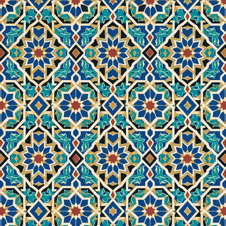
Bezalel took Moorish and Islamic geometric pattern for its borders and filigree; pair the two for frames whose star tilings and strapwork hold a figurative centre.
Mix them and make something Bezalel School Islamic Geometric
01
What each style brings
Each part of the design comes from the style with the stronger say in it, and each style gives at least two.
Bezalel School Islamic Geometric & Calligraphic Tradition
- Type from Islamic Geometric
- Colour from Bezalel School
- Form from Islamic Geometric
-
Bezalel School avoids non-representational: this is where the two pull against each other.
- Composition from Bezalel School
- Surface from Bezalel School
02
The type
Open fonts standing in for each style’s own type, which is often hand-drawn or commercial.
Text · Bezalel School
The house style of the Bezalel School of Arts and Crafts, opened in Jerusalem by Boris Schatz in 1906 with E. M. Lilien and given its definitive form by Ze'ev Raban. It joined Jugendstil and Symbolism to Persian, Syrian and Islamic ornament, Yemenite silverwork and ancient Jewish coins to make a Jewish national art: biblical and Zionist scenes in symmetrical, ornament-packed frames, hand-drawn Hebrew letters as decoration, and jewel colours heightened with gold, on books, posters, carpets, metalwork and tiles until the school closed in 1929 (its designs lingered on objects into the 1950s).
Jost; Bezalel School used Bezalel workshop Hebrew display lettering, which combined Arabic-script forms with German Jugendstil writing and Ze'ev Raban's hand-drawn Hebrew letters, rendered in gold at the centre of an illustrated page
03
The colours
The ground and leading colours come from Bezalel School, with a counter-accent from Islamic Geometric. The ink reads on the ground at 4.5:1 or more.
Bezalel School Islamic Geometric & Calligraphic Tradition
-
#f0e4c6ground · 36% -
#1d4e89ink · 14% -
#c9a03aaccent · 18% -
#a8322daccent · 14% -
#2f8a8caccent · 10% -
#4f5d2faccent · 8%
As CSS
:root {
  --ground: #f0e4c6;
  --ink: #1d4e89;
  --accent-1: #c9a03a;
  --accent-2: #a8322d;
  --accent-3: #2f8a8c;
  --accent-4: #4f5d2f;
  --font-display: "Reem Kufi", cursive;
  --font-text: "Jost", sans-serif;
}
Use it with care
Bezalel School: Bezalel works quote Hebrew scripture and decorate ritual objects: do not crop, distort, mirror or print biblical verses, and above all the names of God, on throwaway items (such pages are customarily buried rather than discarded), and have any Hebrew read by a fluent reader. The style's figures cast Yemenite and other Middle Eastern Jews, who modelled for its students and worked as its silversmiths and stone carvers, as picturesque biblical types, and its programme was Zionist in Ottoman and Mandate Palestine; credit the artisans, avoid exoticising living communities, and do not present it as a neutral 'Holy Land' or regional style. It also built a Jewish national art in part from Arab and Islamic sources (Persian and Syrian metalwork, Damascene inlay, Moorish pattern, and Hebrew lettering that drew on Arabic script) in a land it shared with Palestinian Arabs, whom, like Yemenite Jews, its artists took as models for biblical figures: name those sources rather than presenting the motifs as purely Jewish, and treat pieces such as 'Come to Palestine' and the Zionist insignia as political documents, not neutral travel imagery.
Islamic Geometric & Calligraphic Tradition: Qur'anic verses, the names of God and the Prophet and other sacred phrases must not be cropped, distorted, mirrored, used as texture or printed on floors, footwear or throwaway packaging; have any Arabic-script text read and approved by a fluent reader or calligrapher. Abstract geometric pattern is far less sensitive than script, but credit the traditions and makers it comes from.
04
The two styles
05
More combinations
With Bezalel School
- Vienna Secession Contrasts · Both put pictures inside symmetrical ornamental frames, but Vienna squared the frame into grids and bars while Bezalel filled it with Middle Eastern filigree, carpet and metalwork motifs.
- Harlem Renaissance Graphic Art Pairs well · Both built a graphic language for a people's cultural renewal from ancestral ornament and biblical subjects in the 1920s; combine Bezalel's gilded frames with Aaron Douglas's flat silhouettes.
- Early Turkish Republican Graphic Design Contrasts · In the same decade Turkey replaced the Arabic script with Latin letters, while Bezalel made the revived Hebrew script its chief ornament; set them side by side to show two national answers to script.
- Die Neue Typographie Contrasts · While Bezalel was gilding hand-drawn Hebrew letters inside ornamental frames, German modernists stripped ornament for sans-serif type and asymmetric layout; the two mark the poles of 1920s print.
- Hebrew Poster Lettering & Early Israeli State Design Contrasts · The Jerusalem national art that came before it used the same menorah, ancient coins and hand-drawn Hebrew, but packed them into gilded, ornamental, biblical frames; the Tel Aviv studios reduced them to a single emblem on flat colour, and the emblem committee of 1949 deliberately left out overtly religious symbols.
- Celtic Revival Illumination & Lettering Pairs well · Another national illumination of the 1900s–1920s, with hand-drawn national letters, jewel colours and gold inside heavy symmetrical frames; compare how each built a national art from ancient ornament.
- Kultur-Lige & Yiddish Avant-Garde Book Design Contrasts · Two Jewish national arts of the same years with hand-drawn Hebrew letters: Bezalel's Zionist, biblical pictures in gilded symmetrical frames in Jerusalem, and the Kultur-Lige's secular Yiddish children's books in faceted avant-garde planes in Kyiv; never merge them into one 'Jewish style'.
- Mir iskusstva Book Art Pairs well · In the same years both used Art Nouveau's ornamental frame to build a national book art from older ornament; set Bilibin's folk borders beside Raban's filigree frames to compare two revivals, or combine their framed, lettered pages.
With Islamic Geometric
- International Typographic Style Contrasts · Drop one tessellated panel into an asymmetric Swiss grid to make the tension between infinite pattern and white space the subject.
- Art Deco Pairs well · Borrow star polygons and stepped borders for Deco-style framing; both depend on strict symmetry and metallic accents.
- Iranian Modernist Graphic Design Pairs well · Set one calligraphic word or a fragment of girih against flat colour and a modernist grid instead of reproducing whole tile panels.
- Armenian Manuscript Illumination Contrasts · Horseshoe arches and vegetal and geometric ornament are shared, but the Islamic geometric tradition keeps its arches and fields aniconic, while Armenian books fill the same arches with birds, beasts and painted saints; choose whether a frame should carry figures or only pattern.
- Kamon (Japanese Family Crests) Contrasts · Both are built with compass and straight edge, but girih tiles the whole surface without end while a mon closes one motif inside a ring; borrow the tessellation for a ground and the crest for the single sign on it.
- Baghdad School of Arab Book Painting (Maqamat Illustration) Contrasts · Non-figural Islamic art is the contrast: this style puts people and satire where geometry would be. No descent is implied.
- Ethiopian Ge'ez Manuscript & Haräg Illumination Pairs well · Haräg interlace and Islamic strapwork share frame-and-band logic; compare them for headpieces, but keep the Ethiopian bands varied rather than strictly tiled.
- Andean Woven Graphic Systems Contrasts · Islamic pattern interlaces stars around radial centres while Andean geometry is orthogonal, stepped and deliberately irregular; choose one as the structural logic rather than blending them.