Style combination · Contrasts
Belle Époque Lithographic Poster × Isotype Pictorial Statistics
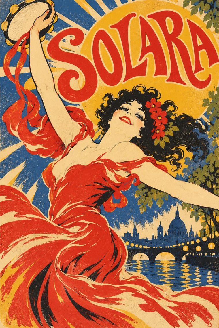
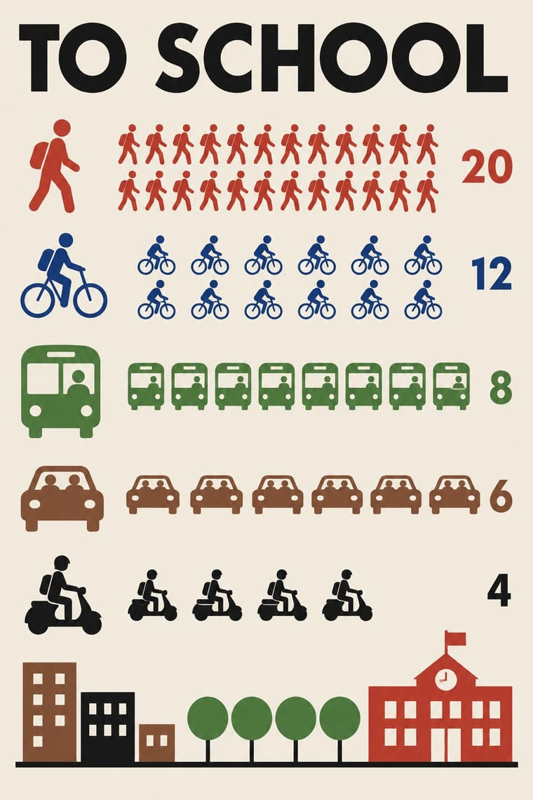
Neurath's neutral pictograms are the opposite of this seductive, personal figure; use the contrast to separate information from persuasion.
Mix them and make something Belle Époque Lithographic Poster Isotype Pictorial Statistics
01
What each style brings
Each part of the design comes from the style with the stronger say in it, and each style gives at least two.
Belle Époque Lithographic Poster Isotype Pictorial Statistics
- Type from Belle Époque Lithographic Poster
-
Isotype Pictorial Statistics avoids ornamented display: this is where the two pull against each other, which is the point of the contrast.
- Colour from Isotype Pictorial Statistics
- Form from Isotype Pictorial Statistics
- Composition from Belle Époque Lithographic Poster
- Surface from Belle Époque Lithographic Poster
02
The type
Open fonts standing in for each style’s own type, which is often hand-drawn or commercial.
Display · Belle Époque Lithographic Poster
Fiesta
Ultra, standing in for Fat-face and Clarendon poster capitals inherited from letterpress bills
Text · Isotype Pictorial Statistics
A method of visual education developed by Otto Neurath, Marie Neurath (Reidemeister) and Gerd Arntz in Red Vienna from 1925, which turns statistics into rows of identical pictograms where a greater quantity is shown by more signs, never by bigger ones. Continued in The Hague and Oxford until 1971, its standardised symbols, flat colours and sans-serif captions laid the foundations of modern information graphics and pictogram systems.
Jost; Isotype Pictorial Statistics used Futura and Gerd Arntz's linocut pictogram set (c. 4,000 signs), used like a fount of picture-type
03
The colours
The ground and leading colours come from Isotype Pictorial Statistics, with a counter-accent from Belle Époque Lithographic Poster. The ink reads on the ground at 4.5:1 or more.
Belle Époque Lithographic Poster Isotype Pictorial Statistics
-
#f2ecdfground · 36% -
#1a1a1aink · 14% -
#c8372daccent · 18% -
#f0b62baccent · 14% -
#2c5aa0accent · 10% -
#8a5a3baccent · 8%
As CSS
:root {
  --ground: #f2ecdf;
  --ink: #1a1a1a;
  --accent-1: #c8372d;
  --accent-2: #f0b62b;
  --accent-3: #2c5aa0;
  --accent-4: #8a5a3b;
  --font-display: "Ultra", serif;
  --font-text: "Jost", sans-serif;
}
04
The two styles
05
More combinations
With Belle Époque Lithographic Poster
- Die Neue Typographie Contrasts · Swap the hand-drawn lettering and painted figure for set sans-serif and photography to see exactly what the modernists rejected.
- Hand-Painted Signage & Vernacular Lettering Pairs well · Both letter by hand at street scale; combine sign-painter lettering with one bold figure for a lively event or shopfront poster.
- Push Pin Style Pairs well · Push Pin revived this exuberance; pair a Chéret-style dancing figure with bouncy display lettering for nostalgic entertainment graphics.
- Beggarstaffs Poster (Nicholson & Pryde) Contrasts · Lithographic tone and drawn line against flat cut shapes.
- Ukiyo-e Woodblock Prints Pairs well · Use the flat silhouette and keyline of ukiyo-e inside a lithographic poster, as Toulouse-Lautrec did, to read at a distance.
- Italian Liberty Poster (Ricordi and the Stile Liberty Affiche) Pairs well · Take the French poster's single-figure punch but add Ricordi's framed, theatrical symmetry and floral borders.
- Cuban Tobacco Lithography (Habilitaciones & Marquillas) Contrasts · Both are colour lithography of the same decades, but the Paris poster puts one figure on a wall at a distance, while the cigar label packs medals, arms and views into a matched set read in the hand; borrow the poster's single figure when a label grows too crowded.
- Egyptian Painted Film Poster Pairs well · Both are colour-lithographed street posters; borrow the Belle Époque's flat colour and single animated figure to calm a crowded star montage.
With Isotype Pictorial Statistics
- International Typographic Style Pairs well · Set Isotype rows of pictograms on a Swiss grid for public information that is rigorous yet friendly.
- Socialist Realist Propaganda Poster Contrasts · Socialist Realism dramatises with heroic figures while Isotype persuades by counting; choose evidence over emotion when trust matters.
- Flat Design Pairs well · Flat icon sets are Isotype's heirs; apply its one-symbol-one-meaning rule to keep an icon family consistent.
- Corporate Memphis Contrasts · Corporate Memphis uses flat figures for mood; Isotype's figures always count something, so use people icons only when they carry data.
- Ancient Egyptian Hieroglyphic & Register Composition Pairs well · Otto Neurath called his visual autobiography From hieroglyphics to Isotype, with chapters on hieroglyphics through the centuries and their renaissance; borrow the rule-bound sign family and rows of standing figures, but note the opposite rule of size: Isotype shows more by adding signs of equal size, Egypt shows rank by making one figure bigger.
- Data Humanism Contrasts · Isotype fixes one standard sign per thing and counts by repeating it so anyone can read the chart; data humanism invents a new code for each dataset and asks for slow reading. Choose Isotype for public information, data humanism for portraits of particular lives.
- Schematic Transit Diagram (Beck Tube Map Idiom) Pairs well · Add pictorial statistics beside the diagram to carry quantities as well as connections.
- Warli Painting Contrasts · Both build people from a few reduced shapes and repeat them in rows; Isotype's figures count data in flat colours on a light ground, Warli's narrate ritual and village life in white on earth, so borrow the repetition but not the meaning.