Style combination · Pairs well
Art Nouveau × Shōjo Manga
Art Nouveau reached shōjo manga twice: through the prewar lyrical illustration of the girls' magazines, whose sentimental style drew on Art Nouveau and Nihonga, and directly, in the 1970s–80s shōjo artists influenced by Mucha's aestheticism whom the Mucha Foundation's 'Mucha to Manga' exhibition (Bunkamura, 2019) showed. Frame a shōjo title page in an Art Nouveau border with hand-drawn lettering for a romantic poster or book cover.
01
What each style brings
Each part of the design comes from the style with the stronger say in it, and each style gives at least two.
Art Nouveau Shōjo Manga (Japanese Girls' Comics)
- Type from Art Nouveau
- Colour from Shōjo Manga
- Form from Art Nouveau
- Composition from Shōjo Manga
- Surface from Shōjo Manga
02
The type
Open fonts standing in for each style’s own type, which is often hand-drawn or commercial.
Text · Shōjo Manga
The look of Japan's girls' comics (strictly a readership, not a style), which Takahashi Macoto fixed in 1958 from the lyrical illustration (jojōga) of Nakahara Jun'ichi and the Year 24 Group remade in the 1970s. The page is built for feeling, not action: panels overlap, slant or lose their borders, and slender full-length figures with huge, sparkling eyes merge with flowers, petals and pattern screentone into one layered spread, while inner monologue drifts free of the balloons through white space. Black and white inside; soft colour on covers and title pages.
Shippori Mincho; Shōjo Manga used Free-floating monologue lines and Words strung across the page
03
The colours
The ground and leading colours come from Shōjo Manga, with a counter-accent from Art Nouveau. The ink reads on the ground at 4.5:1 or more.
Art Nouveau Shōjo Manga (Japanese Girls' Comics)
-
#fbf8f3ground · 36% -
#161214ink · 14% -
#a8cdeaaccent · 18% -
#c9a24baccent · 14% -
#f4b8caaccent · 10% -
#3f7a75accent · 8%
As CSS
:root {
  --ground: #fbf8f3;
  --ink: #161214;
  --accent-1: #a8cdea;
  --accent-2: #c9a24b;
  --accent-3: #f4b8ca;
  --accent-4: #3f7a75;
  --font-display: "Federant", sans-serif;
  --font-text: "Shippori Mincho", serif;
}
Use it with care
Shōjo Manga (Japanese Girls' Comics): Shōjo manga is the living work of named, mostly women artists, several of them still publishing, and its series and characters, from The Rose of Versailles to Sailor Moon, are in copyright: draw original characters in the shared idiom, never ask an image model for a named series, character or artist's hand, and label generated pages as AI-made rather than presenting them as a manga artist's work. Many heroines, and the boys of the 1970s boarding-school romances, are adolescents: keep the romance in mood, flowers and faces, and never sexualise characters who read as minors.
04
The two styles
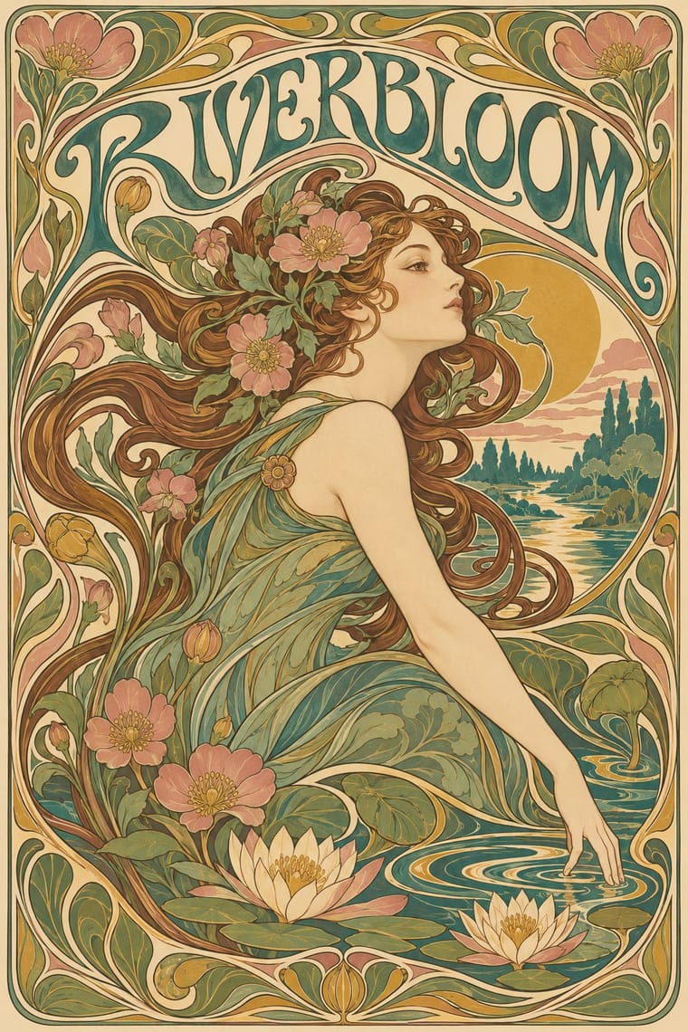
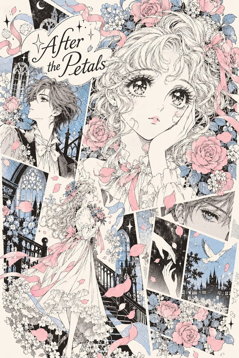
05
More combinations
With Art Nouveau
- Fileteado Porteño Pairs well · Fileteado's acanthus scrolls share the whiplash; combine them for ornate, hand-made lettering frames.
- International Typographic Style Contrasts · Ornamental curves against an orthogonal grid make a strong deliberate tension; let one botanical flourish break a cold grid.
- Psychedelic Poster Pairs well · San Francisco poster artists lifted Mucha's figures and whiplash wholesale; push the curves into saturated, vibrating colour for a 1960s-flavoured revival.
- Russian Constructivism Contrasts · Organic sensuality versus machine-age diagonals: use the opposition to stage nature against industry.
- Vienna Secession Contrasts · Set French whiplash against the Viennese square to show the turn from organic to geometric ornament within one decorative idiom.
- Skønvirke (Danish Art Nouveau, Bindesbøll) Contrasts · Shares the hand-lettering and abundance but swaps the whiplash line and the female figure for blunt abstract masses; set side by side they show the heavy Danish variant.
- Expressionist Woodcut Graphics Contrasts · The parent's smooth whiplash and floral harmony is exactly what the gouge splinters; use one against the other to stage order breaking down.
- Beggarstaffs Poster (Nicholson & Pryde) Contrasts · Its curving floral line is the opposite of cut masses; set side by side to show how much a poster can drop.
With Shōjo Manga
- Fotoromanzo (Italian Photo-Romance) Contrasts · Both are romance told in pages for a mass readership of girls and women, with close-ups of faces carrying the drama; the photo-romance keeps staged photographs in a plain grid of ruled frames, while shōjo manga draws its figures and dissolves the grid into flowers, white space and drifting words.
- Taishō Roman & Lyrical Illustration Pairs well · Its root: Takahashi Macoto took Nakahara Jun'ichi's large, doll-like eyes with highlights and long lashes and added dots, stars and colour to the iris. Borrow jojōga's single wistful figure, muted cream paper and hand lettering for a cover or title page with a period mood.
- Kawaii Design Contrasts · The otome-chikku manga of 1970s Ribon fed into kawaii, but kawaii reduces the figure to a rounded, minimal-faced mascot on a flat pastel ground; return to shōjo manga for slender full-length figures, detailed sparkling eyes and a page that tells a story.
- Story Manga (Postwar Japanese Comics) Pairs well · Its parent: the Tezuka-school page cuts like film between ruled panels, with speed lines, drawn sound effects and detailed backgrounds in perspective; shōjo manga slows the sequence, drops the borders and lets figures, flowers and floating monologue merge into one decorative spread. Switch to story manga for action, to shōjo for feeling.
- Korean Webtoon Graphics Contrasts · Romance webtoons tell a similar story in one full-colour column, one beat per screen with long empty gutters; shōjo manga layers several moments, flowers and monologue on one black-and-white spread at once.
- Purikura Photo-Sticker Decoration Pairs well · Borrow a small halo of flowers or sparkles to intensify a portrait's mood, but retain photographic faces and personal messages rather than turning the sticker into a drawn sequential story.
- Yami-Kawaii (Sick-Cute) Pairs well · Borrow shojo emotional intensity and sparkle ornament to deepen the melancholy.
- Illustrated Rom-Com Book Cover (Cartoon Couple Cover) Pairs well · When the faces have to carry more feeling, as on the later, more detailed covers, borrow shōjo manga's expressive eyes and sparkle accents while keeping the flat ground and big lettering.