Style combination · Pairs well
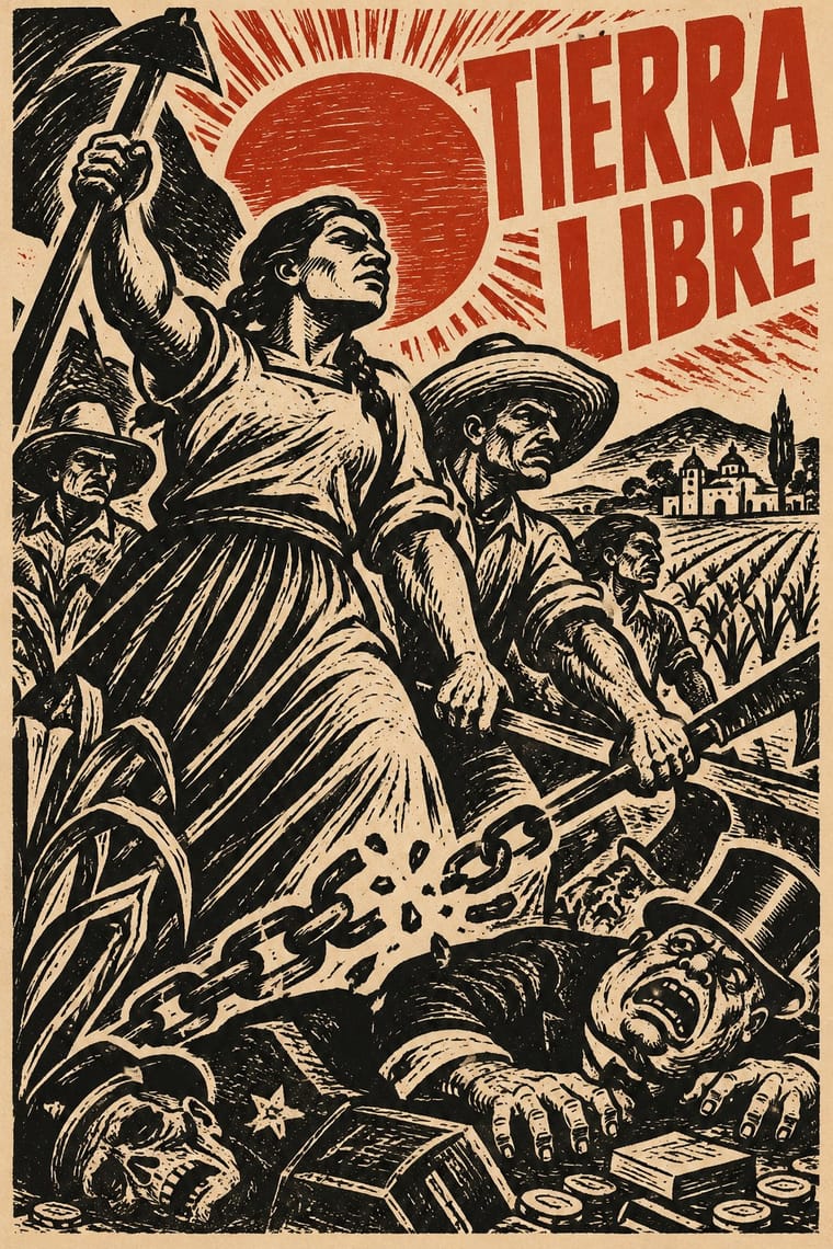
Estridentismo Graphics × Taller de Gráfica Popular
Leopoldo Méndez carried the Stridentist woodcut into the Taller de Gráfica Popular in 1937; give a TGP print a radio mast or a skyline on a steep diagonal and one bright ink to bring back the machine-age optimism.
Mix them and make something Estridentismo Graphics Taller de Gráfica Popular
01
What each style brings
Each part of the design comes from the style with the stronger say in it, and each style gives at least two.
Estridentismo (Stridentist) Graphics Taller de Gráfica Popular
- Type from Estridentismo Graphics
- Colour from Taller de Gráfica Popular
- Form from Estridentismo Graphics
- Composition from Estridentismo Graphics
- Surface from Taller de Gráfica Popular
02
The type
Open fonts standing in for each style’s own type, which is often hand-drawn or commercial.
Display · Estridentismo Graphics
Riot
Anton, standing in for Heavy condensed block capitals (Irradiador masthead and cover texts between thick black rules, with giant block-built issue numerals, 1923)
Text · Taller de Gráfica Popular
A Mexico City printmaking collective founded in 1937 around Leopoldo Méndez, Pablo O'Higgins and Luis Arenal to put art at the service of popular and anti-fascist struggles. Heir to Posada's broadsides, it produced cheap linocut, woodcut and lithographic posters, leaflets, portfolios and books: dense black-and-white images of workers, peasants and revolutionary history, often captioned with bold letterpress headlines.
Inter; Taller de Gráfica Popular used Condensed wood-type gothic headlines and Hand-cut linocut lettering
03
The colours
The ground and leading colours come from Taller de Gráfica Popular, with a counter-accent from Estridentismo Graphics. The ink reads on the ground at 4.5:1 or more.
Estridentismo (Stridentist) Graphics Taller de Gráfica Popular
-
#f0e8d6ground · 36% -
#151515ink · 14% -
#c0392baccent · 18% -
#d9c39aaccent · 14% -
#8a6e4baccent · 10% -
#2f6f9caccent · 8%
As CSS
:root {
  --ground: #f0e8d6;
  --ink: #151515;
  --accent-1: #c0392b;
  --accent-2: #d9c39a;
  --accent-3: #8a6e4b;
  --accent-4: #2f6f9c;
  --font-display: "Anton", sans-serif;
  --font-text: "Inter", sans-serif;
}
04
The two styles
05
More combinations
With Estridentismo Graphics
- Art Deco Pairs well · Both drew the 1920s skyline; pair Deco's setback towers and block display letters with Stridentist black-and-white relief for a skyscraper poster with a rougher, revolutionary edge.
- Mexican Popular Graphics (Posada) Contrasts · Same Mexico City walls a generation apart: Posada's broadsheets of skeletons, crimes and saints against Maples Arce's broadside of radio, speed and skyscrapers; set one beside the other to stage folk memory against the machine future.
- Russian Constructivism Pairs well · Two post-revolutionary avant-gardes: borrow Constructivism's thick bars and heavy grotesque to steady a Stridentist cover, but keep the hand-cut woodcut instead of photomontage.
- Arts & Crafts Movement Contrasts · Both cut wood by hand, for opposite ends: Arts and Crafts used the block to flee the machine, Stridentism used it to celebrate radio masts and factories.
- Brazilian Modernismo Graphics (Klaxon and the Semana de 22) Pairs well · Two Latin American avant-gardes launched within two months of each other (Actual No. 1 in December 1921, the Semana in February 1922). Pair Klaxon's shared-letter letterpress cover with a Stridentist woodcut skyline for a 1920s magazine that is both witty and machine-mad.
With Taller de Gráfica Popular
- Punk & DIY Zine Pairs well · Both favour cheap, direct, monochrome reproduction; a linocut figure with photocopied type gives protest graphics hand-made urgency.
- Cuban Revolutionary Poster (OSPAAAL & ICAIC) Pairs well · Combine TGP's black linocut figures with Cuban flat colour for politically engaged posters with a hand-made Latin American lineage.
- Art Deco Contrasts · Glossy Deco glamour versus gouged, populist black and white: use the contrast to separate luxury from solidarity.
- Chinese Modern Woodcut Movement Pairs well · China's 1930s–40s woodcut movement ran in parallel with the TGP; combine the two black-line traditions for prints about labour and resistance across continents.
- Minjung Woodcut Graphics (Korean People's Art) Contrasts · Nearest in the atlas, and the closest Mexican print lineage to the Mexican Muralism that MMCA names as a source: both cut black-line people's prints for movements, but TGP sets condensed Latin capitals and lithographs, while Minjung prints carry short Hangul slogans and dancing, ritual-derived figures, and are scaled up to geolgae banners.
- Brazilian Concrete Design Contrasts · Mexico's figurative, militant linocuts are Latin America's other modernism; contrast them to choose between abstraction and narrative.
- Vicente Rojo & Mexican Editorial Modernism Pairs well · Rojo set Leopoldo Méndez's engravings in the Revista de la Universidad de México (no. 3, 1971); a black linocut framed by fine rules on a white page joins Mexico City's militant print culture to its editorial modernism.
- Mexican Popular Graphics (Posada) Pairs well · The TGP took Posada as its ancestor; combine his calavera satire with linocut political posters for socially engaged print.