Style combination · Pairs well
Andean Woven Graphic Systems × Brazilian Concrete Design
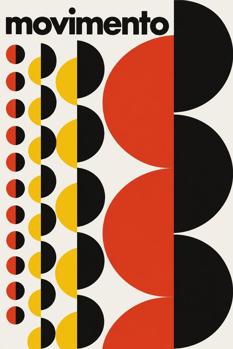
Both vary a single module serially; apply the Wari rule of rotating and compressing one unit across a field to a systematic poster or identity.
Mix them and make something Andean Woven Graphic Systems Brazilian Concrete Design
01
What each style brings
Each part of the design comes from the style with the stronger say in it, and each style gives at least two.
Andean Woven Graphic Systems Brazilian Concrete Design
- Type from Brazilian Concrete Design
- Colour from Brazilian Concrete Design
- Form from Andean Woven Graphic Systems
- Composition from Andean Woven Graphic Systems
- Surface from Andean Woven Graphic Systems
02
The type
Open fonts standing in for each style’s own type, which is often hand-drawn or commercial.
Text · Andean Woven Graphic Systems
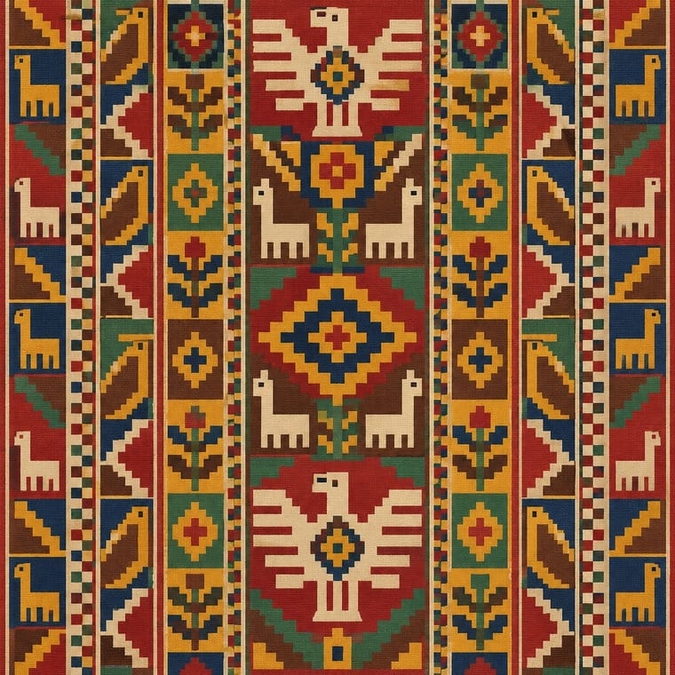
The graphic systems of Andean cloth, the region's most prestigious medium, in which every motif is built on the warp-and-weft grid. Wari tapestry tunics repeat staff-bearers and profile heads in columns, compressing and rotating them toward the edges until figure turns into geometry. Inca state cloth reduced design to t'oqapu, square cells of geometric signs granted as marks of rank, and living Quechua and Aymara weaving bands named pallay motifs between stripes.
Fira Sans; Andean Woven Graphic Systems used T'oqapu cells as a sign set standing where lettering would and Grid-built letterforms that share the woven cell, such as bitmap faces like Silkscreen
03
The colours
The ground and leading colours come from Brazilian Concrete Design, with a counter-accent from Andean Woven Graphic Systems. The ink reads on the ground at 4.5:1 or more.
Andean Woven Graphic Systems Brazilian Concrete Design
-
#f4f2ecground · 36% -
#121212ink · 14% -
#f3c316accent · 18% -
#e2361faccent · 14% -
#a3262aaccent · 10% -
#1f4e9eaccent · 8%
As CSS
:root {
  --ground: #f4f2ec;
  --ink: #121212;
  --accent-1: #f3c316;
  --accent-2: #e2361f;
  --accent-3: #a3262a;
  --accent-4: #1f4e9e;
  --font-display: "Jost", sans-serif;
  --font-text: "Fira Sans", sans-serif;
}
Use it with care
Andean Woven Graphic Systems: Andean textile motifs are living cultural property: pallay designs are named and taught within particular Quechua and Aymara communities, regional styles such as Jalq'a and Tarabuco mark community identity, and Inca t'oqapu were state-controlled insignia of rank. Do not lift motifs from museum tunics or market weavings onto products as generic 'Inca pattern'. Commission weavers through community-run organisations such as the Center for Traditional Textiles of Cusco, pay and credit them, and record which community each motif comes from.
04
The two styles
05
More combinations
With Andean Woven Graphic Systems
- Bitmap & Pixel Graphics Pairs well · Woven cells and pixels are the same constraint; build icons and letters on a strict square grid with stepped diagonals, and credit the weaving source when you borrow its logic.
- Adinkra & Kente Symbol Systems Contrasts · Adinkra stamps named symbols into ruled squares and kente joins woven strips, whereas Andean cells are woven into one garment and distorted toward its edges; keep the two languages distinct.
- Islamic Geometric & Calligraphic Tradition Contrasts · Islamic pattern interlaces stars around radial centres while Andean geometry is orthogonal, stepped and deliberately irregular; choose one as the structural logic rather than blending them.
- Diné (Navajo) Weaving Design Contrasts · Both build stepped geometry on the thread grid. Andean cloth repeats and distorts a figure across cells and columns, while a Diné rug is one planned symmetrical field around a centre, so choose one structural logic.
- Mixteca-Puebla Codex Painting Contrasts · Andean signs are built on the thread grid and repeated as pattern, while codex signs are painted freely in contour and strung along a narrative path; do not merge the two as generic 'pre-Columbian'.
- Square Kufic (Bannāʾī) Contrasts · T'oqapu also fill square cells on a grid, but with signs of rank rather than legible words; compare them to see how a grid can carry writing or emblem, and never blend the two sacred systems into a generic 'geometric' pattern.
With Brazilian Concrete Design
- Op Art Graphics Pairs well · Maluf's repeated rectangles already vibrate; push the serial module towards op moiré for a kinetic poster that stays constructed.
- Taller de Gráfica Popular Contrasts · Mexico's figurative, militant linocuts are Latin America's other modernism; contrast them to choose between abstraction and narrative.
- International Typographic Style Pairs well · Bring concrete poetry's spatial word-play into a Swiss grid to make typographic layouts that read as images.
- Tropicália Graphic Design Contrasts · The Brazilian rational design Duarte trained beside and then swallowed: the 1964 Deus e o Diabo poster keeps concrete's lowercase Helvetica and aligned text blocks, then splits them with one cut-out figure in a sun; the 1968 covers drop the grid altogether.
- Literatura de Cordel Woodcut Contrasts · Brazil's concrete designers worked in the same decades with grids and sans-serifs; set a cordel woodcut against concrete typography for a sharp sertão-versus-São Paulo tension.
- Brazilian Modernismo Graphics (Klaxon and the Semana de 22) Pairs well · Almeida's tumbled LACTA advertisement gained new meaning once concrete poetry arrived in the 1950s. Set a Klaxon-style word image on a concrete grid to keep the play of letters but discipline its spacing.
- Zagreb Modernist Graphics (EXAT 51 to Teatar &TD) Contrasts · The nearest genome: São Paulo and Zagreb both turned constructive geometry and serial units into posters from 1951. Brazilian concrete design prints offset for industry and the press, sets a few geometric elements in tension with a white ground and stays strictly non-figurative; Zagreb screenprints for a gallery and a student theatre, runs one multiplied unit across the sheet, sometimes on metallic paper, against a small band of lowercase grotesque, and with Arsovski breaks the system with photo collage, pop quotation and rebus titles.
- Pixação (São Paulo Tag Reto) Contrasts · São Paulo's two letter cultures met at the Bienal: concrete design grew out of the first Bienal in 1951, and pixadores wrote across the 28th in 2008. A rational sans on a grid against a wall of tag reto stages the city's divide between institutional modernism and the periphery.