Style combination · Pairs well
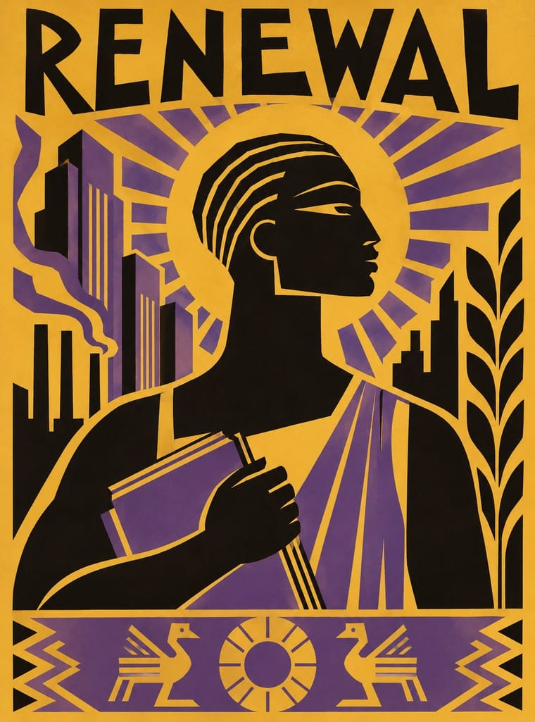
Harlem Renaissance Graphic Art × WPA Silkscreen Posters
Douglas's 1934 murals were New Deal commissions; pair his silhouettes with WPA screenprint layouts for civic, narrative posters.
Mix them and make something Harlem Renaissance Graphic Art WPA Silkscreen Posters
01
What each style brings
Each part of the design comes from the style with the stronger say in it, and each style gives at least two.
Harlem Renaissance Graphic Art WPA Silkscreen Posters
- Type from Harlem Renaissance Graphic Art
- Colour from Harlem Renaissance Graphic Art
- Form from Harlem Renaissance Graphic Art
- Composition from WPA Silkscreen Posters
- Surface from WPA Silkscreen Posters
02
The type
Open fonts standing in for each style’s own type, which is often hand-drawn or commercial.
Display · Harlem Renaissance Graphic Art
Square
Limelight, standing in for Aaron Douglas's hand-lettered Deco capitals on jackets and covers
Text · WPA Silkscreen Posters
Posters made by the Federal Art Project of the Works Progress Administration to promote health campaigns, education, theatre, travel and the national parks during the Depression. Unemployed artists adapted commercial silkscreen to print runs by hand, which gave the work its flat, opaque layered colour, simplified stylised forms and clear geometric lettering in a public-service voice.
Jost; WPA Silkscreen Posters used Hand-cut stencil lettering in geometric sans-serif capitals and Futura (Paul Renner, 1927) and similar geometric sans-serifs
03
The colours
The ground and leading colours come from Harlem Renaissance Graphic Art, with a counter-accent from WPA Silkscreen Posters. The ink reads on the ground at 4.5:1 or more.
Harlem Renaissance Graphic Art WPA Silkscreen Posters
-
#efe5cfground · 36% -
#161210ink · 14% -
#e3782baccent · 18% -
#d6b44aaccent · 14% -
#e9a3adaccent · 10% -
#5d4a86accent · 8%
As CSS
:root {
  --ground: #efe5cf;
  --ink: #161210;
  --accent-1: #e3782b;
  --accent-2: #d6b44a;
  --accent-3: #e9a3ad;
  --accent-4: #5d4a86;
  --font-display: "Limelight", sans-serif;
  --font-text: "Jost", sans-serif;
}
Use it with care
Harlem Renaissance Graphic Art: Douglas built this idiom so that Black artists could picture Black history against minstrel caricature and white primitivist fantasy. Lifted as generic Jazz Age or 'tribal' decoration, the Egyptian profiles, mask-like eyes and black silhouettes can slide back into the stereotypes it answered, so use it to tell Black stories with Black artists and writers, and credit Douglas and the magazines (The Crisis, Opportunity) whose images you draw on.
04
The two styles

05
More combinations
With Harlem Renaissance Graphic Art
- Corporate Memphis Contrasts · Both flatten the human figure, but Douglas's silhouettes are specific and historical where corporate Memphis is generic; study the difference before drawing people flat.
- Afrofuturist Design Pairs well · Carry Douglas's Egyptian profiles and radiating light into a jewel-dark cosmos for a Black futurism that knows its own lineage.
- Bezalel School Pairs well · Both built a graphic language for a people's cultural renewal from ancestral ornament and biblical subjects in the 1920s; combine Bezalel's gilded frames with Aaron Douglas's flat silhouettes.
- AfriCOBRA Pairs well · Aaron Douglas's flat silhouettes are an earlier Black self-portrait in print; set his stepped light and profiles beside AfriCOBRA's lettered colour to trace the line from the New Negro to Black Power.
- Woodland School (Legend Painting) Contrasts · Both set flat, stylised figures to spiritual and communal ends, but Aaron Douglas's Harlem graphics print hard-edged silhouettes in one to three flat colours, stepping their tone where concentric rings of light cross them among Deco angles, while Woodland painting closes many bright colours inside a continuous black contour and opens each body in x-ray.
With WPA Silkscreen Posters
- Flat Design Pairs well · Its flat layered shapes translate directly to vector; use the national-park look for warm, civic flat illustration.
- Psychedelic Poster Contrasts · Calm, legible public information versus deliberate optical overload; choose WPA clarity when a message must reach everyone.
- Risograph & Indie Print Culture Pairs well · Both layer a few opaque inks; borrow WPA's stylised landscapes and plain messages for contemporary riso posters.
- Socialist Realist Propaganda Poster Pairs well · Both mobilised a 1930s public with state-funded posters; add socialist realism's heroic low-angle figures to WPA's flat silkscreen colour when a civic campaign needs more urgency.
- Australian Travel Poster (ANTA Era) Contrasts · The Federal Art Project also made travel and national-park posters in the 1930s, but in flat, layered screenprint for public programmes; set them side by side to choose between commercial painted lithography and a few opaque public-service inks.
- Australian Poster Collective Screenprints Pairs well · An earlier public-service silkscreen tradition; combine its calm stencil figures with the collectives' fluoro colour and puns.
- Early Turkish Republican Graphic Design Pairs well · Both are 1930s state-backed poster programmes for public institutions and tourism; combine WPA silkscreen flatness with Görey's modelled figures for civic campaigns.
- Estado Novo Folk Modernism (SPN) Pairs well · Both turned 1930s state poster programmes toward the rural and the regional; borrow WPA's flat layered landscapes and add SPN heraldry for regional tourism or heritage pieces.