Style combination · Pairs well
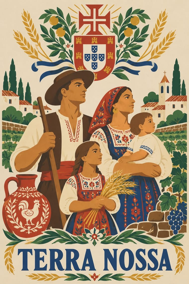
Estado Novo Folk Modernism × WPA Silkscreen Posters
Both turned 1930s state poster programmes toward the rural and the regional; borrow WPA's flat layered landscapes and add SPN heraldry for regional tourism or heritage pieces.
Mix them and make something Estado Novo Folk Modernism WPA Silkscreen Posters
01
What each style brings
Each part of the design comes from the style with the stronger say in it, and each style gives at least two.
Estado Novo Folk Modernism (SPN) WPA Silkscreen Posters
- Type from Estado Novo Folk Modernism
- Colour from WPA Silkscreen Posters
- Form from Estado Novo Folk Modernism
- Composition from WPA Silkscreen Posters
- Surface from WPA Silkscreen Posters
02
The type
Open fonts standing in for each style’s own type, which is often hand-drawn or commercial.
Display · Estado Novo Folk Modernism
Rise
Cinzel, standing in for Roman inscriptional capitals with Cross-of-Christ word separators (text panels of the Exposição do Mundo Português, 1940)
Text · WPA Silkscreen Posters
Posters made by the Federal Art Project of the Works Progress Administration to promote health campaigns, education, theatre, travel and the national parks during the Depression. Unemployed artists adapted commercial silkscreen to print runs by hand, which gave the work its flat, opaque layered colour, simplified stylised forms and clear geometric lettering in a public-service voice.
Jost; WPA Silkscreen Posters used Hand-cut stencil lettering in geometric sans-serif capitals and Futura (Paul Renner, 1927) and similar geometric sans-serifs
03
The colours
The ground and leading colours come from WPA Silkscreen Posters, with a counter-accent from Estado Novo Folk Modernism. The ink reads on the ground at 4.5:1 or more.
Estado Novo Folk Modernism (SPN) WPA Silkscreen Posters
-
#efe6cfground · 36% -
#222222ink · 14% -
#c8622daccent · 18% -
#d3a23baccent · 14% -
#b8322aaccent · 10% -
#3d5a7aaccent · 8%
As CSS
:root {
  --ground: #efe6cf;
  --ink: #222222;
  --accent-1: #c8622d;
  --accent-2: #d3a23b;
  --accent-3: #b8322a;
  --accent-4: #3d5a7a;
  --font-display: "Cinzel", serif;
  --font-text: "Jost", sans-serif;
}
Use it with care
Estado Novo Folk Modernism (SPN): This was the official propaganda of an authoritarian dictatorship, whose idealised peasant served the myth of 'honoured poverty'. The crafts it staged, such as Barcelos clay figures, Viana do Castelo embroidery and regional costume, remain living community traditions. Do not present the regime's version of them as neutral heritage, or its Catholic and heraldic symbols as decoration. Its celebration of the Discoveries served a living colonial empire: the 1940 Exposição do Mundo Português showed 138 men, women and children recruited in the colonies, among reconstructed villages, as a 'human zoo'. Do not reuse its caravels, padrões and imperial slogans as innocent heritage.
04
The two styles

05
More combinations
With Estado Novo Folk Modernism
- Socialist Realist Propaganda Poster Contrasts · Both are 1930s state doctrine, but the SPN flattened and decorated a pastoral, Catholic idyll where Soviet posters modelled heroic industrial bodies; use the pair to choose between consoling and mobilising.
- Art Deco Pairs well · This is Deco's stylised figure with the glamour stripped out; add Deco's stepped geometry and wide-tracked capitals to give a folk subject a sharper 1930s commercial finish.
- Spanish Civil War Poster Contrasts · Its Iberian contemporary: Republican posters are diagonal, urgent and red-and-black, while the Estado Novo's are static, pale and 'pseudo-tranquil'; set them side by side to stage revolt against order.
- Greek Tourism Modernism (EOT) Contrasts · Both are southern European state images aimed partly at foreign visitors, but the SPN staged a static rural, Catholic idyll in lithographed figures, while EOT turned antiquity and the islands into cut-out signs on colour; compare them to choose between folk narrative and modernist emblem.
With WPA Silkscreen Posters
- Flat Design Pairs well · Its flat layered shapes translate directly to vector; use the national-park look for warm, civic flat illustration.
- Psychedelic Poster Contrasts · Calm, legible public information versus deliberate optical overload; choose WPA clarity when a message must reach everyone.
- Risograph & Indie Print Culture Pairs well · Both layer a few opaque inks; borrow WPA's stylised landscapes and plain messages for contemporary riso posters.
- Socialist Realist Propaganda Poster Pairs well · Both mobilised a 1930s public with state-funded posters; add socialist realism's heroic low-angle figures to WPA's flat silkscreen colour when a civic campaign needs more urgency.
- Australian Travel Poster (ANTA Era) Contrasts · The Federal Art Project also made travel and national-park posters in the 1930s, but in flat, layered screenprint for public programmes; set them side by side to choose between commercial painted lithography and a few opaque public-service inks.
- Australian Poster Collective Screenprints Pairs well · An earlier public-service silkscreen tradition; combine its calm stencil figures with the collectives' fluoro colour and puns.
- Early Turkish Republican Graphic Design Pairs well · Both are 1930s state-backed poster programmes for public institutions and tourism; combine WPA silkscreen flatness with Görey's modelled figures for civic campaigns.
- Harlem Renaissance Graphic Art Pairs well · Douglas's 1934 murals were New Deal commissions; pair his silhouettes with WPA screenprint layouts for civic, narrative posters.