Style combination · Contrasts
Turkish Modernist Poster × Early Turkish Republican Graphic Design
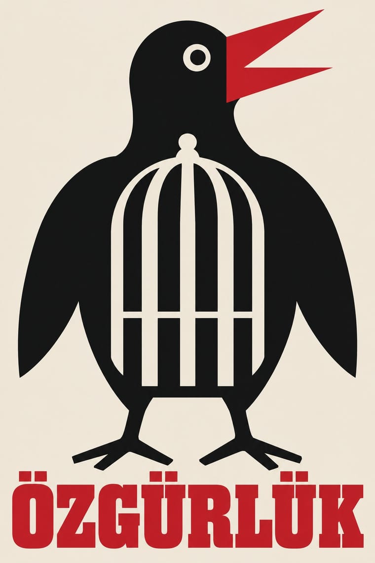
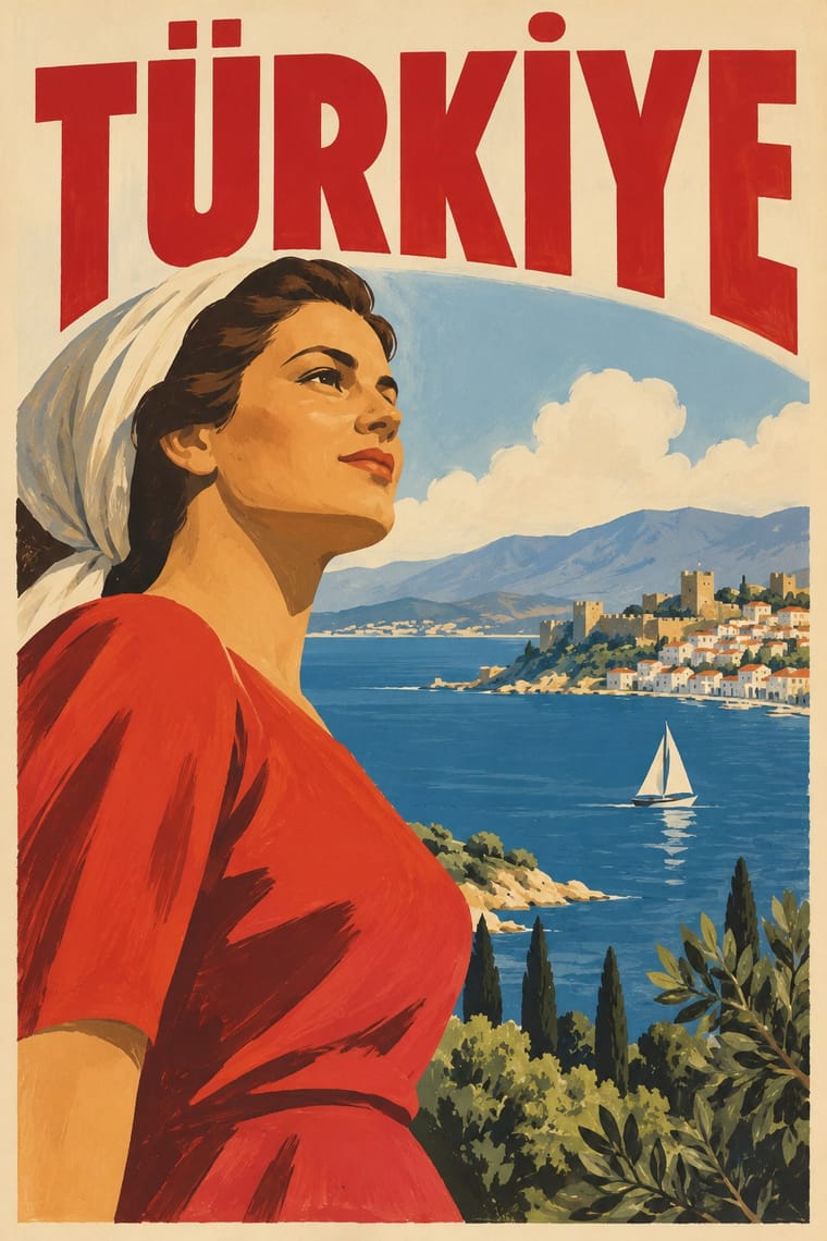
İhap Hulusi's generation modelled figures in lithographed light and shade for banks, monopolies and state campaigns; the modernists who followed worked for theatres and festivals and replaced the modelled figure with a flat sign and, later, with type. Use the Republican posters for warmth and official confidence, the modernists for wit.
Mix them and make something Turkish Modernist Poster Early Turkish Republican Graphic Design
01
What each style brings
Each part of the design comes from the style with the stronger say in it, and each style gives at least two.
Turkish Modernist Poster & Graphic Design Early Turkish Republican Graphic Design
- Type from Early Turkish Republican Graphic Design
- Colour from Turkish Modernist Poster
- Form from Early Turkish Republican Graphic Design
-
Turkish Modernist Poster avoids naturalistic depiction: this is where the two pull against each other, which is the point of the contrast.
- Composition from Turkish Modernist Poster
- Surface from Early Turkish Republican Graphic Design
02
The type
Open fonts standing in for each style’s own type, which is often hand-drawn or commercial.
Display · Early Turkish Republican Graphic Design
Home
Bungee Shade, standing in for Shaded and extruded display letters and giant numerals (Milli Piyango '7', İş Bankası '12', Köy Halk Kıraatı)
Text · Turkish Modernist Poster
The posters of Istanbul's first generation of professional graphic designers for theatres, films, festivals and exhibitions. Mengü Ertel, Yurdaer Altıntaş and later Bülent Erkmen reduced each play or film to one visual idea or pun: a figure, mask, eye or object drawn as flat, simplified shapes in two or three inks on an open field of colour or white, with a hand-drawn or bold serif title. From the 1980s Erkmen pared the language down further to a giant word, a stripe or one photographed detail.
Newsreader; Turkish Modernist Poster used Hand-drawn title lettering by the designers themselves, e.g. Altıntaş's heavy lowercase 'aptal kız' (Kent Oyuncuları, 1961) and his condensed brush capitals for Dormen Tiyatrosu's 'Bugün Git Yarın Gel' and Bold and book serif titles centred above the image (Erkmen's Kent Oyuncuları posters and 'Les Civilisations Anatoliennes', 1983, in a Times-like transitional serif), and heavy serif capitals on Ertel's 'Jan Dark'ın Çilesi' and 'Le Gardien'
03
The colours
The ground and leading colours come from Turkish Modernist Poster, with a counter-accent from Early Turkish Republican Graphic Design. The ink reads on the ground at 4.5:1 or more.
Turkish Modernist Poster & Graphic Design Early Turkish Republican Graphic Design
-
#efe8dcground · 36% -
#111214ink · 14% -
#c8162daccent · 18% -
#007266accent · 14% -
#c89b3caccent · 10% -
#36345aaccent · 8%
As CSS
:root {
  --ground: #efe8dc;
  --ink: #111214;
  --accent-1: #c8162d;
  --accent-2: #007266;
  --accent-3: #c89b3c;
  --accent-4: #36345a;
  --font-display: "Bungee Shade", sans-serif;
  --font-text: "Newsreader", serif;
}
Use it with care
Turkish Modernist Poster & Graphic Design: These posters are the signed work of named designers, several of them living or recently dead: borrow the method (one flat sign, two or three inks, an open field), not a particular poster. Karagöz shadow theatre is a living tradition on UNESCO's Representative List of the Intangible Cultural Heritage of Humanity (2009), and square Kufic often spells sacred names such as Allah, Muhammad or Ali, so do not cut either into decoration without knowing what it says.
Early Turkish Republican Graphic Design: Atatürk's likeness, the Turkish flag and the star and crescent are living national symbols, and Turkey's Law No. 5816 (1951) criminalises insulting Atatürk's memory, so do not caricature, distort or trivialise them when borrowing this style. Much of this imagery was produced for a one-party state and its campaigns, and Kemalist iconography (the unveiled "modern" woman, the six arrows, Atatürk portraits) is still politically charged in Turkey, read differently by secularists, religious conservatives and minorities whom the nation-building imagery left out. Do not present the regime's modernising narrative as neutral, and do not reuse party emblems as decoration.
04
The two styles
05
More combinations
With Turkish Modernist Poster
- Polish Poster School Contrasts · The same conceptual-poster network: Turkish designers showed at the Warsaw Poster Biennale from 1966 and Ertel's posters entered the Wilanów archive in 1968. The Polish school paints, collages and distorts its single idea; the Turkish posters cut it into flat shapes in two or three clean inks. Choose Warsaw for unease, Istanbul for a crisp visual pun.
- Square Kufic (Bannāʾī) Pairs well · Erkmen set the Latin initials TİEM on a square-Kufic grid for the Türk ve İslam Eserleri Müzesi logo, and Ertel drew on Kufic for a Ministry of Culture logo; borrow the bannāʾī grid as a structure for a mark, but check what any Kufic letters spell before using them.
- International Typographic Style Pairs well · A background influence that came through teaching rather than through the poster makers themselves: the Bauhaus-modelled State School of Applied Fine Arts (1957), whose functionalism Erzincan sees following 'a trajectory parallel to the International Typographic Style', trained Aydın Erkmen and İlhan Bilge, not Ertel, Altıntaş or Bülent Erkmen, and the Academy's Grafik Atölyesi taught 'less is more' from 1967. Set a festival's credits on a column grid beside one flat figure, as Altıntaş set the credits of the film poster 'Sen de Gitme' (1996) in three columns.
- Iranian Modernist Graphic Design Contrasts · Its Iranian contemporary also learned from the Polish poster, but built its posters on Persian calligraphy and miniature; after the 1928 alphabet reform Turkish designers worked in Latin letters and quoted Kufic only as a reduced sign. Choose Tehran when the letterform should be the protagonist, Istanbul when a drawn figure should be.
- Turkish Weekly Humour Magazines (Gırgır to Uykusuz) Contrasts · Same city, same decades, opposite density: Istanbul's poster designers reduced a play or film to one flat idea on an open field, while the humour weeklies packed a cover with a caricature, balloons, headline band and price box. Borrow the poster's single idea to calm a crowded cover.
With Early Turkish Republican Graphic Design
- WPA Silkscreen Posters Pairs well · Both are 1930s state-backed poster programmes for public institutions and tourism; combine WPA silkscreen flatness with Görey's modelled figures for civic campaigns.
- Urdu Katib Lithography Contrasts · Urdu print kept hand-written Arabic-script lithography for another century, while Turkey abolished Arabic letters in 1928; set the two side by side to show two answers to modern print.
- Contemporary Arabic & Dual-Script Type Design Contrasts · Turkey replaced Arabic letters with Latin in 1928, and Emin Barın carried calligraphic habits into the new script; contemporary dual-script type design keeps both scripts and matches them as equals. Compare the two to show replacement against coexistence.
- Die Neue Typographie Contrasts · In the same years German modernists replaced illustration with sans-serif type and photography; Turkish Republican graphics kept Munich's pictorial poster and hand-drawn letters.
- Egyptian Painted Film Poster Pairs well · Görey was born in Cairo and worked for Egyptian clients; Cairo's painted lithographic posters share his modelled faces and hand-lettered titles, in Arabic rather than Latin script.
- Mongol Bichig Calligraphy & Ugalz Ornament Contrasts · Both make the state's alphabet part of its official graphics, by opposite moves: Turkish Republican posters hand-letter the new Latin alphabet at display size to promote it, while Mongolia sets its revived old script beside Cyrillic on seals, signboards and letterheads as a national mark.
- Yeşilçam Film Poster (Turkish Hand-Painted Afiş) Pairs well · Both use hand-drawn Latin Turkish lettering; Republican graphics are calm and official, the film poster is crowded and emotional.
- Ottoman Tughra & Dîvânî Chancery Calligraphy Contrasts · The end of the sultanate in 1922 retired the tughra (its last on stamps that year), and the Republic replaced Arabic script with the Latin alphabet in 1928; its hand-lettered Latin posters are the deliberate opposite of the chancery's sultanic calligraphy.
All 12 combinations with Early Turkish Republican Graphic Design