Style combination · Contrasts
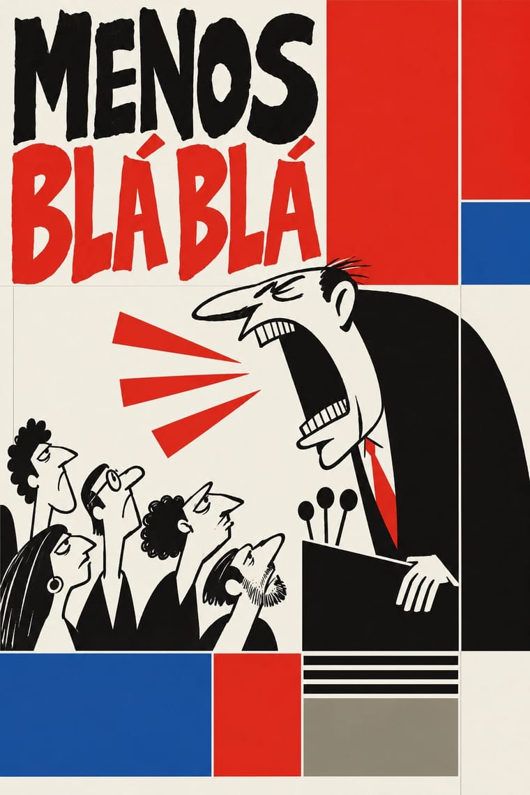
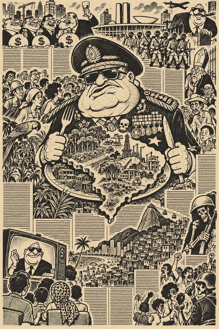
O Pasquim Satirical Press × International Typographic Style
A rigid grid and neutral type are the opposite of Pasquim's dense, hand-lettered, cartoon-filled page.
Mix them and make something O Pasquim Satirical Press International Typographic Style
01
What each style brings
Each part of the design comes from the style with the stronger say in it, and each style gives at least two.
O Pasquim Satirical Press International Typographic Style
- Type from O Pasquim Satirical Press
-
International Typographic Style avoids eclectic mixing: this is where the two pull against each other, which is the point of the contrast.
- Colour from International Typographic Style
- Form from O Pasquim Satirical Press
- Composition from International Typographic Style
- Surface from O Pasquim Satirical Press
-
02
The type
Open fonts standing in for each style’s own type, which is often hand-drawn or commercial.
Display · O Pasquim Satirical Press
Form
Londrina Solid, standing in for Cartoonists' own hand lettering
Text · International Typographic Style
A post-war refinement of the New Typography in which the mathematical grid, objective photography and neo-grotesque sans-serifs were used to communicate with clarity and neutrality. Taught at the Basel and Zurich schools, it became the default language of international corporate and institutional communication.
Inter; International Typographic Style used Akzidenz-Grotesk and Helvetica
03
The colours
The ground and leading colours come from International Typographic Style, with a counter-accent from O Pasquim Satirical Press. The ink reads on the ground at 4.5:1 or more.
O Pasquim Satirical Press International Typographic Style
-
#f2f0e9ground · 36% -
#111111ink · 14% -
#e1251baccent · 18% -
#d8cfb4accent · 14% -
#1f4e9caccent · 10% -
#8a8575accent · 8%
As CSS
:root {
  --ground: #f2f0e9;
  --ink: #111111;
  --accent-1: #e1251b;
  --accent-2: #d8cfb4;
  --accent-3: #1f4e9c;
  --accent-4: #8a8575;
  --font-display: "Londrina Solid", cursive;
  --font-text: "Inter", sans-serif;
}
04
The two styles

05
More combinations
With O Pasquim Satirical Press
- Underground Comix Pairs well · Share the hand-drawn, irreverent cartoon line, but borrow Pasquim's column-and-interview newspaper page for a more journalistic result.
- Tropicália Graphic Design Pairs well · A contemporary Brazilian counterculture; Tropicália's colour and collage can lift Pasquim's monochrome page.
- Turkish Weekly Humour Magazines (Gırgır to Uykusuz) Pairs well · Another cartoonist-led weekly where satire and local idiom carry political commentary under pressure.
- Il Male Newspaper-Forgery Satire Pairs well · Another satirical newspaper with cartoons; Il Male differs by forging real papers' front pages rather than publishing an original tabloid.
With International Typographic Style
- Art Nouveau Contrasts · Ornamental curves against an orthogonal grid make a strong deliberate tension.
- Brutalist Web Design Pairs well · Strip the grid to raw HTML defaults to get a rawer, contemporary take on Swiss honesty.
- Psychedelic Poster Contrasts · Its exact opposite on legibility; borrow one swirling element to break a too-cold Swiss layout.
- Japanese Postwar Modernism Pairs well · Add Japanese restraint and emblematic colour fields to the grid for warmth without losing order.
- American Traditional Tattoo Flash Contrasts · Rational grid and sans-serif against sentimental, hand-lettered emblems: one flash motif on a Swiss layout makes a sharp contrast.
- Graffiti & Hip-Hop Graphics Contrasts · Put a single tag or throw-up over a strict Swiss grid to stage the clash between institutional order and a street voice.
- Pop Art Graphics Contrasts · Set one loud appropriated Pop image inside a strict grid with a neutral grotesque so the irony reads as deliberate rather than chaotic.
- Italian Painted Film Poster (Rome Studios) Contrasts · Grid, restraint and photographic objectivity are the opposite of a crowded painted montage.