Style combination · Pairs well
Il Male Newspaper-Forgery Satire × O Pasquim Satirical Press
Another satirical newspaper with cartoons; Il Male differs by forging real papers' front pages rather than publishing an original tabloid.
Mix them and make something Il Male Newspaper-Forgery Satire O Pasquim Satirical Press
01
What each style brings
Each part of the design comes from the style with the stronger say in it, and each style gives at least two.
Il Male Newspaper-Forgery Satire O Pasquim Satirical Press
- Type from O Pasquim Satirical Press
- Colour from Il Male Newspaper-Forgery Satire
- Form from O Pasquim Satirical Press
- Composition from Il Male Newspaper-Forgery Satire
- Surface from Il Male Newspaper-Forgery Satire
02
The type
Open fonts standing in for each style’s own type, which is often hand-drawn or commercial.
Display · O Pasquim Satirical Press
No!
Londrina Solid, standing in for Cartoonists' own hand lettering
Text · Il Male Newspaper-Forgery Satire
The graphic voice of Il Male, the Roman satirical magazine of 1978-1982: forged front pages of real newspapers, photomontage and cartoons in a dense tabloid layout. It grew out of the left-wing milieu around the Movement of 1977, in the political tension of the late 1970s, and its fakes were sensational media pranks that could pass for the real paper. Unlike an original satirical tabloid such as O Pasquim, its signature is the counterfeit of an existing newspaper.
Newsreader; Il Male Newspaper-Forgery Satire used Newspaper mastheads imitated in the forgeries and Newspaper headline lettering imitated in the forgeries
03
The colours
The ground and leading colours come from Il Male Newspaper-Forgery Satire, with a counter-accent from O Pasquim Satirical Press. The ink reads on the ground at 4.5:1 or more.
Il Male Newspaper-Forgery Satire O Pasquim Satirical Press
-
#e8e0ccground · 39% -
#161616ink · 15% -
#c8231eaccent · 20% -
#8a8575accent · 15% -
#e2b93baccent · 11%
As CSS
:root {
  --ground: #e8e0cc;
  --ink: #161616;
  --accent-1: #c8231e;
  --accent-2: #8a8575;
  --accent-3: #e2b93b;
  --font-display: "Londrina Solid", cursive;
  --font-text: "Newsreader", serif;
}
04
The two styles
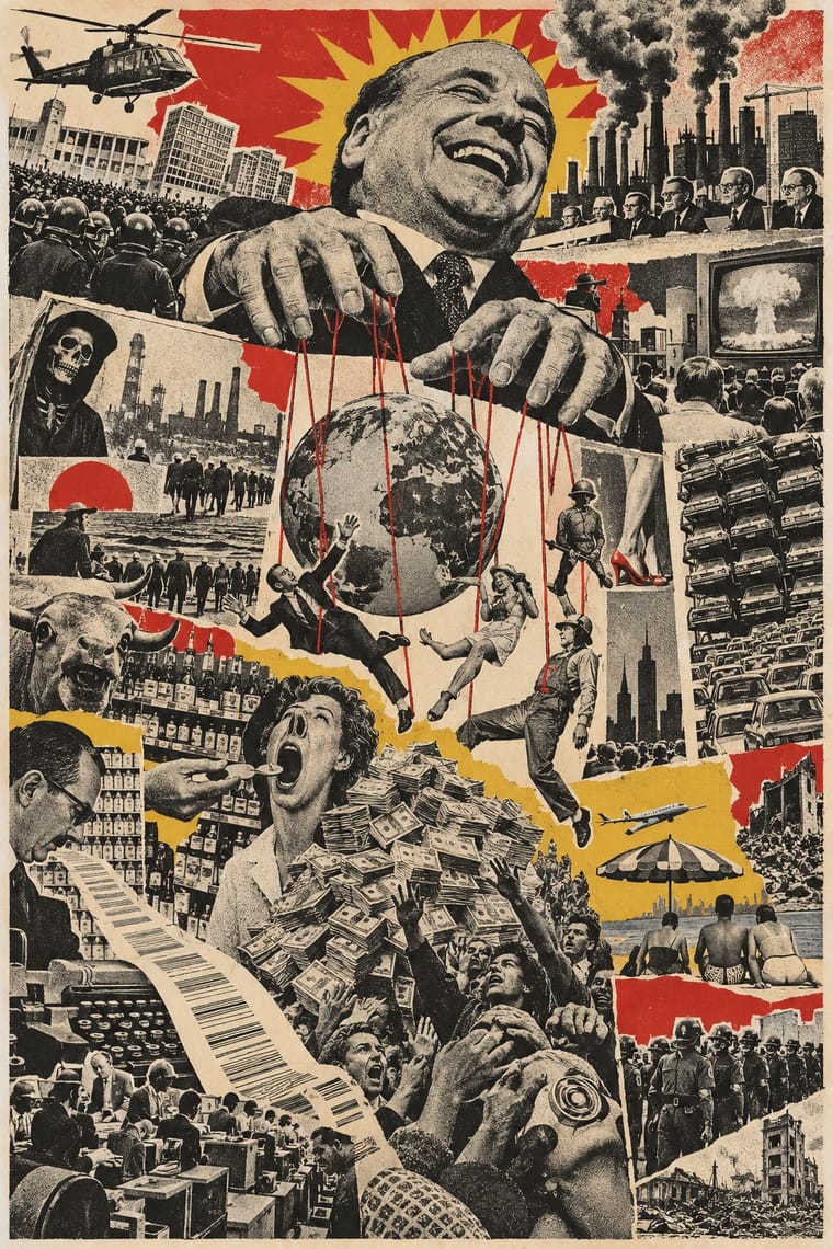
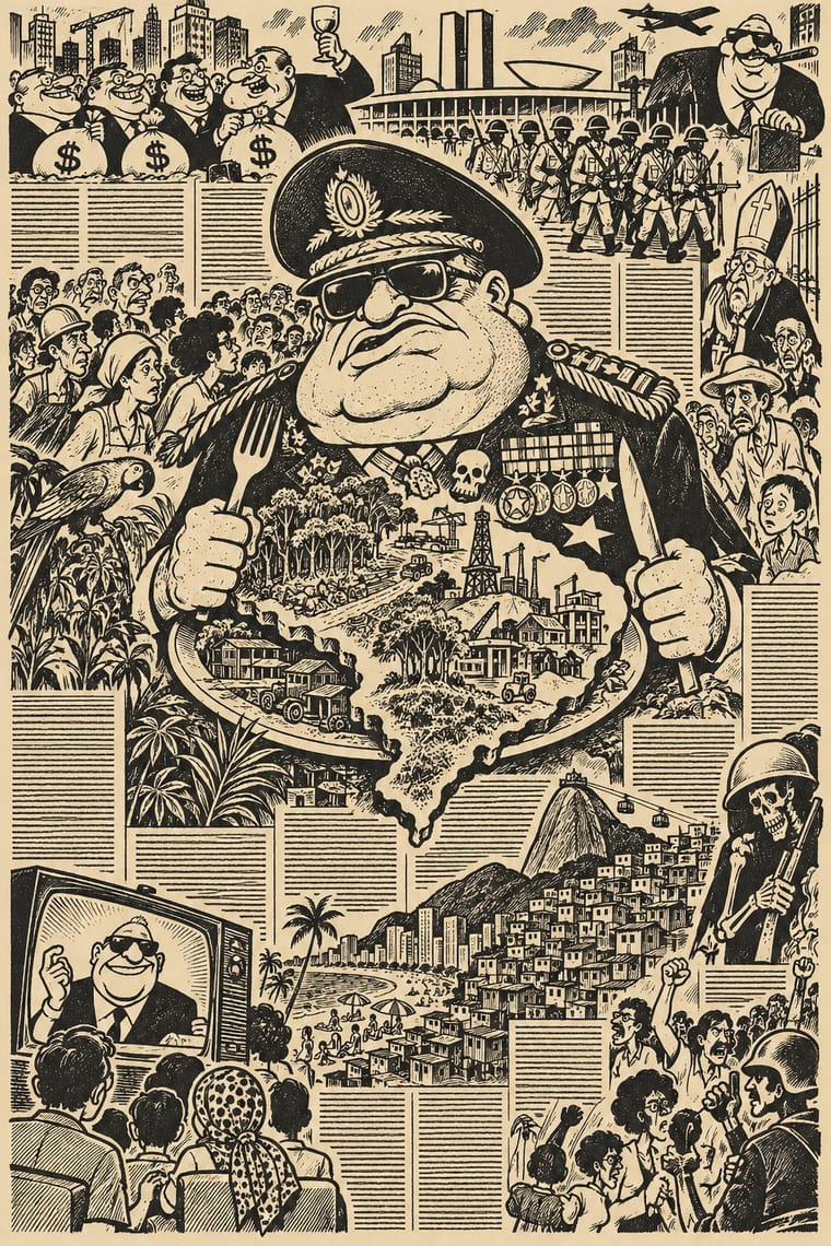
05
More combinations
With Il Male Newspaper-Forgery Satire
With O Pasquim Satirical Press
- International Typographic Style Contrasts · A rigid grid and neutral type are the opposite of Pasquim's dense, hand-lettered, cartoon-filled page.
- Underground Comix Pairs well · Share the hand-drawn, irreverent cartoon line, but borrow Pasquim's column-and-interview newspaper page for a more journalistic result.
- Tropicália Graphic Design Pairs well · A contemporary Brazilian counterculture; Tropicália's colour and collage can lift Pasquim's monochrome page.
- Turkish Weekly Humour Magazines (Gırgır to Uykusuz) Pairs well · Another cartoonist-led weekly where satire and local idiom carry political commentary under pressure.