Style combination · Pairs well
NFT Profile-Picture Collections × Pop Art Graphics
Warhol's silkscreened faces repeated in shifting colours anticipate the grid of near-identical portraits; borrow pop's halftone and clashing grounds to make a set feel less machine-made.
Mix them and make something NFT Profile-Picture Collections Pop Art Graphics
01
What each style brings
Each part of the design comes from the style with the stronger say in it, and each style gives at least two.
NFT Profile-Picture Collections (CryptoPunks to Bored Apes) Pop Art Graphics
- Type from Pop Art Graphics
- Colour from Pop Art Graphics
- Form from NFT Profile-Picture Collections
- Composition from NFT Profile-Picture Collections
- Surface from Pop Art Graphics
02
The type
Open fonts standing in for each style’s own type, which is often hand-drawn or commercial.
Display · Pop Art Graphics
Sure.
Bangers; Pop Art Graphics used Comic-book hand lettering and Franklin Gothic
Text · NFT Profile-Picture Collections
Sets of thousands of avatar portraits that code assembles from one or two hundred hand-drawn traits, each sold as a token on a blockchain. Each image repeats one character in one pose on a flat coloured square, varied only by skin, eyes, mouth, headwear and accessories whose rarity drives the price. Begun with Larva Labs' 24×24-pixel CryptoPunks (2017) and booming with Yuga Labs' thick-outlined cartoon Bored Apes (2021), it made the social-media profile picture a badge of club membership and wealth.
Jost; NFT Profile-Picture Collections used Montserrat, the geometric sans of the CryptoPunks website and The current CryptoPunks wordmark (cryptopunks.app), a smooth sans whose C, t, P and u are built partly from square pixel blocks
03
The colours
The ground and leading colours come from Pop Art Graphics, with a counter-accent from NFT Profile-Picture Collections. The ink reads on the ground at 4.5:1 or more.
NFT Profile-Picture Collections (CryptoPunks to Bored Apes) Pop Art Graphics
-
#fbf8f0ground · 36% -
#111111ink · 14% -
#ffd400accent · 18% -
#f2a03daccent · 14% -
#e10600accent · 10% -
#8b5a2baccent · 8%
As CSS
:root {
  --ground: #fbf8f0;
  --ink: #111111;
  --accent-1: #ffd400;
  --accent-2: #f2a03d;
  --accent-3: #e10600;
  --accent-4: #8b5a2b;
  --font-display: "Bangers", sans-serif;
  --font-text: "Jost", sans-serif;
}
Use it with care
NFT Profile-Picture Collections (CryptoPunks to Bored Apes): Most collections were sold as speculative assets and lost most of their value after 2022 (the Bored Ape floor price fell by about 90% from its May 2022 peak by May 2024); draw your own characters and trait layers rather than imitating a collection's punks or apes, whose rights belong to their holders or rights owners, and do not present an avatar set as an investment. Do not make skin tone, gender or ethnic dress a rarity tier: a study of the full CryptoPunks sales history finds that punks with black and brown skin sell for less than light-skinned ones, a gap their other facial features do not explain (Hubbard and LaFave, Journal of Cultural Economics, 2025), and the Bored Apes have been accused of racism, which their founders deny (Anti-Defamation League researchers called the charge doubtful but said traits such as 'Hip-Hop' can be seen as problematic). Keep identity traits evenly distributed, and keep racially or culturally coded costume off animal characters.
04
The two styles
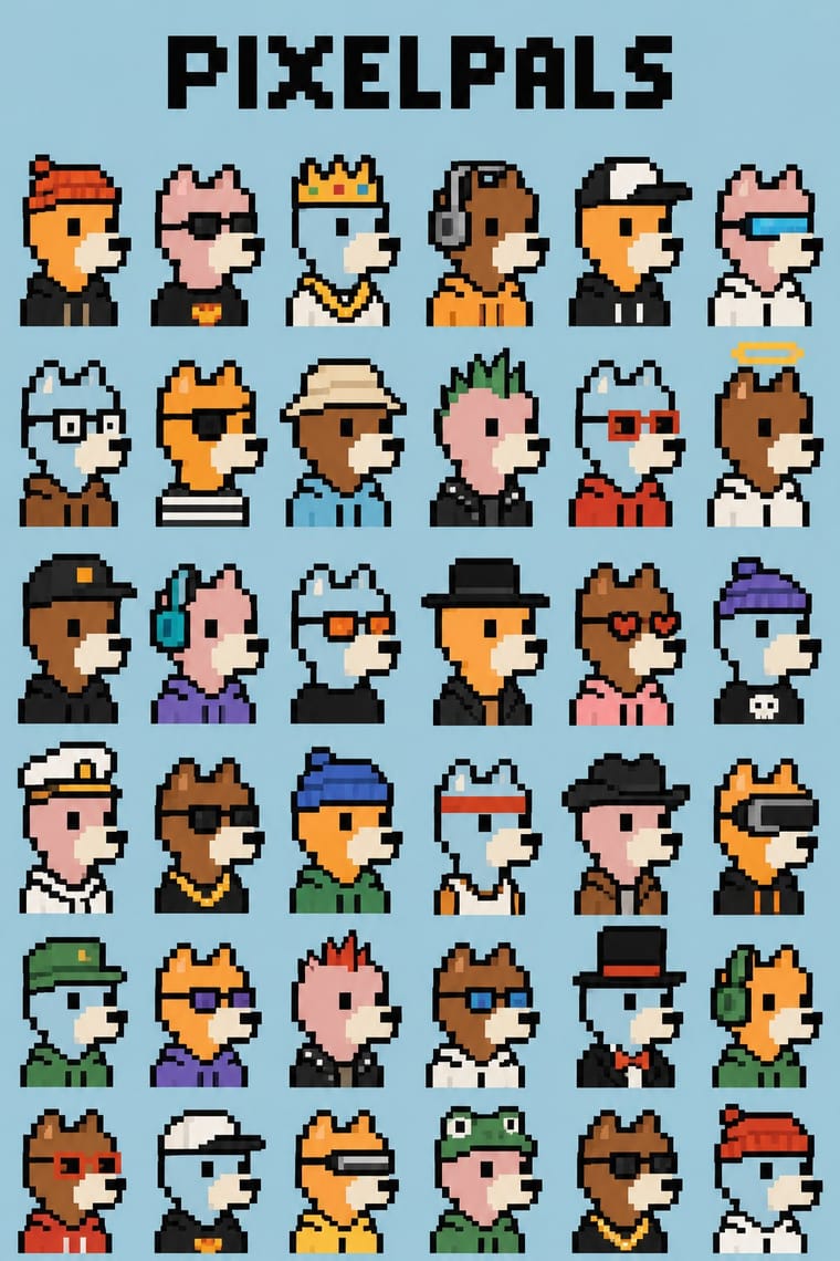
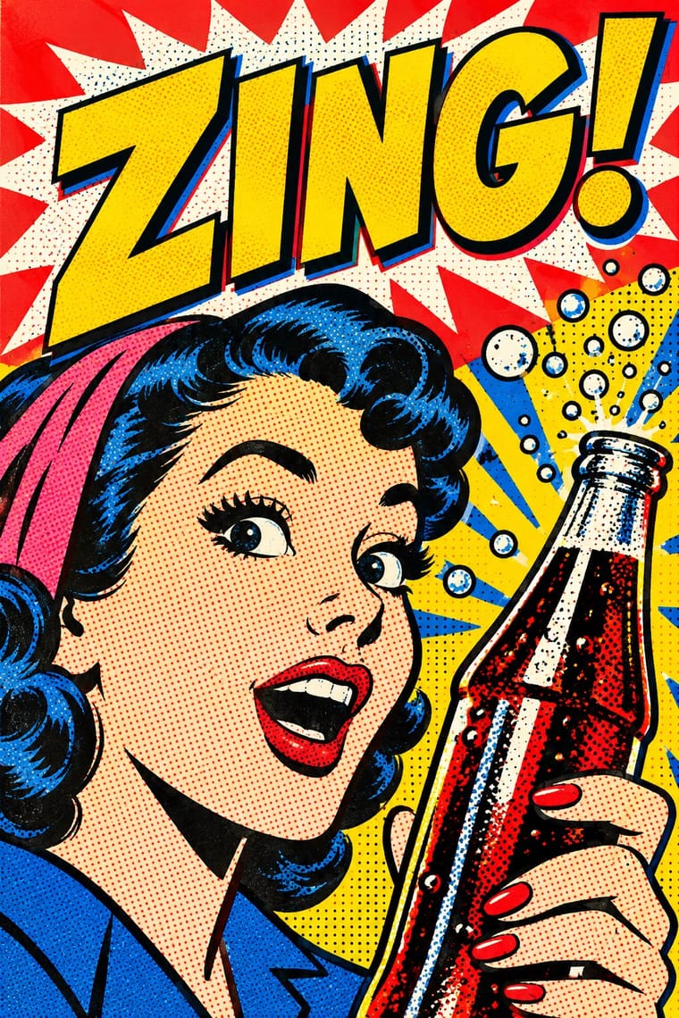
05
More combinations
With NFT Profile-Picture Collections
- Generative-AI Image Aesthetic Contrasts · PFP sets recombine hand-drawn trait layers with a simple script, while diffusion models synthesise every pixel; decide whether the authored layer drawing or the model's polish should show.
- Kawaii Design Pairs well · Round, soft mascot characters carry a collection from avatar to toy shelf, as Pudgy Penguins did; keep the outlines simple so they survive at thumbnail size.
- Generative & Dynamic Identities Contrasts · Both generate variants by rule, but an identity varies abstract marks around a constant brand, while a PFP set varies a character's accessories so that each token is rare and ownable.
With Pop Art Graphics
- International Typographic Style Contrasts · Set one loud appropriated Pop image inside a strict grid with a neutral grotesque so the irony reads as deliberate rather than chaotic.
- Ma & Wabi-sabi Aesthetics Contrasts · Where Pop multiplies glossy commodities, wabi-sabi values the single worn object; use one to puncture the mood of the other.
- Guna Mola Pairs well · Guna women redraw brand logos and cartoons (RCA Victor, Bullwinkle) in reverse appliqué; let that act of translation inspire Pop work, but buy or commission molas rather than imitating them.
- Neo-Brutalism Pairs well · Lift Pop's thick black outlines and flat primaries into UI cards and buttons for a confident, comic-strip interface.
- Risograph & Indie Print Culture Pairs well · Print Ben-Day dot screens in fluorescent pink and yellow riso inks to give Pop's mass-media imagery a small-run, handmade warmth.
- Screenprinted Gig & Alt-Movie Poster Pairs well · Shepard Fairey called Kozik 'the punk rock Warhol'; take Pop's appropriated cartoons and halftones and give them a gig poster's single idea and hand-lettered title.
- Finnish Bold Print (Marimekko Modernism) Pairs well · Contemporaries in saturated flat colour at a giant scale; borrow pop's isolated, enlarged object for a poster, but drop its halftone and irony to keep Marimekko's sincerity.
- Superflat Contrasts · Both turn commodities into art; take Pop's repetition and frontal commodity but swap its halftone and off-register silkscreen for Superflat's smooth vector fills and anime characters, so the print process disappears.