Style combination · Contrasts
Kōwhaiwhai × Torres Strait Islander Linocut
Another Oceanian pattern tradition, but kōwhaiwhai paints symmetrical koru scrolls in red, black and white along rafters, while Torres Strait linocut carves hatching around narrative figures; never treat Māori and Torres Strait design as one 'Pacific' style.
Mix them and make something Kōwhaiwhai Torres Strait Islander Linocut
01
What each style brings
Each part of the design comes from the style with the stronger say in it, and each style gives at least two.
Kōwhaiwhai & Toi Māori Design Torres Strait Islander Linocut
- Type from Torres Strait Islander Linocut
-
- Colour from Kōwhaiwhai
- Form from Kōwhaiwhai
- Composition from Kōwhaiwhai
- Surface from Torres Strait Islander Linocut
02
The type
Open fonts standing in for each style’s own type, which is often hand-drawn or commercial.
Display · Torres Strait Islander Linocut
Vow
Caveat, standing in for Printmaker's pencilled margin under the image: title, often in Kala Lagaw Ya (David Bosun, Lagau mabaigau malu aidal, 2002), edition number, signature and date; on Alick Tipoti's Zugubal (2006) 'A Tipoti 06 ©' is pencilled lower left, the title 'Zugubal' lower centre and the edition 9/35 lower right
Text · Kōwhaiwhai
Toi Māori, the visual arts of the tangata whenua of Aotearoa, of which kōwhaiwhai, the painted scroll patterns of paddles and meeting-house rafters, is the most graphic strand. Patterns are built from the koru (unfurling frond) and crescent forms in red ochre (kōkōwai), black and white, balancing positive and negative shapes in long mirrored bands, alongside carving (whakairo), tukutuku lattice panels and woven tāniko.
Archivo; Kōwhaiwhai used Whakarare and Painted and carved lettering in 19th-century meeting houses
03
The colours
The ground and leading colours come from Kōwhaiwhai, with a counter-accent from Torres Strait Islander Linocut. The ink reads on the ground at 4.5:1 or more.
Kōwhaiwhai & Toi Māori Design Torres Strait Islander Linocut
-
#f2efe8ground · 36% -
#141210ink · 14% -
#c46b2baccent · 18% -
#a5432aaccent · 14% -
#1d4e7aaccent · 10% -
#d9d0bfaccent · 8%
As CSS
:root {
  --ground: #f2efe8;
  --ink: #141210;
  --accent-1: #c46b2b;
  --accent-2: #a5432a;
  --accent-3: #1d4e7a;
  --accent-4: #d9d0bf;
  --font-display: "Caveat", cursive;
  --font-text: "Archivo", sans-serif;
}
Use it with care
Kōwhaiwhai & Toi Māori Design: Toi Māori is taonga: kōwhaiwhai patterns can belong to particular iwi and houses and carry whakapapa, and tā moko is personal and especially restricted. Work with Māori designers and iwi under tikanga, credit them, and do not graft koru onto letters or products as generic 'tribal' decoration.
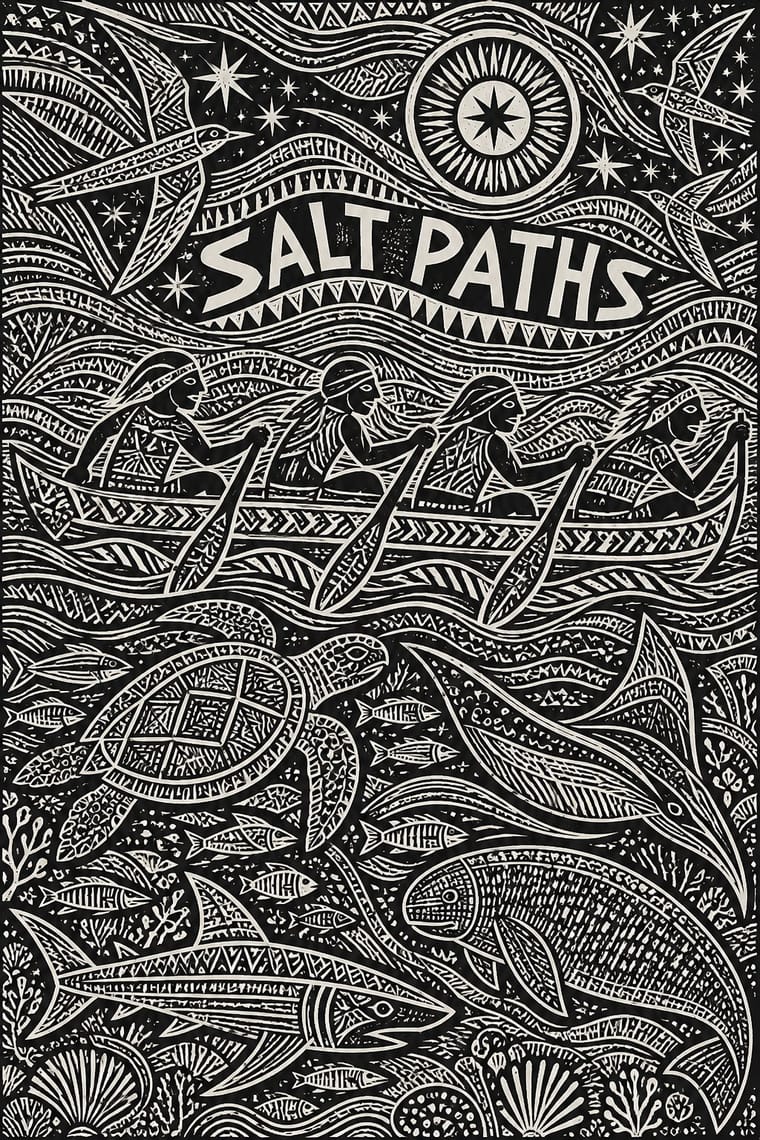
Torres Strait Islander Linocut: These prints are the work of named Torres Strait Islander artists, most of them living and in copyright, and their stories, totems, constellations and minaral patterns belong to particular families, clans and islands of Zenadth Kes; Mariw Minaral, the title of Alick Tipoti's 2020–2023 exhibition, means spiritual patterns, and the hidden images within his patterns are secrets that protect sacred cultural information. Torres Strait Islanders are a distinct people from Aboriginal Australians: even the V&A files Nona's print under 'Australian Aboriginal' style, so do not label the work Aboriginal, 'tribal' or generically Pacific, or blend it with dot painting or other Oceanian traditions. Commission or license work from Islander artists and their art centres, such as Moa Arts (Ngalmun Lagau Minaral) on Mua, and follow Creative Australia's Protocols for using First Nations Cultural and Intellectual Property in the Arts. Borrow only the general method of a densely carved black relief, never a particular print, an artist's figures, a legend or a constellation story; never invent Zenadth Kes legends, masks, headdresses or minaral as decoration, never add an artist's signature, and never present a generated image as a Torres Strait Islander print.
04
The two styles
05
More combinations
With Kōwhaiwhai
- Art Nouveau Pairs well · Both build on the living, curling stem; compare their curves to find a rhythm that is organic without being florid.
- International Typographic Style Contrasts · A rectilinear grid and neutral sans throw mirrored koru bands into relief, which suits bilingual institutional work in Aotearoa.
- Northwest Coast Formline Design Contrasts · Abstract koru bands and figurative formline crests are distinct Indigenous systems, not one 'tribal' look; study the difference and never blend them.
- Pacific Barkcloth (Tapa) Design Contrasts · Curvilinear kōwhaiwhai and ruled, gridded Polynesian barkcloth belong to different peoples and grammars; keep them separate and credit each source.
- Op Art Graphics Pairs well · Kōwhaiwhai figure-ground reversal reads as optical pattern, but Gordon Walters' koru paintings show the appropriation risk, so work with Māori artists.
- Uli & Nsibidi Line and Sign Tradition Contrasts · Both build from curving line and balance positive against negative space, but kōwhaiwhai mirrors koru in continuous bands along a rafter, while uli scatters single motifs asymmetrically over open skin, wall or paper.
- Tiki Pop (Polynesian Pop) Contrasts · Polynesian Pop folded Māori carving into one generic 'Tiki'; Toi Māori is taonga tied to particular iwi, so keep it out of tiki pastiche and work with Māori designers when the subject is Aotearoa.
With Torres Strait Islander Linocut
- Northwest Coast Formline Design Contrasts · Both translate carved crest and totemic art into prints, but formline builds beings from swelling ovoids and U-forms in flat red and black, while Torres Strait linocut builds them from fields of fine hatching; study the difference and never blend two nations' visual languages.
- Kinngait (Cape Dorset) Inuit Printmaking Contrasts · Both are Indigenous community print studios whose cut marks pattern the inside of a figure, but Kinngait floats one flat silhouette in one to three inks on unprinted paper, while Torres Strait linocut packs a black field with incised pattern from edge to edge; choose Kinngait for a single quiet figure, Torres Strait for a dense cosmos, and keep Inuit and Torres Strait Islander imagery apart.
- Minimalist Graphic Design Pairs well · Set a print commissioned or licensed from an Islander artist on a quiet layout of generous white space and one restrained sans, so the carved density carries the page alone.
- Rorke's Drift Linocut Contrasts · Both pack a black linocut to the edges and grew from a teaching studio, but Rorke's Drift stacks Bible and history scenes in horizontal bands, while Torres Strait prints let sea beings and stars interlock in one field of minaral; pick bands to narrate in order, the open field to show a cosmos.
- Op Art Graphics Contrasts · Both make fine repeated lines vibrate, but op art's pattern is pure optics with no subject, while minaral names and surrounds beings in a story; use op art when a shimmering line field must carry no cultural meaning.
- Taller de Gráfica Popular Contrasts · Same medium, opposite intent: TGP gouges expressive, social-realist marks under a slogan to agitate, while Torres Strait linocut carves ornamental, pattern-saturated figures of ancestral stories with no headline at all.