Style combination · Contrasts
Lubok Popular Print × Minimalist Graphic Design
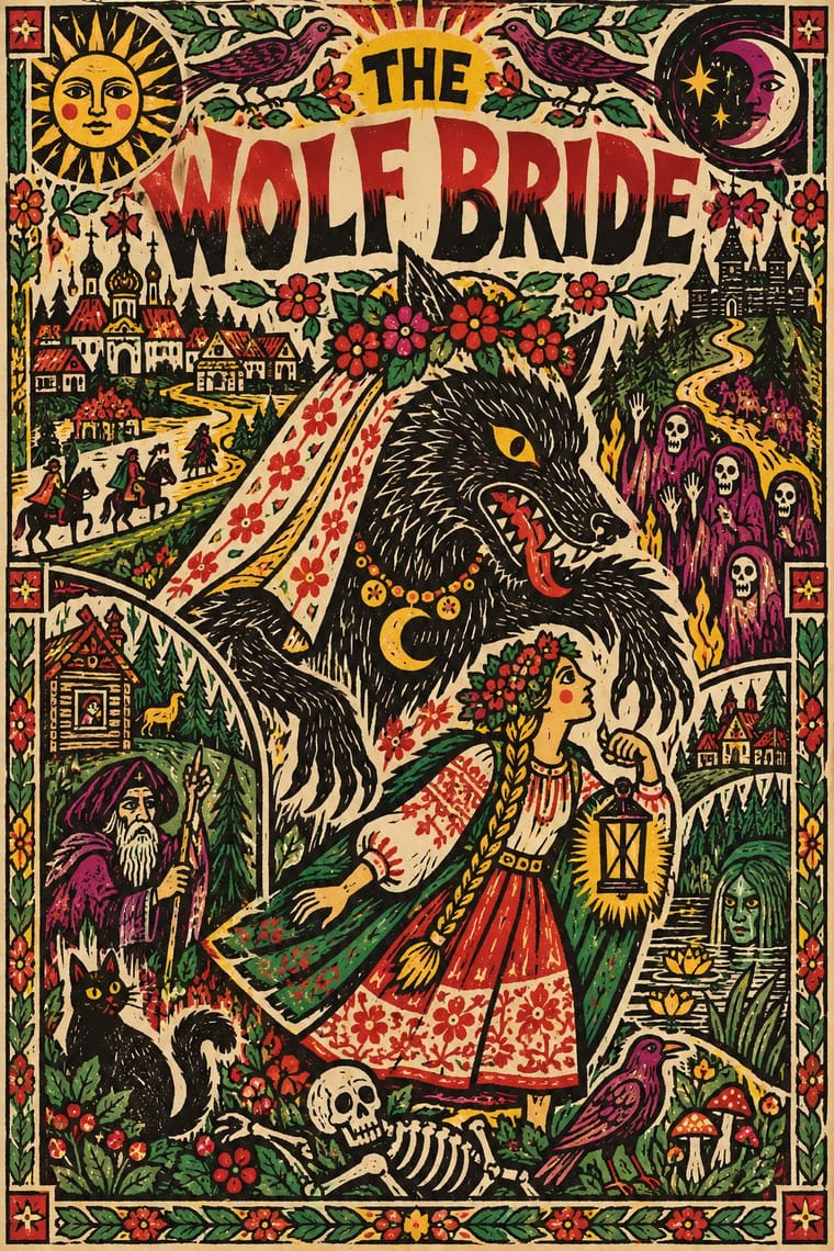
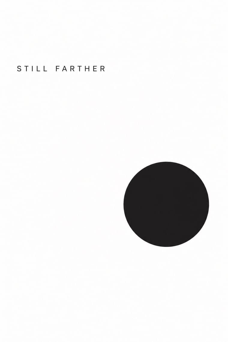
Lubok's crowding is its voice; isolate one figure on white to test how much of the meaning lives in the jostling text.
Mix them and make something Lubok Popular Print Minimalist Graphic Design
01
What each style brings
Each part of the design comes from the style with the stronger say in it, and each style gives at least two.
Lubok Popular Print Minimalist Graphic Design
- Type from Lubok Popular Print
- Colour from Minimalist Graphic Design
- Form from Lubok Popular Print
- Composition from Minimalist Graphic Design
-
Lubok Popular Print avoids generous white space: this is where the two pull against each other, which is the point of the contrast.
- Surface from Lubok Popular Print
02
The type
Open fonts standing in for each style’s own type, which is often hand-drawn or commercial.
Display · Lubok Popular Print
Calm
Londrina Solid; Lubok Popular Print used Hand-cut Cyrillic lettering in the block, from Church Slavonic-style semi-uncial (poluustav) to civil script and Rubber-stamped and stencilled lettering imitating lubok woodcut letters in Russian Futurist books
Text · Minimalist Graphic Design
Modernism reduced to its barest means, informed by 1960s Minimal art and Japanese emptiness: one image or line of type, vast white or neutral space, a monochrome or near-monochrome palette and meticulous typographic detail. From ECM record sleeves to Muji and Apple packaging, it signals quality, calm and confidence by withholding rather than adding.
Inter; Minimalist Graphic Design used Helvetica Neue and Akzidenz-Grotesk
03
The colours
The ground and leading colours come from Minimalist Graphic Design, with a counter-accent from Lubok Popular Print. The ink reads on the ground at 4.5:1 or more.
Lubok Popular Print Minimalist Graphic Design
-
#ffffffground · 36% -
#1a1a1aink · 14% -
#d9d6d0accent · 18% -
#e8b923accent · 14% -
#8c8a86accent · 10% -
#c62d2aaccent · 8%
As CSS
:root {
  --ground: #ffffff;
  --ink: #1a1a1a;
  --accent-1: #d9d6d0;
  --accent-2: #e8b923;
  --accent-3: #8c8a86;
  --accent-4: #c62d2a;
  --font-display: "Londrina Solid", cursive;
  --font-text: "Inter", sans-serif;
}
04
The two styles
05
More combinations
With Lubok Popular Print
- Mexican Popular Graphics (Posada) Pairs well · Posada's broadsheets and lubki share cheap paper, crude relief cuts and street humour; brush lubok-style washes over a black relief broadsheet.
- ROSTA Windows Pairs well · ROSTA windows inherited the lubok's numbered, captioned panels and rhymed text; combine the two for sequential agitational posters with a folk voice.
- Literatura de Cordel Woodcut Pairs well · Brazilian cordel is another chapbook woodcut tradition; set rhymed verse and a single crude block together, as both do, for narrative print with a vernacular voice.
- Nianhua & Chinese Folk Print Pairs well · Both are hand-coloured market woodcuts; take nianhua's symmetrical auspicious emblems and lubok's crowded captions and satire for festive print that also tells a story.
- Imagerie d'Épinal & European Bilderbogen Contrasts · Both are pedlars' broadsheets coloured by hand, but the lubok crams verse into the gaps around its figures and brushes washes on freely, while the Épinal sheet keeps its text beneath a ruled frame and stencils colour across rows of repeated figures; choose the lubok for jostling satire and Épinal for an orderly catalogue or story.
- Narbut School (Ukrainian Baroque Revival Graphics) Contrasts · Popular, coloured woodcut exuberance against Narbut's academic, restrained black line.
- Kalighat Pat & Battala Bazaar Prints Pairs well · Both are cheap popular prints that mix piety with satire and splash colour on by hand; combine them for a folk-print exhibition or publishing identity.
- Đông Hồ & Hàng Trống Folk Prints Pairs well · Lubok's Mice Burying the Cat and Đông Hồ's Rats' Wedding tell the same joke about power; pair them for a folk-satire series or exhibition identity.
With Minimalist Graphic Design
- ECM Sleeve Aesthetic (Munich) Pairs well · ECM's record sleeves carry the same reduction into music since 1970: one corresponding image, a few lines of small type and a great deal of silence; borrow their wintry photograph and tiny type when a minimal layout needs mood rather than system.
- Ma & Wabi-sabi Aesthetics Pairs well · Add one imperfect texture or natural material so the emptiness feels contemplative rather than sterile.
- Memphis Design Contrasts · Memphis's clashing patterns are the antidote to minimal reticence; a single Memphis accent makes a minimal layout playful.
- Dark Tech Minimalism Pairs well · Invert the palette to near-black and keep the same reduction for a contemporary technology register.
- Neo-Andean Architecture (Cholets) Contrasts · Its exact opposite on ornament and colour; one symmetrical fluorescent panel in a white, empty layout reads as a loud statement of identity.
- Neoclassical Book Typography Pairs well · Set a single Didone headline in minimalism's empty, monochrome field for the classic luxury-fashion register.
- Renaissance Book Typography Pairs well · Keep classical page proportions and a humanist serif but strip the ornament to give minimal layouts warmth and authority.
- Afrobeat Sleeve Art Contrasts · Its exact opposite on density; a single minimal element on a Lemi-style sleeve stands out sharply, and vice versa.