Style combination · Contrasts
Lubok Popular Print × Narbut School
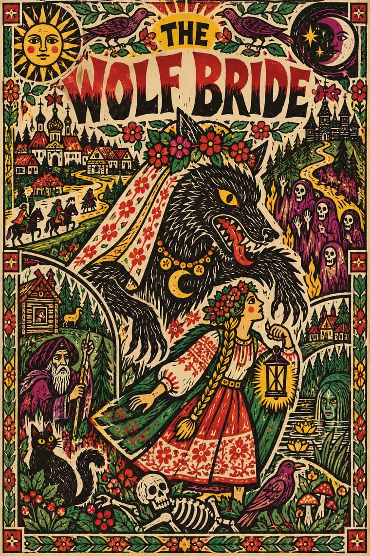
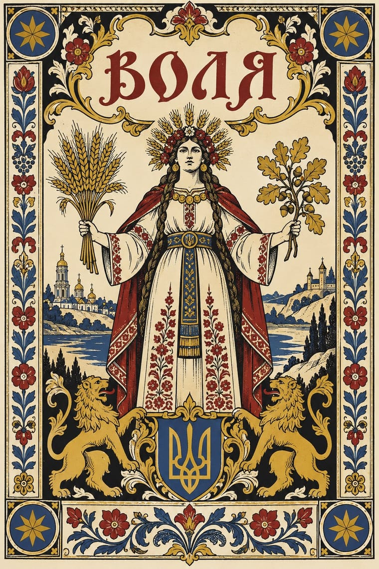
Popular, coloured woodcut exuberance against Narbut's academic, restrained black line.
Mix them and make something Lubok Popular Print Narbut School
01
What each style brings
Each part of the design comes from the style with the stronger say in it, and each style gives at least two.
Lubok Popular Print Narbut School (Ukrainian Baroque Revival Graphics)
- Type from Lubok Popular Print
- Colour from Narbut School
- Form from Narbut School
- Composition from Lubok Popular Print
- Surface from Lubok Popular Print
02
The type
Open fonts standing in for each style’s own type, which is often hand-drawn or commercial.
Display · Lubok Popular Print
Square
Londrina Solid; Lubok Popular Print used Hand-cut Cyrillic lettering in the block, from Church Slavonic-style semi-uncial (poluustav) to civil script and Rubber-stamped and stencilled lettering imitating lubok woodcut letters in Russian Futurist books
Text · Narbut School
A Kyiv graphic idiom of 1917 to 1920 in which Heorhiy Narbut recast Ukrainian Baroque, Cossack heraldry and folk motifs as crisp black-and-white pen drawing, hand-drawn lettering and framed emblems. It served the Ukrainian People's Republic on banknotes, stamps, charters and seals, and was taught at the Ukrainian State Academy of Arts, where Narbut was professor from 1917 and rector from 1918.
Archivo; Narbut School used Narbut's hand-drawn Ukrainian Baroque lettering and initials and Hand-drawn Cossack-baroque title lettering on charters and banknotes
03
The colours
The ground and leading colours come from Narbut School, with a counter-accent from Lubok Popular Print. The ink reads on the ground at 4.5:1 or more.
Lubok Popular Print Narbut School (Ukrainian Baroque Revival Graphics)
-
#f1ead8ground · 36% -
#111111ink · 14% -
#c9a227accent · 18% -
#7a1f1aaccent · 14% -
#c62d2aaccent · 10% -
#2f4a73accent · 8%
As CSS
:root {
  --ground: #f1ead8;
  --ink: #111111;
  --accent-1: #c9a227;
  --accent-2: #7a1f1a;
  --accent-3: #c62d2a;
  --accent-4: #2f4a73;
  --font-display: "Londrina Solid", cursive;
  --font-text: "Archivo", sans-serif;
}
04
The two styles
05
More combinations
With Lubok Popular Print
- Mexican Popular Graphics (Posada) Pairs well · Posada's broadsheets and lubki share cheap paper, crude relief cuts and street humour; brush lubok-style washes over a black relief broadsheet.
- ROSTA Windows Pairs well · ROSTA windows inherited the lubok's numbered, captioned panels and rhymed text; combine the two for sequential agitational posters with a folk voice.
- Literatura de Cordel Woodcut Pairs well · Brazilian cordel is another chapbook woodcut tradition; set rhymed verse and a single crude block together, as both do, for narrative print with a vernacular voice.
- Nianhua & Chinese Folk Print Pairs well · Both are hand-coloured market woodcuts; take nianhua's symmetrical auspicious emblems and lubok's crowded captions and satire for festive print that also tells a story.
- Minimalist Graphic Design Contrasts · Lubok's crowding is its voice; isolate one figure on white to test how much of the meaning lives in the jostling text.
- Imagerie d'Épinal & European Bilderbogen Contrasts · Both are pedlars' broadsheets coloured by hand, but the lubok crams verse into the gaps around its figures and brushes washes on freely, while the Épinal sheet keeps its text beneath a ruled frame and stencils colour across rows of repeated figures; choose the lubok for jostling satire and Épinal for an orderly catalogue or story.
- Kalighat Pat & Battala Bazaar Prints Pairs well · Both are cheap popular prints that mix piety with satire and splash colour on by hand; combine them for a folk-print exhibition or publishing identity.
- Đông Hồ & Hàng Trống Folk Prints Pairs well · Lubok's Mice Burying the Cat and Đông Hồ's Rats' Wedding tell the same joke about power; pair them for a folk-satire series or exhibition identity.
With Narbut School
- Ukrainian Wartime Graphics (Saint Javelin, War Stamps and Be Brave Like Ukraine) Pairs well · A later revival (2022 onward) that draws on Ukrainian national imagery; not an influence on Narbut.
- Mir iskusstva Book Art Pairs well · Share the lineage of line drawing and bookish framing; Narbut turns it toward heraldry and state identity.
- International Typographic Style Contrasts · A gridded, ornament-free neutrality opposite to symmetric heraldic ornament.
- Celtic Revival Illumination & Lettering Pairs well · Another national revival that rebuilds a native ornament and hand-lettering tradition as an identity system.