Style combination · Contrasts
Square Kufic × Vyaz
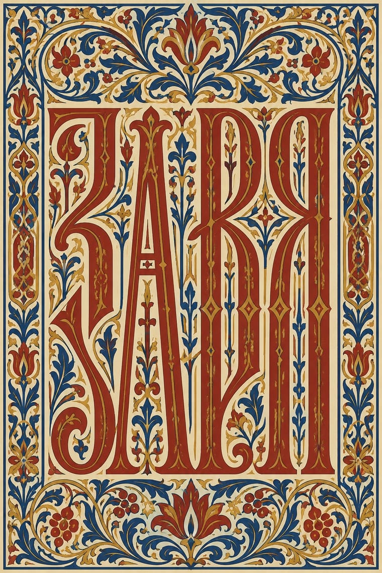
Both turn sacred words into a dense band that reads first as pattern, but square Kufic snaps letters to an orthogonal grid of equal stroke and gap, while vyaz stretches free pen-drawn letters upward and plugs the gaps with plant filler; choose the grid or the calligraphic interlace, and never blend the two sacred scripts into a generic 'ancient' texture.
01
What each style brings
Each part of the design comes from the style with the stronger say in it, and each style gives at least two.
Square Kufic (Bannāʾī) Vyaz (Ornamental Slavonic Lettering)
- Type from Vyaz
- Colour from Square Kufic
- Form from Square Kufic
- Composition from Square Kufic
- Surface from Vyaz
02
The type
Open fonts standing in for each style’s own type, which is often hand-drawn or commercial.
Display · Vyaz
Grace
Federant, standing in for Drawn Russian Revival vyaz of about 1900, intricate and in the spirit of Art Nouveau, such as Vrubel's monolinear vyaz
Text · Square Kufic
Square Kufic builds Arabic script on a square grid: straight lines and right angles only, with every stroke as wide as the gap beside it. A word can then fill a square, a band or a whole wall without gaps. It grew from twelfth- and thirteenth-century brick and tile inscriptions, probably first in Iran and Afghanistan, where one brick or glazed tile made one unit, and spread to Central Asia, Anatolia and the Maghreb. The names of God, Muhammad and ʿAli repeat across minarets and façades. In modern times it was revived for logos, the flag of Iran and calligraphy.
Reem Kufi; Square Kufic used Bannāʾī (maʿqilī) and Square Kufic drawn in ink on a squared (chequered) grid, as in the pattern drawings of the Topkapı Scroll and in modern calligraphy, usually without dots
03
The colours
The ground and leading colours come from Square Kufic, with a counter-accent from Vyaz. The ink reads on the ground at 4.5:1 or more.
Square Kufic (Bannāʾī) Vyaz (Ornamental Slavonic Lettering)
-
#f3eee3ground · 36% -
#161616ink · 14% -
#2a9ea6accent · 18% -
#b5341faccent · 14% -
#1e3d8faccent · 10% -
#c39a3eaccent · 8%
As CSS
:root {
  --ground: #f3eee3;
  --ink: #161616;
  --accent-1: #2a9ea6;
  --accent-2: #b5341f;
  --accent-3: #1e3d8f;
  --accent-4: #c39a3e;
  --font-display: "Federant", sans-serif;
  --font-text: "Reem Kufi", cursive;
}
Use it with care
Square Kufic (Bannāʾī): Square-Kufic panels almost always spell sacred words: the names of God, Muhammad and ʿAli, the shahada, the takbir or Qur'anic phrases. Never crop, mirror or scramble them, never fill a surface with invented pseudo-Kufic as a pixel texture, and keep such text off floors, footwear, packaging and other throwaway surfaces. Some formulas belong to one community, such as the Shiʿi addition 'ʿAli is the friend of God', so have every composition read and approved by a fluent reader or a square-Kufic calligrapher, and commission or credit living calligraphers rather than tracing panels from buildings. The square-Kufic takbir band belongs to the flag of the Islamic Republic of Iran (since July 1980), and many Iranian opposition groups and diaspora communities fly the Lion and Sun flag or a plain tricolour instead, so do not quote the band as decorative Persian shorthand. Do not treat the names Muhammad and ʿAli together as neutral filler either: they interlock on the minarets of the Shah Mosque in Isfahan, and they also appear in the blue brickwork of the Timurid shrine of the Sunni Sufi Khoja Ahmed Yasavi, so check how the community commissioning the work reads them.
Vyaz (Ornamental Slavonic Lettering): Most vyaz carries sacred text: prayers, holy names, the titles of Gospels and service books, and inscriptions on icons, bells, church vessels, shrouds and graves. Do not fill a band with invented pseudo-Cyrillic or scramble real Church Slavonic as texture, keep holy names and prayers off throwaway products, and have any text written or checked by a reader of Church Slavonic. For Old Believers the pre-reform book and its lettering remain a matter of faith, so credit and involve their communities rather than lifting their headings as decoration. Vyaz is not only Russian: Bulgarian and Serbian scribes used it before Russia, Romanian scribes from the 15th century, and western and south-western Rus' in the Grand Duchy of Lithuania (today's Belarus and Ukraine, with Supraśl in Poland) kept its own plant-derived manner, so credit the book culture a model comes from. Since Russia's full-scale invasion of Ukraine in 2022, check whether your audience will read Old Russian display lettering as Russian state or nationalist branding; vyaz is also part of Belarusian and Ukrainian book and icon heritage, so ask how that audience reads it rather than assuming either.
04
The two styles
05
More combinations
With Square Kufic
- Islamic Geometric & Calligraphic Tradition Contrasts · The parent tradition mixes cursive Thuluth and Naskh, girih stars and arabesque, while square Kufic keeps only the orthogonal grid; choose square Kufic when a design needs one rigid two-tone module, and the wider tradition when it needs curves, interlace and polychrome hierarchy.
- Bitmap & Pixel Graphics Pairs well · Both build letters from square units, and Sakkal compares building bricks to large pixels; set a bitmap Latin wordmark on the same cell size as a square-Kufic mark for a bilingual identity, but keep sacred formulas out of jokey, game-like pixel contexts.
- Iranian Modernist Graphic Design Pairs well · Persian Wikipedia records bannāʾī in modern posters, logos and letterheads, and the atlas's Iranian modernist entry counts it among its Persian scripts; pair a square-Kufic title block with a Nastaʿlīq line and one flat figure for a Persian cultural poster.
- Andean Woven Graphic Systems Contrasts · T'oqapu also fill square cells on a grid, but with signs of rank rather than legible words; compare them to see how a grid can carry writing or emblem, and never blend the two sacred systems into a generic 'geometric' pattern.
- Soviet Central Asian Ornamental Modernism Contrasts · The atlas's Soviet Central Asian entry recommends display capitals built on its mosaic or panjara module after the bannāʾī principle of tiles as pixels, for Cyrillic and Latin names only and with no Arabic script or pseudo-Kufic; use that route when a grid-built wordmark must stay secular, and square Kufic only for Arabic-script words read and approved by a fluent reader.
- Contemporary Arabic & Dual-Script Type Design Pairs well · Set reading text in a low-contrast Kufi-derived Arabic sans matched to its Latin companion, and keep square Kufic for the emblem or panel, where legibility may give way to pattern.
- Turkish Modernist Poster & Graphic Design Pairs well · Erkmen set the Latin initials TİEM on a square-Kufic grid for the Türk ve İslam Eserleri Müzesi logo, and Ertel drew on Kufic for a Ministry of Culture logo; borrow the bannāʾī grid as a structure for a mark, but check what any Kufic letters spell before using them.
- Ottoman Tughra & Dîvânî Chancery Calligraphy Contrasts · Square Kufic binds Arabic letters to a square grid of straight strokes; the tughra frees them into sweeping loops and tall shafts. Use the grid for a modular, tiled emblem and the tughra for a single flourishing signature.
With Vyaz
- Mir iskusstva Book Art Pairs well · Bilibin's circle drew titles and initials in an Old Russian manner into bordered fairy-tale books; put a newly drawn vyaz title under a folk-ornament headpiece for a Russian Revival page rather than copying a liturgical heading.
- International Typographic Style Contrasts · Its opposite: airy, flush-left sans-serif on a grid against a dense, centred band of stretched calligraphic letters and plant filler; a single vyaz title can warm an otherwise strict grid.
- Phototype Expressive Typography (Lubalin & U&lc) Pairs well · Lubalin's phototype logotypes also merge neighbouring letters into ligatures and crowd them into a single shape; borrow vyaz's shared stems and nested small letters for a Cyrillic logotype, and keep it to one or two words so it stays readable.
- Edo-moji Commercial Lettering (Kanteiryū, Yose-moji, Sumō-ji) Contrasts · Both are crowded display hands that leave no gap in the band they fill, but edo-moji fills it with plump, heavy strokes, as in Kanteiryū or sumō-ji, and vyaz with tall, interlocked stems and plant filler: two answers to the same demand for a full, dense line, so pick weight or height rather than mixing them.
- Gothic Blackletter & Fraktur Tradition Contrasts · Both pack tall, upright strokes into a dark rhythm, and Shchepkin even called 17th-century vyaz the fraktur style; but blackletter darkens a whole justified page of running text, while vyaz binds one title line into ornament by joining letters on shared stems and nesting small ones between them. Use blackletter for text and vyaz for a single heading band.
- Armenian Manuscript Illumination Pairs well · Another Eastern Christian book culture in which titles and initials carry the ornament; set a vyaz title in gold and azurite beside a canon-table arcade to compare a heading built from joined letters with an initial built from birds.