Style combination · Contrasts
Lo-fi Anime Aesthetic × Vaporwave
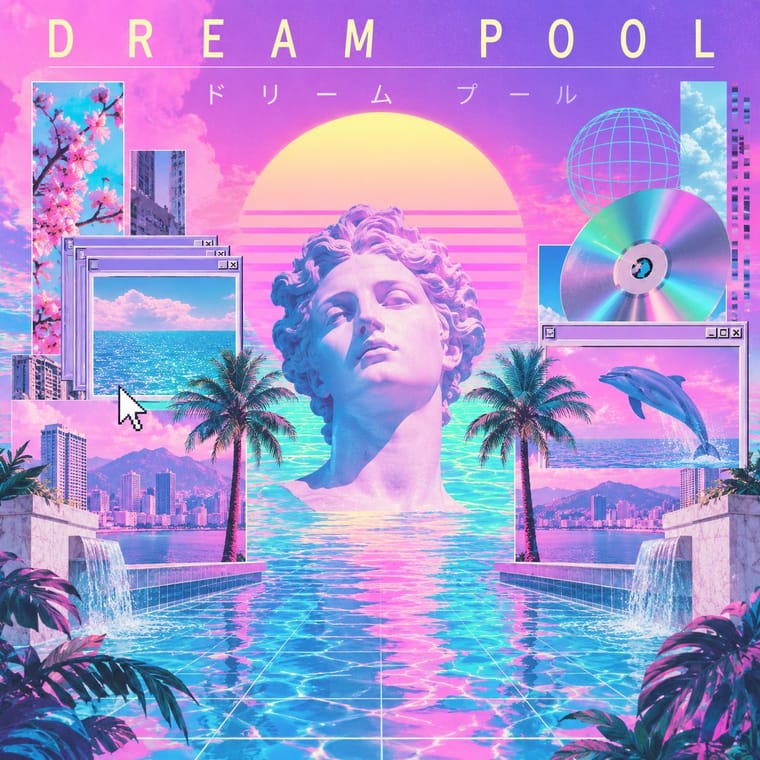
Its sibling on YouTube's 24/7 streams: vaporwave collages found consumer debris (busts, dialog boxes, malls) with irony, lofi paints one sincere, lived-in room. Borrow vaporwave's letter-spaced titles at most, and leave its collage out when the brief is calm focus.
01
What each style brings
Each part of the design comes from the style with the stronger say in it, and each style gives at least two.
Lo-fi Anime Aesthetic Vaporwave
- Type from Vaporwave
- Form from Lo-fi Anime Aesthetic
- Composition from Lo-fi Anime Aesthetic
- Surface from Vaporwave
-
Lo-fi Anime Aesthetic avoids chrome & 3d render: this is where the two pull against each other, which is the point of the contrast.
02
The type
Open fonts standing in for each style’s own type, which is often hand-drawn or commercial.
Text · Lo-fi Anime Aesthetic
The look of YouTube's 24/7 lo-fi hip hop streams. Early uploads looped found clips from cartoons and anime (The Simpsons, Whisper of the Heart); the look was fixed when ChilledCow (now Lofi Girl) swapped its Ghibli clip for Juan Pablo Machado's 'Miyazaki-esque' girl studying by a window over Lyon, art many channels copied. One absorbed figure, anime person or animal mascot, in a cosy painted room, a city or rain at dusk outside, cool blue-violet light warmed by a lamp, a few things moving in a seamless loop: a picture to work beside, sincere where vaporwave is ironic.
Zen Kaku Gothic New; Lo-fi Anime Aesthetic used Lowercase stream and track titles in plain sans text with a single emoji as the only ornament, as in Lofi Girl's 'lofi hip hop radio 📚 beats to relax/study to' and 'jazz lofi radio 🎷 beats to chill/study to' and Letter-spaced capitals in track and compilation titles ('RAINING IN P A R I S', 'L O V E S I C K'), which fans trace to vaporwave and to typing Latin words with Japanese keyboards and typefaces (Wang, 2020)
03
The colours
The ground and leading colours come from Vaporwave, with a counter-accent from Lo-fi Anime Aesthetic. The ink reads on the ground at 4.5:1 or more.
Lo-fi Anime Aesthetic Vaporwave
-
#1a1040ground · 36% -
#fffb96ink · 14% -
#01cdfeaccent · 18% -
#f2a65aaccent · 14% -
#05ffa1accent · 10% -
#7a4e3aaccent · 8%
As CSS
:root {
  --ground: #1a1040;
  --ink: #fffb96;
  --accent-1: #01cdfe;
  --accent-2: #f2a65a;
  --accent-3: #05ffa1;
  --accent-4: #7a4e3a;
  --font-display: "Syncopate", sans-serif;
  --font-text: "Zen Kaku Gothic New", sans-serif;
}
Use it with care
Lo-fi Anime Aesthetic: The study girl (Jade), the Synthwave Boy and Chillhop's raccoon are owned characters, and the genre's first face, a Studio Ghibli clip used without permission, cost ChilledCow its stream in 2017: draw an original figure, room and view instead of tracing Ghibli frames or the Lofi Girl scene. The combination that identifies Lofi Girl (a girl in headphones writing at a desk, a cat on the sill, Lyon's Croix-Rousse hill beyond) is the one to change first: swap at least the figure, the companion and the view. Lofi Girl makes all its art by hand and objects to AI-generated avatars that resemble or recreate its characters, so never generate a look-alike of Jade or her companions, and disclose generated pictures. Leave out Japanese text unless it is correct and means something, and do not dress a room in random kana or generic 'Japan' scenery.
04
The two styles
05
More combinations
With Lo-fi Anime Aesthetic
- Superflat Contrasts · Both draw on anime, but superflat flattens otaku imagery into ironic, polychrome, all-over fields with no depth; choose lofi for one sincere, softly lit room with depth, and superflat when the brief wants pop density and knowing play.
- Synthwave / Outrun Pairs well · Lofi Girl paired them itself in 2023, putting a synthwave stream's boy, neon Saturn sign and lava lamp in the window across from the study girl; add synthwave's neon glow to a lofi room for gaming or late-night variants.
- Kawaii Design Contrasts · Both draw cute, anime-derived figures, but kawaii sets a mascot frontally on a plain pastel ground; switch to lofi when the figure should be absorbed in a painted room at dusk rather than smiling at the viewer.
- Generative-AI Image Aesthetic Contrasts · Lofi Girl's policy rules out AI generation, AI upscaling and AI avatars resembling its characters in favour of handcrafted frames; keep the loop hand-animated and the room specific so it does not slide into glossy, averaged diffusion realism.
- Taishō Roman & Lyrical Illustration Pairs well · Both rest on one absorbed, wistful figure made for an intimate format; Taishō's muted cream-paper colour and hand-lettered titles give a lofi playlist cover or print an older, printed melancholy.
- VTuber Avatar and Stream Graphics Contrasts · Both put an anime figure on a 24/7 YouTube screen, but lofi's figure is a looping painting turned away from the viewer; a VTuber faces the camera, lip-syncs to a real performer and reads the chat, so use lofi for background calm and VTuber graphics for presence and talk.
- City Pop Illustration Contrasts · Both are sincere, painted and calm, and both found a worldwide audience on YouTube, lofi in its 24/7 streams and city pop in its 2010s revival; lofi puts one absorbed anime figure in a lamp-lit room at dusk with soft edges, city pop opens onto an empty sunlit place under a deep blue sky in hard-edged colour. Choose city pop when the brief is a place, not a person.
- Visual Novel Graphics (Sprites, Backgrounds and Textbox UI) Contrasts · A looping mood against an interface system of fixed parts.
With Vaporwave
- International Typographic Style Contrasts · Swiss objectivity is vaporwave's antithesis; a strict grid can frame its chaos for editorial or music-packaging use.
- Bitmap & Pixel Graphics Pairs well · Use pixel fonts, dithered gradients and Windows-style dialog boxes as framing devices for vaporwave collages.
- Memphis Design Pairs well · Memphis terrazzo, squiggles and pastel laminates ground vaporwave's busts and grids in genuine 1980s decorative language.
- Ma & Wabi-sabi Aesthetics Contrasts · Wabi-sabi's natural imperfection and quiet earth tones are the analogue counterpoint to vaporwave's synthetic, plastic nostalgia.
- Generative-AI Image Aesthetic Pairs well · Vaporwave's ironic distance is the antidote to AI's earnest polish; frame generated images as found kitsch to make the artificiality the point.
- Frutiger Aero Pairs well · Both trade on mid-2000s tech nostalgia; mix Aero bubbles and skies with vaporwave's pastel 3D for retro-internet campaigns.
- Weirdcore & Dreamcore Contrasts · Tanni's genealogy starts with vaporwave's spectral reuse of web imagery; vaporwave collages pastel consumer debris, busts and Japanese text with ironic luxury, while weirdcore empties the frame and drops the joke. Keep the found picture but swap the bust for a vacant playground to move from irony to unease.
- Early Web Vernacular Pairs well · Vaporwave already mines this archive; combine tiled backgrounds and default fonts with its pastel 3D for nostalgic net art.