Style combination · Contrasts
Lira Popular × International Typographic Style
Both run on columns, but the Swiss sheet is airy and asymmetric; a lira layout shows how far crowding and centred shouting change the same grid.
Mix them and make something Lira Popular International Typographic Style
01
What each style brings
Each part of the design comes from the style with the stronger say in it, and each style gives at least two.
Lira Popular (Chilean Illustrated Verse Broadsheets) International Typographic Style
- Type from International Typographic Style
- Colour from International Typographic Style
- Form from Lira Popular
- Composition from Lira Popular
- Surface from Lira Popular
02
The type
Open fonts standing in for each style’s own type, which is often hand-drawn or commercial.
Text · Lira Popular
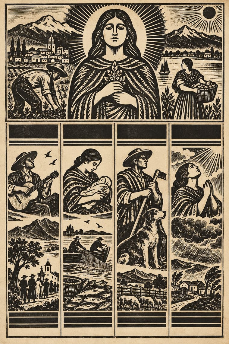
Loose verse sheets printed and sold in Chile's cities from 1866, peaking around 1890 and declining after 1920, though some were still printed into the 1940s. A band of woodcuts of crimes, executions, disasters, prodigies, wars and saints and a block of stacked headlines in mixed display types (sometimes above the cuts, sometimes below) announce the lead stories like a newspaper, and four to eight signed décima poems by one poet fill narrow ruled columns below, in black ink on cheap paper.
Bodoni Moda; Lira Popular used Nineteenth-century condensed and extended wood and metal display types, stacked and centred for the headlines and Modern-face roman for the décimas in narrow columns, with a short title, often in capitals, over each poem
03
The colours
The ground and leading colours come from International Typographic Style, with a counter-accent from Lira Popular. The ink reads on the ground at 4.5:1 or more.
Lira Popular (Chilean Illustrated Verse Broadsheets) International Typographic Style
-
#f2f0e9ground · 36% -
#111111ink · 14% -
#e1251baccent · 18% -
#ddcfa6accent · 14% -
#1f4e9caccent · 10% -
#7a7064accent · 8%
As CSS
:root {
  --ground: #f2f0e9;
  --ink: #111111;
  --accent-1: #e1251b;
  --accent-2: #ddcfa6;
  --accent-3: #1f4e9c;
  --accent-4: #7a7064;
  --font-display: "Inter Tight", sans-serif;
  --font-text: "Bodoni Moda", serif;
}
Use it with care
Lira Popular (Chilean Illustrated Verse Broadsheets): The sheets show the real executions, murders and disasters of named people, and some verse 'a lo divino' is devotional; do not recycle a scaffold or a mutilated body as period gore for effect. Prodigy and scandal sheets ("El niño con dos cabezas", "La niña vestida de hombre i que se casó con otra niña") made a spectacle of real, often poor or gender-nonconforming people; quote them as history, not as freak-show novelty. The images are mostly anonymous, so do not credit a cut to the poet named on the sheet. Popular poetry in décimas, sung a lo divino and a lo humano, is still practised by Chilean cantores and payadores, so work with them, and credit them, rather than imitating their verse.
04
The two styles

05
More combinations
With Lira Popular
- Chilean Unidad Popular & Nueva Canción Graphics Pairs well · Set a flat-colour Unidad Popular poster beside a black woodcut frieze and ruled verse columns for a Chilean design that spans popular print and political modernism.
- Literatura de Cordel Woodcut Pairs well · Brazil's cordel puts one woodcut on a folded booklet cover; combine it with the Chilean single sheet for a series of verse prints that share one set of cuts.
- Mexican Popular Graphics (Posada) Pairs well · A sibling street broadside; borrow Posada's coloured paper and single big cut, or keep the Chilean frieze of cuts over many ruled verse columns.
- Victorian Letterpress & Wood Type Pairs well · Take the jobbing printer's mixed display types for the headline block while keeping the crude cuts and columns of verse.
With International Typographic Style
- Art Nouveau Contrasts · Ornamental curves against an orthogonal grid make a strong deliberate tension.
- Brutalist Web Design Pairs well · Strip the grid to raw HTML defaults to get a rawer, contemporary take on Swiss honesty.
- Psychedelic Poster Contrasts · Its exact opposite on legibility; borrow one swirling element to break a too-cold Swiss layout.
- Japanese Postwar Modernism Pairs well · Add Japanese restraint and emblematic colour fields to the grid for warmth without losing order.
- American Traditional Tattoo Flash Contrasts · Rational grid and sans-serif against sentimental, hand-lettered emblems: one flash motif on a Swiss layout makes a sharp contrast.
- Graffiti & Hip-Hop Graphics Contrasts · Put a single tag or throw-up over a strict Swiss grid to stage the clash between institutional order and a street voice.
- Pop Art Graphics Contrasts · Set one loud appropriated Pop image inside a strict grid with a neutral grotesque so the irony reads as deliberate rather than chaotic.
- Italian Painted Film Poster (Rome Studios) Contrasts · Grid, restraint and photographic objectivity are the opposite of a crowded painted montage.