Style combination · Pairs well
Korean Commercial Calligraphy × Song–Ming Woodblock Book Typography
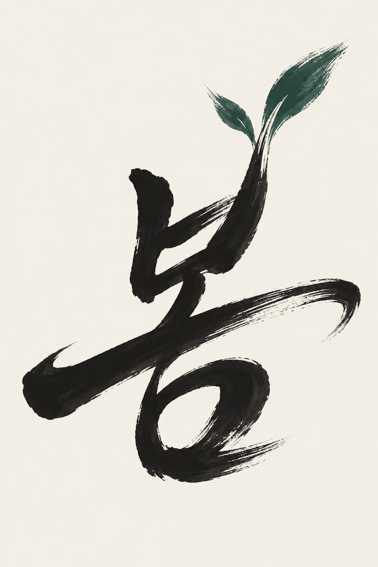
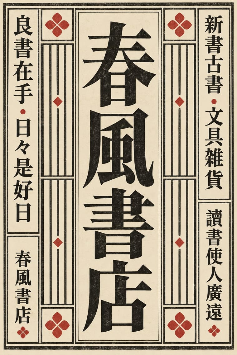
Set a brushed Hangul title over a Myeongjo (Batang) text block, as on Korean book covers and film posters, so the hand-written word carries the feeling and the type carries the reading.
Mix them and make something Korean Commercial Calligraphy Song–Ming Woodblock Book Typography
01
What each style brings
Each part of the design comes from the style with the stronger say in it, and each style gives at least two.
Korean Commercial Calligraphy (Kaelligeurapi) Song–Ming Woodblock Book Typography (Songti / Mincho)
- Type from Korean Commercial Calligraphy
- Colour from Korean Commercial Calligraphy
- Form from Song–Ming Woodblock Book Typography
- Composition from Korean Commercial Calligraphy
- Surface from Song–Ming Woodblock Book Typography
02
The type
Open fonts standing in for each style’s own type, which is often hand-drawn or commercial.
Display · Korean Commercial Calligraphy
Calm
Kaushan Script; Korean Commercial Calligraphy used Gungche (궁체), the palace style of Hangul seoye in regular, semi-cursive and cursive forms, a trained hand some commercial calligraphers start from, though Kang names Chusa's Hanja writing as his model and many brush-pen hobbyists have no seoye training and Panbonche (판본체), modelled on the woodblock Hangul of the Hunminjeongeum, and minche (민체), the less regular folk style
Text · Song–Ming Woodblock Book Typography
The page and letter of the East Asian book. Song block cutters copied the regular script of Tang masters; from the mid-16th century Ming cutters straightened it into a knife-made letter of thin horizontals, thick verticals and triangular stroke ends. Equal square characters run in right-to-left vertical columns in a ruled frame folded at a central column. As metal type in Shanghai and Nagasaki it became Mincho, Myeongjo and the standard CJK text face. Frame, rules and fold column belong to the woodblock page; type keeps the letter, the square and, in Japan and Taiwan, the vertical column.
Shippori Mincho; Song–Ming Woodblock Book Typography used Song block-cut regular script after Ouyang Xun, Yan Zhenqing and Liu Gongquan and Ming-style Songti / Mingti, the straightened 'craftsman's' letter, mature by the Wanli era
03
The colours
The ground and leading colours come from Korean Commercial Calligraphy, with a counter-accent from Song–Ming Woodblock Book Typography. The ink reads on the ground at 4.5:1 or more.
Korean Commercial Calligraphy (Kaelligeurapi) Song–Ming Woodblock Book Typography (Songti / Mincho)
-
#f4f0e6ground · 36% -
#151515ink · 14% -
#b9312baccent · 18% -
#2f5d50accent · 14% -
#d6c49caccent · 10% -
#6e6a64accent · 8%
As CSS
:root {
  --ground: #f4f0e6;
  --ink: #151515;
  --accent-1: #b9312b;
  --accent-2: #2f5d50;
  --accent-3: #d6c49c;
  --accent-4: #6e6a64;
  --font-display: "Kaushan Script", cursive;
  --font-text: "Shippori Mincho", serif;
}
Use it with care
Korean Commercial Calligraphy (Kaelligeurapi): Kaelligeurapi is a living profession with named authors: commission or credit a calligrapher, never trace or imitate a published logotype such as Chamisul's or Hwayo's, which belong to their brands, and never present a generated hand as the work of Kang Byung-in, Kim Jong-gun or another named writer. Have every word written or checked by a fluent Hangul reader, since image models produce pseudo-Hangul with broken or misplaced jamo and Korean buyers spot a misspelt syllable at once. It grew from Korean seoye, a tradition distinct from Chinese shufa and Japanese shodō, so do not label it Chinese or Japanese or swap Hanja or kana in for Hangul, and do not stamp a red seal bearing a real person's name without their consent.
Song–Ming Woodblock Book Typography (Songti / Mincho): Have any Chinese, Japanese or Korean text set and proofread by a fluent reader: Song, Mincho and Myeongjo fonts draw some characters differently for each locale, and pseudo-characters, mirrored glyphs or random hanzi used as texture read as nonsense or worse. Pages of Buddhist sutras and other scripture carry devotional text; do not crop them into decoration.
04
The two styles
05
More combinations
With Korean Commercial Calligraphy
- Out-of-Square Hangul Typography Contrasts · Both free Hangul from the equal square, but Ahn Sang-soo constructs monoline jamo as a reusable typeface while kaelligeurapi writes each word once with the brush; choose between a system and a signature.
- Ma & Wabi-sabi Aesthetics Pairs well · Give one brushed word a wide, quiet field of paper-toned space so its dry streaks and pooled ink read as the whole design.
- Chaekgeori & Minhwa Screen Painting Pairs well · Munjado paints a character full of pictures and commercial calligraphy bends a brushed word into a picture of its meaning; pair them for a Korean identity in which writing and image are the same mark.
- Edo-moji Commercial Lettering (Kanteiryū, Yose-moji, Sumō-ji) Contrasts · Edo-moji packs fat, gapless brush letters into crowded columns for a full house; Korean commercial calligraphy lets one airy, expressive word breathe, so decide between a crowd-pulling block and a personal gesture.
- Newtro (Korean New-Retro) Contrasts · Both meet on Korean soju shelves: newtro redraws a firm's old label lettering and mascot in flat spot colours, while commercial calligraphy writes a new brushed name in black on a pale label.
- Seoul Independent Graphic Design (Small-Studio Scene) Contrasts · Commercial calligraphy writes one warm brushed word for a soju label or a drama title; the small studios construct and systematise Hangul, even when they reinterpret old calligraphic scripts. Decide between a signature and a system.
- Modern Calligraphy and Brush Lettering Contrasts · Both make one hand-written word the whole design, but kaelligeurapi brushes Hangul in black with dry, pooled strokes that picture the word's meaning, while modern calligraphy writes a looping Latin script in soft colour for an occasion.
With Song–Ming Woodblock Book Typography
- Dazibao (Big-Character Posters) Contrasts · The big-character poster is the hand-brushed, crowded, personal opposite of the quiet official printed page; set one against the other to weigh public urgency against canonical calm.
- Urdu Katib Lithography Contrasts · Urdu turned down type to keep the calligrapher's hand while Song–Ming printing depersonalised the brush for the block cutter; choose deliberately between a written page and a cut one.
- Out-of-Square Hangul Typography Contrasts · Ahn Sang-soo's typeface broke exactly the equal square that Myeongjo keeps; run Myeongjo body text under out-of-square headings to stage tradition against experiment.
- Chaekgeori & Minhwa Screen Painting Pairs well · Chaekgeori screens paint stacks of the scholar's books; pair a painted bookcase grid with real ruled, framed Myeongjo text pages for a Korean scholarly identity.
- Japanese Postwar Modernism Pairs well · The postwar school set Mincho beside gothic and Latin sans; use a vertical Mincho column beside a flat colour field to give a modern grid a literary voice.
- Renaissance Book Typography Pairs well · Its Western counterpart: both fix one justified text block in a proportioned page with deep margins, so set a Ming face and a Garalde side by side in a bilingual book and let each keep its own grid.
- Ten Bamboo Studio Colour Woodblock (Douban & Gonghua) Pairs well · The same Nanjing book trade cut both: put a ruled Song-style text page opposite a graded colour leaf, as an album or a book with plates.
- Republican Chinese Book Cover Design (Lu Xun & Tao Yuanqing) Contrasts · The ruled woodblock page and Songti type that the new covers left behind; set a Song-type text block against a drawn, off-centre cover title to show old book and new.
All 18 combinations with Song–Ming Woodblock Book Typography