Style combination · Pairs well
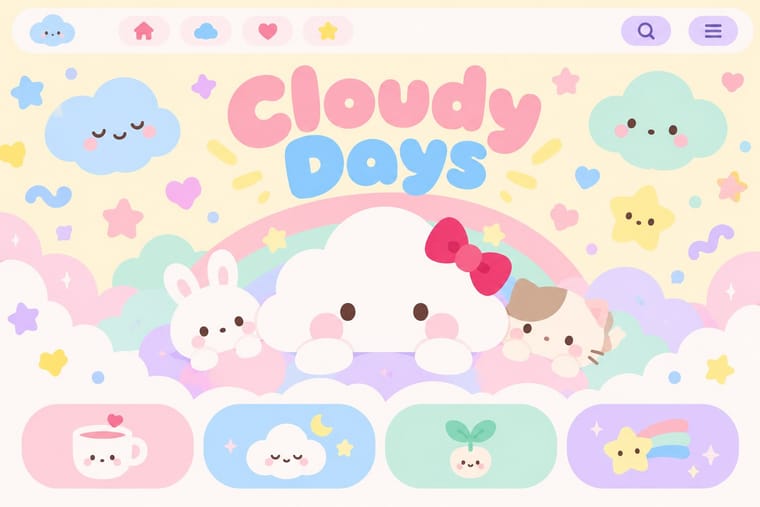
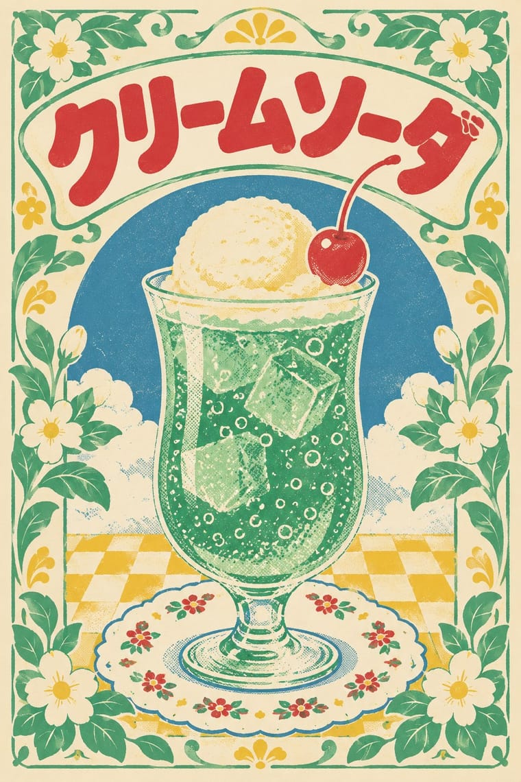
Kawaii Design × Showa and Heisei Retro Revival
Its rounded mascots and pastel softness supply the friendly figure at the centre of a retro wrapper.
Mix them and make something Kawaii Design Showa and Heisei Retro Revival
01
What each style brings
Each part of the design comes from the style with the stronger say in it, and each style gives at least two.
Kawaii Design Showa and Heisei Retro Revival (Japanese Packaging and Kissaten Graphics)
- Type from Kawaii Design
- Colour from Showa and Heisei Retro Revival
- Form from Kawaii Design
- Composition from Kawaii Design
- Surface from Showa and Heisei Retro Revival
02
The type
Open fonts standing in for each style’s own type, which is often hand-drawn or commercial.
Display · Kawaii Design
Wow
Zen Maru Gothic, standing in for Maru-ji (rounded teenage handwriting, 1970s)
Text · Kawaii Design
Japan's culture of cuteness, which grew from 1970s teenage rounded handwriting and shōjo fancy goods into a global design language through Sanrio, character merchandise and emoji. Its decisions are simple and consistent: rounded forms, oversized heads and minimal faces, pastel or candy colour in flat fields, scattered hearts and sparkles, and friendly rounded type.
Zen Maru Gothic; Kawaii Design used Maru-ji and Maru Gothic rounded type
03
The colours
The ground and leading colours come from Showa and Heisei Retro Revival, with a counter-accent from Kawaii Design. The ink reads on the ground at 4.5:1 or more.
Kawaii Design Showa and Heisei Retro Revival (Japanese Packaging and Kissaten Graphics)
-
#f4ead2ground · 36% -
#3a2a22ink · 14% -
#f2c340accent · 18% -
#e60033accent · 14% -
#d6323aaccent · 10% -
#a8d8ffaccent · 8%
As CSS
:root {
  --ground: #f4ead2;
  --ink: #3a2a22;
  --accent-1: #f2c340;
  --accent-2: #e60033;
  --accent-3: #d6323a;
  --accent-4: #a8d8ff;
  --font-display: "Zen Maru Gothic", sans-serif;
  --font-text: "Zen Maru Gothic", sans-serif;
}
04
The two styles
05
More combinations
With Kawaii Design
- Techno-Futurist Graphics Pairs well · A cute mascot inside a dense techno-corporate layout softens its satire; Groovisions' Chappie is the model.
- Grunge Typography Contrasts · Grunge's dirt and illegibility is kawaii's opposite; one cute character on a distressed texture creates knowing dissonance.
- Memphis Design Pairs well · Kawaii characters sit happily on Memphis pastel geometry; combine them for playful packaging with a little more edge.
- Dark Tech Minimalism Contrasts · Use a single pastel mascot or emoji moment to humanise a cold, dark interface without changing its structure.
- Claymorphism & Soft 3D Pairs well · Kawaii's oversized heads, minimal faces and scattered sparkles translate directly into clay volumes; use its character rules for mascots and emoji so the 3D figures stay simple and readable at small sizes.
- Moomin Graphics (Tove Jansson's Pen-Drawn World and its Licensed Afterlife) Contrasts · Its round, white characters sit near kawaii fancy goods, but they keep a hatched, melancholy world around them that kawaii fancy goods leave out.
- Superflat Contrasts · Kawaii offers sincere, simple, pastel cuteness for fancy goods; switch to Superflat when the cute should be saturated, crowded, many-eyed and ironic, a comment on consumer culture rather than a product of it.
- VTuber Avatar and Stream Graphics Contrasts · Its parent in cute character culture, but kawaii fixes a static mascot on pastel goods and print; switch to VTuber graphics when the character has to move, talk and answer a live chat, with a performer's voice and a whole stream screen around it.
With Showa and Heisei Retro Revival
- Newtro (Korean New-Retro) Contrasts · Both revive old everyday graphics, but newtro is Korean heritage-brand reissue with badge-led logic, while this is Japanese katakana-led kissaten and dagashi graphics in pastel spot colour.
- Japanese Postwar Modernism Contrasts · Its restrained emblem-and-grid discipline opposes the cluttered, warm vernacular of retro packaging.
- City Pop Illustration Pairs well · Shares 1980s nostalgia; pair its painted, airy scenes with retro tableware graphics for a fuller period feel.