Style combination · Contrasts
Japanese Postwar Modernism × Showa and Heisei Retro Revival
Its restrained emblem-and-grid discipline opposes the cluttered, warm vernacular of retro packaging.
Mix them and make something Japanese Postwar Modernism Showa and Heisei Retro Revival
01
What each style brings
Each part of the design comes from the style with the stronger say in it, and each style gives at least two.
Japanese Postwar Modernism Showa and Heisei Retro Revival (Japanese Packaging and Kissaten Graphics)
- Type from Showa and Heisei Retro Revival
- Colour from Japanese Postwar Modernism
- Form from Japanese Postwar Modernism
- Composition from Japanese Postwar Modernism
- Surface from Showa and Heisei Retro Revival
02
The type
Open fonts standing in for each style’s own type, which is often hand-drawn or commercial.
Display · Showa and Heisei Retro Revival
Memory
Zen Maru Gothic, standing in for Maru gothic (rounded gothic) display
Text · Japanese Postwar Modernism
Building on the New Typography that Hiromu Hara and the Nippon Kobo circle had absorbed in the 1930s, Japan's postwar graphic designers fused the grid, sans-serif and objective photography of European modernism with indigenous traditions of family crests (kamon), asymmetry and charged emptiness (ma). From the Graphic '55 exhibition and the Nippon Design Center to Yusaku Kamekura's Tokyo 1964 Olympic posters, it produced bold emblematic symbols, luminous flat colour fields and photography of startling precision.
Zen Kaku Gothic New; Japanese Postwar Modernism used Gothic and Mincho
03
The colours
The ground and leading colours come from Japanese Postwar Modernism, with a counter-accent from Showa and Heisei Retro Revival. The ink reads on the ground at 4.5:1 or more.
Japanese Postwar Modernism Showa and Heisei Retro Revival (Japanese Packaging and Kissaten Graphics)
-
#f4f1eaground · 36% -
#111111ink · 14% -
#d7261eaccent · 18% -
#f2c340accent · 14% -
#c8a24aaccent · 10% -
#1d3c78accent · 8%
As CSS
:root {
  --ground: #f4f1ea;
  --ink: #111111;
  --accent-1: #d7261e;
  --accent-2: #f2c340;
  --accent-3: #c8a24a;
  --accent-4: #1d3c78;
  --font-display: "Zen Maru Gothic", sans-serif;
  --font-text: "Zen Kaku Gothic New", sans-serif;
}
04
The two styles
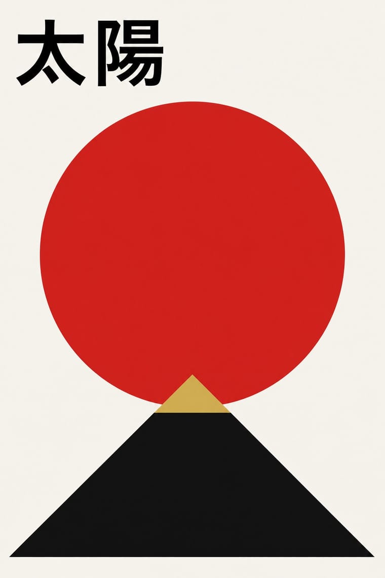
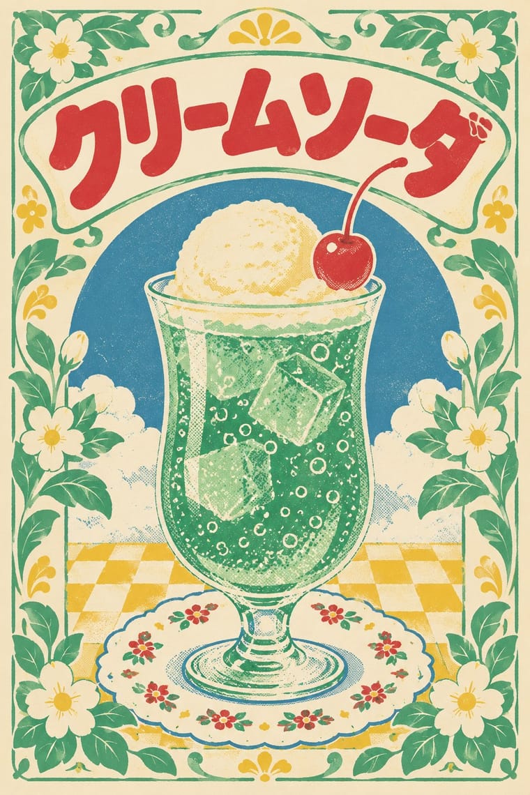
05
More combinations
With Japanese Postwar Modernism
- Angura Theatre Poster Contrasts · Tadanori Yokoo's angura theatre posters broke with this school; set one beside a Kamekura poster to calibrate restraint against overload.
- Kawaii Design Contrasts · Kawaii shows the soft, crowded face of Japanese visual culture; use the contrast to tune a brand between gravitas and charm.
- Minimalist Graphic Design Pairs well · Muji-era minimalism grew from this school; enlarge the empty field further and reduce the emblem to a whisper.
- International Typographic Style Pairs well · Graft a single emblematic disc or crest onto a Swiss grid to add focus and warmth without breaking its order.
- Hong Kong East–West Graphic Modernism Pairs well · Take its single emblem on an empty field, then add a bilingual Chinese–English lockup and one ink stroke to move the poster from Tokyo to Hong Kong.
- Finnish Bold Print (Marimekko Modernism) Pairs well · Japanese postwar emblematic colour fields share the reduction of nature to a few flat silhouettes, and two of Marimekko's leading designers, Katsuji Wakisaka and Fujiwo Ishimoto, came from Japan; pair one Japanese-style emblem with a Marimekko-scale repeat for a calm, nature-led identity.
- Yuru-chara (Japanese Local Mascot Design) Contrasts · Postwar Japanese identities give institutions abstract, grid-built marks; a yuru-chara gives a prefecture a face, a name and a body that walks into festivals and shakes hands.
- Taishō Roman & Lyrical Illustration Contrasts · Postwar modernism replaced this sentimental figure with emblems and empty fields; set one against the other to calibrate warmth against austerity.
With Showa and Heisei Retro Revival
- Newtro (Korean New-Retro) Contrasts · Both revive old everyday graphics, but newtro is Korean heritage-brand reissue with badge-led logic, while this is Japanese katakana-led kissaten and dagashi graphics in pastel spot colour.
- City Pop Illustration Pairs well · Shares 1980s nostalgia; pair its painted, airy scenes with retro tableware graphics for a fuller period feel.
- Kawaii Design Pairs well · Its rounded mascots and pastel softness supply the friendly figure at the centre of a retro wrapper.