Style combination · Contrasts
Kamon × Thai Yantra Diagrams
Both are one-colour, symmetrical signs on cloth governed by inherited rules, but a mon is a wordless emblem of a family, varied in small codified ways and read at a glance, while a yantra is built from sacred script and read by initiates.
01
What each style brings
Each part of the design comes from the style with the stronger say in it, and each style gives at least two.
Kamon (Japanese Family Crests) Thai Yantra (Yant) Diagrams
- Type from Thai Yantra Diagrams
- Colour from Kamon
- Form from Kamon
- Composition from Kamon
- Surface from Thai Yantra Diagrams
02
The type
Open fonts standing in for each style’s own type, which is often hand-drawn or commercial.
Display · Thai Yantra Diagrams
Public
Yatra One; Thai Yantra Diagrams used Khom Thai (akson khom), the Khmer-derived script used for Pali formulae and heart syllables and Mul (round) Khmer script in Cambodian-lineage yantras, distinguishable from Khom only by small variants
Text · Kamon
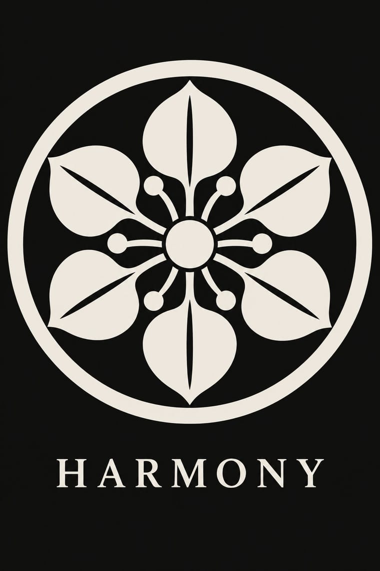
Japan's family crests: small one-colour emblems that reduce a plant, animal, tool or pattern to a flat silhouette, mirrored or repeated around a centre, often ringed and drawn with compass and brush. Begun on Heian court carriages and spread to samurai and all of society, mon are usually inherited, granted or freely chosen rather than designed, varied in small codified ways for branch families, and placed in fixed positions on formal kimono, shop curtains, lacquer and banners. Covers the formal crest (jōmon), not the decorative coloured kaga-mon or pictorial date-mon and share-mon.
Shippori Mincho; Kamon used Kago-moji, the thick, squared Edo lettering often reversed out in white, for names set beside a crest and Brush-written kaisho (regular-script) kanji for shop names and family names on curtains and lanterns
03
The colours
The ground and leading colours come from Kamon, with a counter-accent from Thai Yantra Diagrams. The ink reads on the ground at 4.5:1 or more.
Kamon (Japanese Family Crests) Thai Yantra (Yant) Diagrams
-
#f3efe6ground · 36% -
#121212ink · 14% -
#b38f3daccent · 18% -
#d9b44aaccent · 14% -
#8c2d25accent · 10% -
#1d2b47accent · 8%
As CSS
:root {
  --ground: #f3efe6;
  --ink: #121212;
  --accent-1: #b38f3d;
  --accent-2: #d9b44a;
  --accent-3: #8c2d25;
  --accent-4: #1d2b47;
  --font-display: "Yatra One", cursive;
  --font-text: "Shippori Mincho", serif;
}
Use it with care
Kamon (Japanese Family Crests): Mon are inherited marks of particular families, shrines, temples and institutions. Only the imperial chrysanthemum is named in Japanese law: the Trademark Act (art. 4(1)(i)) bars registering it or anything like it. The government's paulownia, though the official emblem of the Prime Minister and Cabinet, was never given the same legal restrictions, while famous crests registered as trademarks, such as Mitsubishi's three diamonds, are protected as marks. Do not use the chrysanthemum, the government paulownia, or any identifiable family's, shrine's or temple's crest as decoration or as a brand. Imperial emblems can also recall Japan's wartime empire for audiences in Korea and China. The manji (卍), a standard crest (the Hachisuka clan; the temple crest of Sensō-ji), is read in the West as the Nazi swastika: avoid it outside a Japanese context that explains it. Draw new crests by the tradition's rules instead of borrowing real ones, and commission or credit working monsho uwaeshi, who still draw and paint crests by hand.
Thai Yantra (Yant) Diagrams: Yantras are consecrated Buddhist and Brahmanic protective diagrams in living use: their Khom formulae are incantations, sak yant are given by monks and ajarn within master–disciple lineages under precepts the wearer must keep, and pha yant are blessed objects hung high over doors. Do not use real or imitation yantras, Khom letters or Buddha images as texture, logos, fashion prints or tattoos without a master, do not place them low (on floors, footwear, seats) or crop and mirror them, do not invent pseudo-Khom, and work with Thai practitioners and readers of Khom rather than tracing designs from temples or tattoo photographs. Image models cannot write Khom and will invent letters: in generated images leave the cells blank or set legible secular Thai, and never present the result as a real or working yantra.
04
The two styles
05
More combinations
With Kamon
- Ukiyo-e Woodblock Prints Pairs well · Kabuki actors had their own mon, and actor prints show them on the costume, as on the sleeve of Ichikawa Yaozō III in a print of 1796; pair a flat crest with ukiyo-e figures to identify characters without captions.
- Islamic Geometric & Calligraphic Tradition Contrasts · Both are built with compass and straight edge, but girih tiles the whole surface without end while a mon closes one motif inside a ring; borrow the tessellation for a ground and the crest for the single sign on it.
- Corporate Identity Modernism Pairs well · A mon already behaves like a corporate mark (one colour, scalable, placed in fixed positions), as Mitsubishi's three diamonds show; use crest construction rules to build a logo family with codified variants for subsidiaries.
- Ma & Wabi-sabi Aesthetics Contrasts · Both set a single sign in emptiness, but wabi-sabi wants it off-centre, irregular and brush-marked while a mon is exact, symmetric and compass-drawn; set a crest's geometry against wabi-sabi's rough, quiet grounds when packaging or interiors need that tension.
- Japanese Postwar Modernism Pairs well · Postwar Japanese designers drew on kamon for their single emblematic symbols; pair a compass-drawn crest with a grotesque or Gothic caption on an empty field for an identity that is plainly modern but rooted.
- Northwest Coast Formline Design Contrasts · Both are hereditary crest systems, but formline fills a red-and-black field with split, swelling creatures while a mon is a tiny symmetric silhouette in emptiness; compare them to decide between abundance and reduction.
- Japonisme Pairs well · Through Japonisme, mon fed late-19th-century Western pattern design, Louis Vuitton's monogram among them; borrow a crest's compass-built flat silhouette for a Western repeat or monogram, drawn new rather than copied from a real family.
- European Heraldry Contrasts · Both mark kinship with hereditary emblems varied in small codified ways, but a mon is a one-colour silhouette drawn round a centre, while a coat of arms is a shield of contrasting tinctures read by the rule of tincture.
With Thai Yantra Diagrams
- Ethiopian Ge'ez Manuscript & Haräg Illumination Pairs well · Ethiopian talismanic scrolls are the closest counterpart: protective scripts, frames and guardian figures made by clergy for a named owner; compare how each turns a sacred script into a frame.
- Adinkra & Kente Symbol Systems Pairs well · Both are symbol systems printed on cloth whose meaning is read through convention; set them side by side to study how coded signs travel between cloth, body and building.
- Islamic Geometric & Calligraphic Tradition Contrasts · Both make sacred script structural, but Islamic pattern repeats edge to edge without end while a yantra closes in on one centre, often inside nested text borders.
- Isotype Pictorial Statistics Contrasts · Both are diagrams built from rules: Isotype makes meaning legible to everyone, a yantra encodes it for initiates; the opposition is useful for thinking about who a diagram is for.
- Roman-like Thai Typography (modern loopless Thai) Contrasts · Yantras keep hand-drawn Khom letters in sacred, protective diagrams; loopless Thai is secular, standardised and commercial, so never use a yantra as a decorative foil for it.
- Baybayin Revival Graphics Contrasts · Both put a Southeast Asian script on skin and cloth, but a yantra packs sacred formulae into a consecrated diagram, while a baybayin tattoo or shirt carries a word of identity rather than a consecrated formula; never borrow yantra structure or Khom letters for a baybayin design.
- Tibetan Woodblock Print Culture (Pecha & Prayer Flags) Pairs well · Both are consecrated Buddhist signs printed in one ink on paper and cloth and hung up for protection and fortune. The yantra's grid of cells and the flag's field of mantras round a central figure share a logic, so they suit a calm, devotional layout of text-as-pattern, made only with practitioners.