Style combination · Contrasts
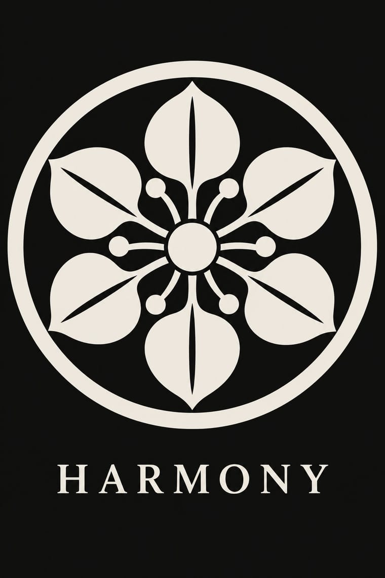
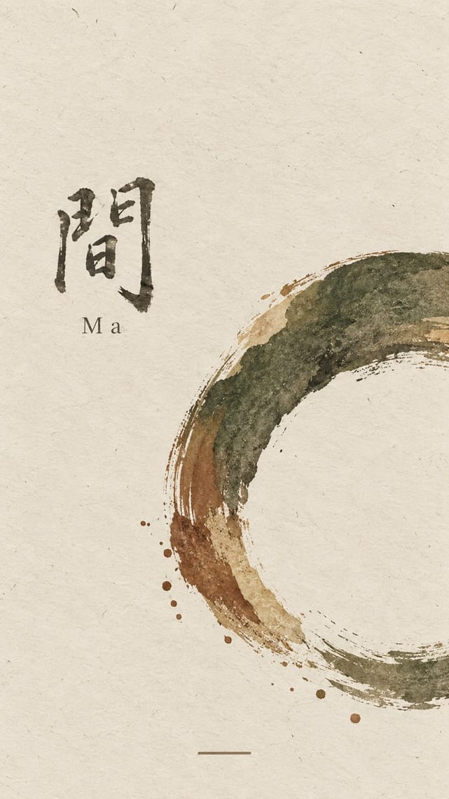
Kamon × Ma
Both set a single sign in emptiness, but wabi-sabi wants it off-centre, irregular and brush-marked while a mon is exact, symmetric and compass-drawn; set a crest's geometry against wabi-sabi's rough, quiet grounds when packaging or interiors need that tension.
01
What each style brings
Each part of the design comes from the style with the stronger say in it, and each style gives at least two.
Kamon (Japanese Family Crests) Ma & Wabi-sabi Aesthetics
- Type from Ma
- Colour from Kamon
- Form from Kamon
- Composition from Kamon
-
Ma avoids central symmetry: this is where the two pull against each other, which is the point of the contrast.
- Surface from Ma
-
Kamon avoids painterly brushwork: this is where the two pull against each other, which is the point of the contrast.
02
The type
Open fonts standing in for each style’s own type, which is often hand-drawn or commercial.
Text · Ma
A Japanese aesthetic rooted in Zen and the wabi tea ceremony that prizes austerity, imperfection, impermanence and the charged interval (ma) between things. In graphic design it appears as vast empty grounds, a single off-centre element, muted natural colours, visible material texture and the unrepeatable brush mark, from ink painting to Muji's 'emptiness'.
Shippori Mincho; Ma used Bokuseki and Sōsho cursive kana and kanji
03
The colours
The ground and leading colours come from Kamon, with a counter-accent from Ma. The ink reads on the ground at 4.5:1 or more.
Kamon (Japanese Family Crests) Ma & Wabi-sabi Aesthetics
-
#f3efe6ground · 36% -
#121212ink · 14% -
#b38f3daccent · 18% -
#7d4e3aaccent · 14% -
#b9a88aaccent · 10% -
#1d2b47accent · 8%
As CSS
:root {
  --ground: #f3efe6;
  --ink: #121212;
  --accent-1: #b38f3d;
  --accent-2: #7d4e3a;
  --accent-3: #b9a88a;
  --accent-4: #1d2b47;
  --font-display: "Shippori Mincho", serif;
  --font-text: "Shippori Mincho", serif;
}
Use it with care
Kamon (Japanese Family Crests): Mon are inherited marks of particular families, shrines, temples and institutions. Only the imperial chrysanthemum is named in Japanese law: the Trademark Act (art. 4(1)(i)) bars registering it or anything like it. The government's paulownia, though the official emblem of the Prime Minister and Cabinet, was never given the same legal restrictions, while famous crests registered as trademarks, such as Mitsubishi's three diamonds, are protected as marks. Do not use the chrysanthemum, the government paulownia, or any identifiable family's, shrine's or temple's crest as decoration or as a brand. Imperial emblems can also recall Japan's wartime empire for audiences in Korea and China. The manji (卍), a standard crest (the Hachisuka clan; the temple crest of Sensō-ji), is read in the West as the Nazi swastika: avoid it outside a Japanese context that explains it. Draw new crests by the tradition's rules instead of borrowing real ones, and commission or credit working monsho uwaeshi, who still draw and paint crests by hand.
04
The two styles
05
More combinations
With Kamon
- Ukiyo-e Woodblock Prints Pairs well · Kabuki actors had their own mon, and actor prints show them on the costume, as on the sleeve of Ichikawa Yaozō III in a print of 1796; pair a flat crest with ukiyo-e figures to identify characters without captions.
- Islamic Geometric & Calligraphic Tradition Contrasts · Both are built with compass and straight edge, but girih tiles the whole surface without end while a mon closes one motif inside a ring; borrow the tessellation for a ground and the crest for the single sign on it.
- Corporate Identity Modernism Pairs well · A mon already behaves like a corporate mark (one colour, scalable, placed in fixed positions), as Mitsubishi's three diamonds show; use crest construction rules to build a logo family with codified variants for subsidiaries.
- Japanese Postwar Modernism Pairs well · Postwar Japanese designers drew on kamon for their single emblematic symbols; pair a compass-drawn crest with a grotesque or Gothic caption on an empty field for an identity that is plainly modern but rooted.
- Northwest Coast Formline Design Contrasts · Both are hereditary crest systems, but formline fills a red-and-black field with split, swelling creatures while a mon is a tiny symmetric silhouette in emptiness; compare them to decide between abundance and reduction.
- Japonisme Pairs well · Through Japonisme, mon fed late-19th-century Western pattern design, Louis Vuitton's monogram among them; borrow a crest's compass-built flat silhouette for a Western repeat or monogram, drawn new rather than copied from a real family.
- European Heraldry Contrasts · Both mark kinship with hereditary emblems varied in small codified ways, but a mon is a one-colour silhouette drawn round a centre, while a coat of arms is a shield of contrasting tinctures read by the rule of tincture.
- Adinkra & Kente Symbol Systems Pairs well · Both are vocabularies of named symbols with fixed meanings; set the two side by side to show how one culture stamps meaning in repeat while the other places a single crest, crediting the makers of each.
With Ma
- Minimalist Graphic Design Pairs well · Add one rough material or brush mark to a minimalist layout so its emptiness feels lived-in rather than sterile.
- Japanese Postwar Modernism Pairs well · Use a modernist grid but leave whole modules empty, the way Tanaka and Hara let ma structure the page.
- Memphis Design Contrasts · Memphis is loud, synthetic and glossy; set one Memphis squiggle on a vast wabi ground only if you want deliberate friction.
- Scandinavian Functionalism Pairs well · Both prize natural materials and restraint; combine Nordic clarity with wabi irregularity for warm, quiet identities.
- Uli & Nsibidi Line and Sign Tradition Pairs well · Both make the empty interval carry meaning and place a few elements off-centre in earth colours; uli supplies a living line and named signs where wabi-sabi supplies texture and a single mark.
- Slow-Living Editorial (the Kinfolk Look) Pairs well · Leonard Koren, author of the 1994 book on wabi-sabi for designers, joined Kinfolk's editorial board in 2016; add a cracked bowl, raw linen or an off-centre object on a bare ground to make the calm less styled and more lived-in.
- Korean Commercial Calligraphy (Kaelligeurapi) Pairs well · Give one brushed word a wide, quiet field of paper-toned space so its dry streaks and pooled ink read as the whole design.
- Rinpa & Saga-bon Contrasts · Both come from Kyoto's tea culture (Kōetsu also made Raku tea bowls), but wabi-sabi wants rough clay and empty paper where Rinpa wants gold leaf and malachite; one bare field can serve either, so choose the material that fills it.