Style combination · Pairs well
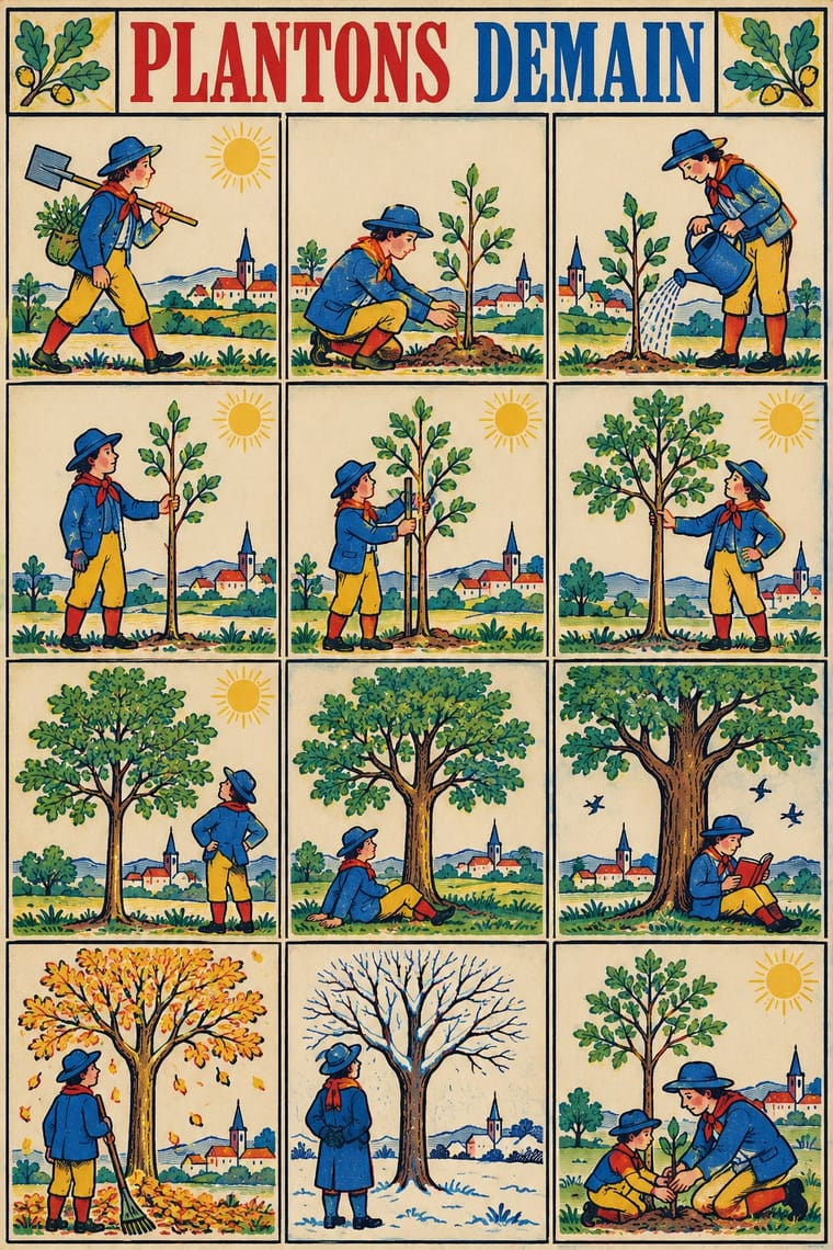
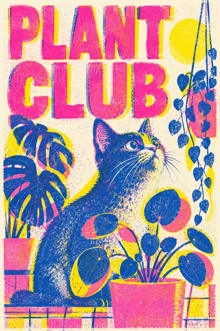
Imagerie d'Épinal × Risograph
Riso's few flat inks and drifting registration reproduce the stencil float of an Épinal sheet; print rows of repeated figures in red, blue and yellow over a black key for a contemporary imagerie.
01
What each style brings
Each part of the design comes from the style with the stronger say in it, and each style gives at least two.
Imagerie d'Épinal & European Bilderbogen Risograph & Indie Print Culture
- Colour from Risograph
- Form from Imagerie d'Épinal
- Composition from Imagerie d'Épinal
- Surface from Risograph
02
The type
Open fonts standing in for each style’s own type, which is often hand-drawn or commercial.
Display · Imagerie d'Épinal
Square
Bodoni Moda, standing in for Bold modern-face (Didone) roman capitals for the centred title, sometimes shaded or outlined ('BATAILLE D'IÉNA.', 'ARMÉE FRANÇAISE, CHASSEURS A PIED.')
Text · Risograph
A contemporary culture of zines, art books, posters and prints made on Japanese Risograph stencil duplicators, whose soy-based spot inks (fluorescent pink, yellow, blue, teal) are laid down one drum at a time. Designers embrace the machine's limits: translucent overprints, slight misregistration, grainy coverage and coarse halftones give flat illustration and type a warm, handmade vibrancy at low cost.
Inter; Risograph used Neo-grotesques set large and Monospace and typewriter faces
03
The colours
The ground and leading colours come from Risograph, with a counter-accent from Imagerie d'Épinal. The ink reads on the ground at 4.5:1 or more.
Imagerie d'Épinal & European Bilderbogen Risograph & Indie Print Culture
-
#f4f1eaground · 36% -
#3255a4ink · 14% -
#ff48b0accent · 18% -
#e4bb3aaccent · 14% -
#f15060accent · 10% -
#b8283aaccent · 8%
As CSS
:root {
  --ground: #f4f1ea;
  --ink: #3255a4;
  --accent-1: #ff48b0;
  --accent-2: #e4bb3a;
  --accent-3: #f15060;
  --accent-4: #b8283a;
  --font-display: "Bodoni Moda", serif;
  --font-text: "Inter", sans-serif;
}
Use it with care
Imagerie d'Épinal & European Bilderbogen: Many sheets carry nationalist, militarist and colonial messages, from the Napoleonic legend to colonial campaigns such as the Tonkin war, and some show colonised peoples as 'savages' (the Kühn Robinson sheet captions 'die Wilden' slaughtering captives at a feast), so do not reproduce these figures as period charm; the Imagerie d'Épinal still trades under its name, so draw new sheets rather than copying its marks.
04
The two styles
05
More combinations
With Imagerie d'Épinal
- Lubok Popular Print Contrasts · Both are pedlars' broadsheets coloured by hand, but the lubok crams verse into the gaps around its figures and brushes washes on freely, while the Épinal sheet keeps its text beneath a ruled frame and stencils colour across rows of repeated figures; choose the lubok for jostling satire and Épinal for an orderly catalogue or story.
- Mexican Popular Graphics (Posada) Pairs well · Posada's hojas volantes are another pedlar broadsheet with a crude relief picture over a block of text; add Épinal's stencil colour to a black relief broadsheet for a hand-coloured street print.
- Isotype Pictorial Statistics Pairs well · Both line up identical figures in rows, Épinal to be cut out as toy soldiers and Isotype to count; borrow Isotype's rule that one figure stands for a quantity to turn a sheet of soldiers into a readable chart.
- Ligne Claire (Franco-Belgian Clear Line) Pairs well · Both read as captioned grids of drawn cases with clear contour and flat colour; give a clear-line strip Épinal's stencil drift, roman-capital title and caption under every case for a 19th-century picture-story feel.
- Victorian Letterpress & Wood Type Contrasts · The same century's printers, but jobbing letterpress leads with mixed display type in one or two inks, while the Épinal sheet leads with a stencil-coloured picture and keeps type to a title and a caption block; set them side by side to choose between a notice and a picture.
- Emblem Book (Motto, Picture & Epigram) Contrasts · Both centre a framed picture over a block of text, but the Épinal sheet tells a popular story in stencil colour for a broad public, while the emblem is a learned monochrome riddle, one to a page, read slowly in sequence.
- Tarot de Marseille Woodcut Cards Contrasts · Both stencil-colour a black woodcut key in a few drifting colours, but the Épinal sheet tells a story in grids of captioned cases and marches rows of soldiers, while the tarot card isolates one emblematic subject under a numeral and a title; choose tarot for a single symbol, Épinal for a sequence.
- Lotería Card Imagery (Mexican Lotería) Contrasts · Both are cheap coloured popular prints of stock figures in ruled frames under capital captions, but an Épinal sheet tells a story or musters a row of soldiers across many cases, while a lotería card holds one emblem and the tabla's cells have no order: the caller draws them by chance.
With Risograph
- Corporate Identity Modernism Contrasts · Exact Pantone-matched corporate colour is the opposite of riso's drifting inks; use the contrast to signal independence.
- Neo-Swiss Revival Pairs well · Print neo-Swiss grids in two fluorescent riso inks to soften their rigour with grain and overprint.
- Y2K Futurism Contrasts · Glossy chrome renders are everything a riso cannot print; set frictionless screen gloss against tactile grain for deliberate friction.
- WPA Silkscreen Posters Pairs well · WPA silkscreen's flat, separated colour translates directly to riso drums; borrow its layered spot-colour scenes.
- Literatura de Cordel Woodcut Pairs well · Print a cordel-style woodcut on a riso in one ink on tinted stock to keep the pocket-chapbook economy for zines and poetry pamphlets.
- Cubist Pictorial Space Pairs well · Print synthetic-Cubist planes as overlapping flat riso inks so the overprints do the faceting for you.
- Leningrad Avant-Garde Picture Book Pairs well · Today's riso picture books share the few flat inks, bare paper and speckled texture; print a Lebedev-style sequence of floating figures in two or three riso inks.
- Die Neue Typographie Pairs well · Two-colour riso printing suits its black-plus-red restraint for low-budget editorial and posters.