Style combination · Pairs well
Imagerie d'Épinal × Ligne Claire
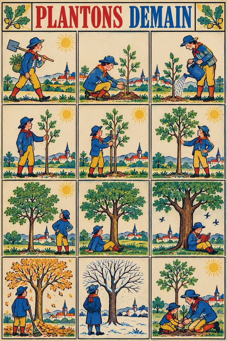
Both read as captioned grids of drawn cases with clear contour and flat colour; give a clear-line strip Épinal's stencil drift, roman-capital title and caption under every case for a 19th-century picture-story feel.
01
What each style brings
Each part of the design comes from the style with the stronger say in it, and each style gives at least two.
Imagerie d'Épinal & European Bilderbogen Ligne Claire (Franco-Belgian Clear Line)
- Type from Ligne Claire
- Colour from Ligne Claire
- Form from Imagerie d'Épinal
- Composition from Imagerie d'Épinal
- Surface from Imagerie d'Épinal
-
Ligne Claire avoids misregistration & overprint and carved line: this is where the two pull against each other.
02
The type
Open fonts standing in for each style’s own type, which is often hand-drawn or commercial.
Display · Ligne Claire
Wow
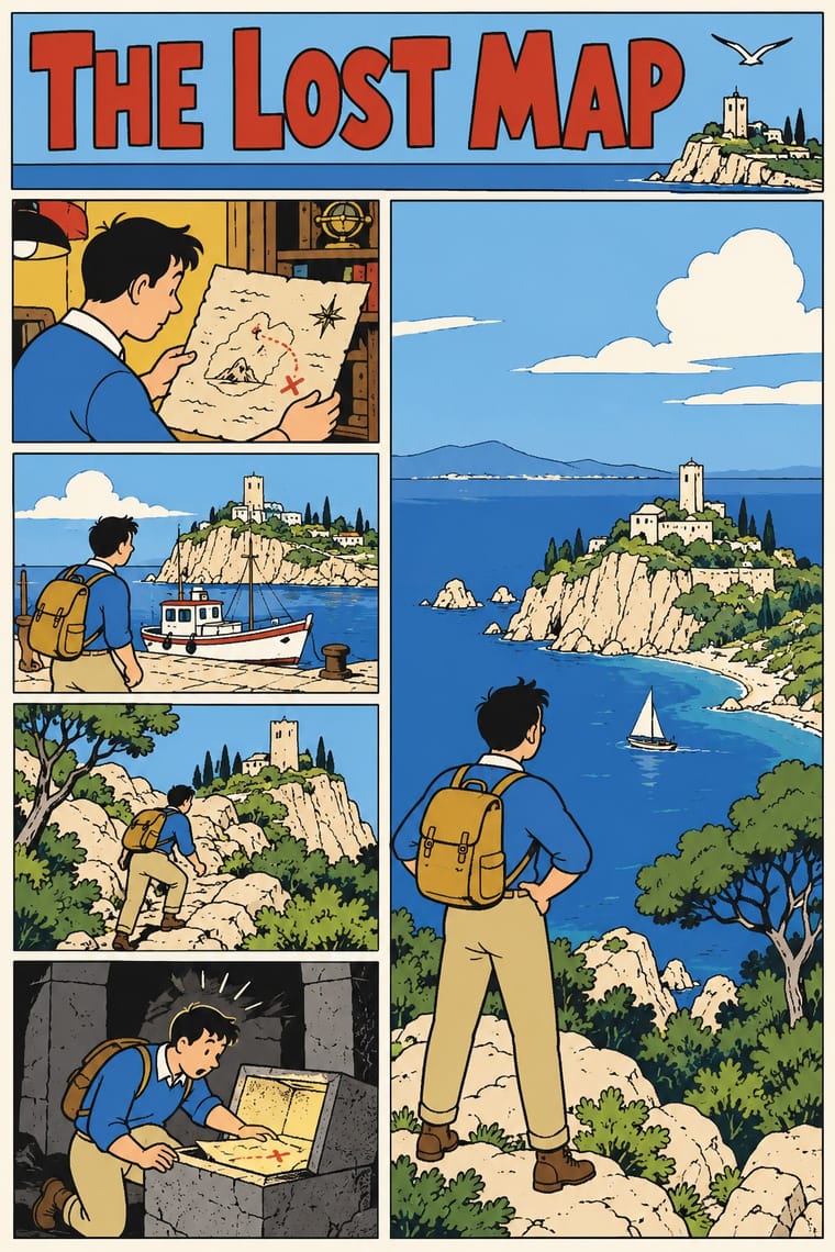
Londrina Solid, standing in for Bold hand-drawn capitals for titles (album titles under a small header naming the author and series: black on a coloured ground, THE BLUE LOTUS on red; yellow on a night sky, EXPLORERS ON THE MOON)
Text · Imagerie d'Épinal
Cheap single-sheet popular prints sold by pedlars across 19th-century Europe, led by the Pellerin imagerie at Épinal and the Neuruppin Bilderbogen. A black woodcut, and later a lithograph, was coloured by hand through stencils in a few flat colours that drift past the outlines: Napoleonic battles, saints, rows of soldiers to cut out, and stories told in grids of equal captioned cases, under a title in roman capitals, or Fraktur in Germany.
Bodoni Moda; Imagerie d'Épinal used Bold modern-face (Didone) roman capitals for the centred title, sometimes shaded or outlined and Small roman text in a justified block beneath the picture, with the imprint ('De la fabrique de Pellerin, imprimeur-libraire, à Épinal') in capitals and 'Propriété de l'Éditeur. Déposé.' in italic
03
The colours
The ground and leading colours come from Ligne Claire, with a counter-accent from Imagerie d'Épinal. The ink reads on the ground at 4.5:1 or more.
Imagerie d'Épinal & European Bilderbogen Ligne Claire (Franco-Belgian Clear Line)
-
#fbf6e9ground · 36% -
#1a1a1aink · 14% -
#f0b73aaccent · 18% -
#d8352aaccent · 14% -
#3b6fb6accent · 10% -
#9cc3e0accent · 8%
As CSS
:root {
  --ground: #fbf6e9;
  --ink: #1a1a1a;
  --accent-1: #f0b73a;
  --accent-2: #d8352a;
  --accent-3: #3b6fb6;
  --accent-4: #9cc3e0;
  --font-display: "Londrina Solid", cursive;
  --font-text: "Bodoni Moda", serif;
}
Use it with care
Imagerie d'Épinal & European Bilderbogen: Many sheets carry nationalist, militarist and colonial messages, from the Napoleonic legend to colonial campaigns such as the Tonkin war, and some show colonised peoples as 'savages' (the Kühn Robinson sheet captions 'die Wilden' slaughtering captives at a feast), so do not reproduce these figures as period charm; the Imagerie d'Épinal still trades under its name, so draw new sheets rather than copying its marks.
Ligne Claire (Franco-Belgian Clear Line): Tintin and his companions and Blake and Mortimer are copyrighted characters whose rights are actively enforced (Hergé's by Tintinimaginatio, called Moulinsart until 2022), and Swarte, Floc'h and Meulen are working artists: draw your own characters, settings and lettering in the shared idiom, never ask an image model for these artists or characters by name, and never present a generated picture as theirs. The style's clarity does not neutralise its early content: Tintin in the Congo caricatures Congolese people as childlike in a colonial frame, and The Shooting Star, serialised in the German-controlled Le Soir in 1941–42, made its villain an antisemitic caricature of a Jewish financier (renamed in 1954). Simplify every character with the same economy as the lead, and never use exaggerated lips, noses, skin colour or dress as ethnic markers.
04
The two styles
05
More combinations
With Imagerie d'Épinal
- Lubok Popular Print Contrasts · Both are pedlars' broadsheets coloured by hand, but the lubok crams verse into the gaps around its figures and brushes washes on freely, while the Épinal sheet keeps its text beneath a ruled frame and stencils colour across rows of repeated figures; choose the lubok for jostling satire and Épinal for an orderly catalogue or story.
- Mexican Popular Graphics (Posada) Pairs well · Posada's hojas volantes are another pedlar broadsheet with a crude relief picture over a block of text; add Épinal's stencil colour to a black relief broadsheet for a hand-coloured street print.
- Isotype Pictorial Statistics Pairs well · Both line up identical figures in rows, Épinal to be cut out as toy soldiers and Isotype to count; borrow Isotype's rule that one figure stands for a quantity to turn a sheet of soldiers into a readable chart.
- Risograph & Indie Print Culture Pairs well · Riso's few flat inks and drifting registration reproduce the stencil float of an Épinal sheet; print rows of repeated figures in red, blue and yellow over a black key for a contemporary imagerie.
- Victorian Letterpress & Wood Type Contrasts · The same century's printers, but jobbing letterpress leads with mixed display type in one or two inks, while the Épinal sheet leads with a stencil-coloured picture and keeps type to a title and a caption block; set them side by side to choose between a notice and a picture.
- Emblem Book (Motto, Picture & Epigram) Contrasts · Both centre a framed picture over a block of text, but the Épinal sheet tells a popular story in stencil colour for a broad public, while the emblem is a learned monochrome riddle, one to a page, read slowly in sequence.
- Tarot de Marseille Woodcut Cards Contrasts · Both stencil-colour a black woodcut key in a few drifting colours, but the Épinal sheet tells a story in grids of captioned cases and marches rows of soldiers, while the tarot card isolates one emblematic subject under a numeral and a title; choose tarot for a single symbol, Épinal for a sequence.
- Lotería Card Imagery (Mexican Lotería) Contrasts · Both are cheap coloured popular prints of stock figures in ruled frames under capital captions, but an Épinal sheet tells a story or musters a row of soldiers across many cases, while a lotería card holds one emblem and the tabla's cells have no order: the caller draws them by chance.
With Ligne Claire
- Lianhuanhua Picture-Story Books Contrasts · Both tell stories in outlined drawings; lianhuanhua gives each pocket-sized page one framed black-ink picture with a caption and keeps colour for the cover, ligne claire fills tiered multi-panel pages with balloons and flat, bright colour, caricatural figures in realistic settings.
- Push Pin Style Contrasts · Push Pin also draws in outline and flat colour, but mixes revived Victorian and Art Nouveau display faces, ornament and distortion; switch to ligne claire for one disciplined line, no ornament and evenly legible scenes.
- Flat Design Pairs well · Flat, unshaded fields translate directly to screen; add ligne claire's even outline and documented settings to flat UI illustration for scenes with more narrative and character, keeping ligne claire's perspective, which flat design avoids.
- Googie & Atomic Age Pairs well · The 1980s revival's 'atomic style' (Swarte's 1977 name for the 1950s Marcinelle school of Spirou, above all Jijé's early work, which Ever Meulen and Yves Chaland remade, with Franquin among Chaland's models; its figures rounder and more dynamic than Hergé's static, schematic line) drew on the optimism and futurism of the 1950s; Googie's boomerangs, starbursts, atoms and roadside signs suit a clear-line street scene or poster, drawn with ligne claire's even contour.
- Pop Art Graphics Contrasts · Hergé admired Roy Lichtenstein, but pop art blows single comic panels up, with enlarged Ben-Day dots and irony; choose ligne claire when the picture should tell a story legibly across a page, in flat, dot-free colour, rather than comment on mass media.
- City Pop Illustration Pairs well · Eizin Suzuki drew his city-pop sleeves and FM Station covers in a ligne-claire manner likened to Hergé's, rendering gradation in solid lines; pair them for a sunlit resort or street scene drawn in clear line under a deep blue sky, keeping ligne claire's unshaded colour.
- Korean Webtoon Graphics Contrasts · Both tell stories in outlined character art; webtoon scrolls one vertical strip on a phone with painterly gradients and brushwork, ligne claire tiers framed panels on a printed page in flat, unshaded colour.
- Ukiyo-e Woodblock Prints Pairs well · Hergé absorbed Chinese and Japanese woodcuts while researching The Blue Lotus, some of his seascapes recall Hokusai and Hiroshige, and the style was also influenced by Japan's shin-hanga prints; borrow ukiyo-e's waves, skies and outlined flat colour for a clear-line landscape.