Style combination · Pairs well
Imagerie d'Épinal × Isotype Pictorial Statistics
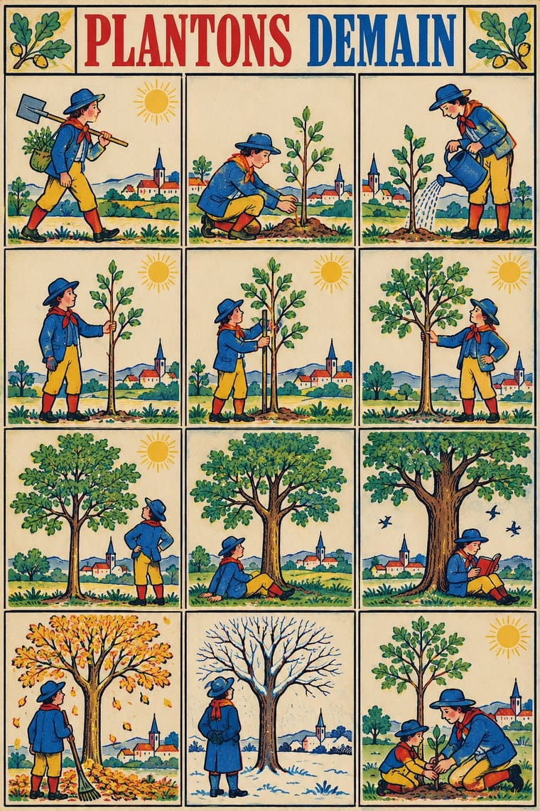
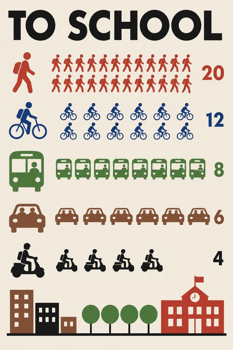
Both line up identical figures in rows, Épinal to be cut out as toy soldiers and Isotype to count; borrow Isotype's rule that one figure stands for a quantity to turn a sheet of soldiers into a readable chart.
Mix them and make something Imagerie d'Épinal Isotype Pictorial Statistics
01
What each style brings
Each part of the design comes from the style with the stronger say in it, and each style gives at least two.
Imagerie d'Épinal & European Bilderbogen Isotype Pictorial Statistics
- Colour from Isotype Pictorial Statistics
- Form from Isotype Pictorial Statistics
- Composition from Imagerie d'Épinal
- Surface from Imagerie d'Épinal
02
The type
Open fonts standing in for each style’s own type, which is often hand-drawn or commercial.
Display · Imagerie d'Épinal
Ours
Bodoni Moda, standing in for Bold modern-face (Didone) roman capitals for the centred title, sometimes shaded or outlined ('BATAILLE D'IÉNA.', 'ARMÉE FRANÇAISE, CHASSEURS A PIED.')
Text · Isotype Pictorial Statistics
A method of visual education developed by Otto Neurath, Marie Neurath (Reidemeister) and Gerd Arntz in Red Vienna from 1925, which turns statistics into rows of identical pictograms where a greater quantity is shown by more signs, never by bigger ones. Continued in The Hague and Oxford until 1971, its standardised symbols, flat colours and sans-serif captions laid the foundations of modern information graphics and pictogram systems.
Jost; Isotype Pictorial Statistics used Futura and Gerd Arntz's linocut pictogram set (c. 4,000 signs), used like a fount of picture-type
03
The colours
The ground and leading colours come from Isotype Pictorial Statistics, with a counter-accent from Imagerie d'Épinal. The ink reads on the ground at 4.5:1 or more.
Imagerie d'Épinal & European Bilderbogen Isotype Pictorial Statistics
-
#f2ecdfground · 36% -
#1a1a1aink · 14% -
#c8372daccent · 18% -
#e4bb3aaccent · 14% -
#2c5aa0accent · 10% -
#8a5a3baccent · 8%
As CSS
:root {
  --ground: #f2ecdf;
  --ink: #1a1a1a;
  --accent-1: #c8372d;
  --accent-2: #e4bb3a;
  --accent-3: #2c5aa0;
  --accent-4: #8a5a3b;
  --font-display: "Bodoni Moda", serif;
  --font-text: "Jost", sans-serif;
}
Use it with care
Imagerie d'Épinal & European Bilderbogen: Many sheets carry nationalist, militarist and colonial messages, from the Napoleonic legend to colonial campaigns such as the Tonkin war, and some show colonised peoples as 'savages' (the Kühn Robinson sheet captions 'die Wilden' slaughtering captives at a feast), so do not reproduce these figures as period charm; the Imagerie d'Épinal still trades under its name, so draw new sheets rather than copying its marks.
04
The two styles
05
More combinations
With Imagerie d'Épinal
- Lubok Popular Print Contrasts · Both are pedlars' broadsheets coloured by hand, but the lubok crams verse into the gaps around its figures and brushes washes on freely, while the Épinal sheet keeps its text beneath a ruled frame and stencils colour across rows of repeated figures; choose the lubok for jostling satire and Épinal for an orderly catalogue or story.
- Mexican Popular Graphics (Posada) Pairs well · Posada's hojas volantes are another pedlar broadsheet with a crude relief picture over a block of text; add Épinal's stencil colour to a black relief broadsheet for a hand-coloured street print.
- Risograph & Indie Print Culture Pairs well · Riso's few flat inks and drifting registration reproduce the stencil float of an Épinal sheet; print rows of repeated figures in red, blue and yellow over a black key for a contemporary imagerie.
- Ligne Claire (Franco-Belgian Clear Line) Pairs well · Both read as captioned grids of drawn cases with clear contour and flat colour; give a clear-line strip Épinal's stencil drift, roman-capital title and caption under every case for a 19th-century picture-story feel.
- Victorian Letterpress & Wood Type Contrasts · The same century's printers, but jobbing letterpress leads with mixed display type in one or two inks, while the Épinal sheet leads with a stencil-coloured picture and keeps type to a title and a caption block; set them side by side to choose between a notice and a picture.
- Emblem Book (Motto, Picture & Epigram) Contrasts · Both centre a framed picture over a block of text, but the Épinal sheet tells a popular story in stencil colour for a broad public, while the emblem is a learned monochrome riddle, one to a page, read slowly in sequence.
- Tarot de Marseille Woodcut Cards Contrasts · Both stencil-colour a black woodcut key in a few drifting colours, but the Épinal sheet tells a story in grids of captioned cases and marches rows of soldiers, while the tarot card isolates one emblematic subject under a numeral and a title; choose tarot for a single symbol, Épinal for a sequence.
- Lotería Card Imagery (Mexican Lotería) Contrasts · Both are cheap coloured popular prints of stock figures in ruled frames under capital captions, but an Épinal sheet tells a story or musters a row of soldiers across many cases, while a lotería card holds one emblem and the tabla's cells have no order: the caller draws them by chance.
With Isotype Pictorial Statistics
- International Typographic Style Pairs well · Set Isotype rows of pictograms on a Swiss grid for public information that is rigorous yet friendly.
- Socialist Realist Propaganda Poster Contrasts · Socialist Realism dramatises with heroic figures while Isotype persuades by counting; choose evidence over emotion when trust matters.
- Flat Design Pairs well · Flat icon sets are Isotype's heirs; apply its one-symbol-one-meaning rule to keep an icon family consistent.
- Corporate Memphis Contrasts · Corporate Memphis uses flat figures for mood; Isotype's figures always count something, so use people icons only when they carry data.
- Ancient Egyptian Hieroglyphic & Register Composition Pairs well · Otto Neurath called his visual autobiography From hieroglyphics to Isotype, with chapters on hieroglyphics through the centuries and their renaissance; borrow the rule-bound sign family and rows of standing figures, but note the opposite rule of size: Isotype shows more by adding signs of equal size, Egypt shows rank by making one figure bigger.
- Data Humanism Contrasts · Isotype fixes one standard sign per thing and counts by repeating it so anyone can read the chart; data humanism invents a new code for each dataset and asks for slow reading. Choose Isotype for public information, data humanism for portraits of particular lives.
- Schematic Transit Diagram (Beck Tube Map Idiom) Pairs well · Add pictorial statistics beside the diagram to carry quantities as well as connections.
- Warli Painting Contrasts · Both build people from a few reduced shapes and repeat them in rows; Isotype's figures count data in flat colours on a light ground, Warli's narrate ritual and village life in white on earth, so borrow the repetition but not the meaning.