Style combination · Pairs well
Fantasy User Interface × International Typographic Style
A strict grid and a neutral sans keep FUI's density legible; Oblivion hung every element on a dot grid. Start from Swiss order, then add rings and readouts.
Mix them and make something Fantasy User Interface International Typographic Style
01
What each style brings
Each part of the design comes from the style with the stronger say in it, and each style gives at least two.
Fantasy User Interface (FUI) & Sci-Fi HUD International Typographic Style
- Type from International Typographic Style
- Colour from International Typographic Style
- Form from Fantasy User Interface
- Composition from Fantasy User Interface
- Surface from Fantasy User Interface
-
02
The type
Open fonts standing in for each style’s own type, which is often hand-drawn or commercial.
Text · Fantasy User Interface
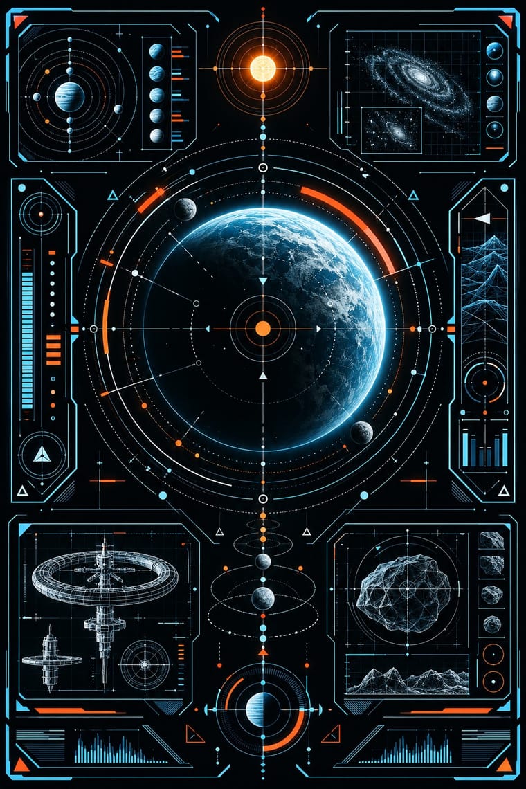
Fantasy user interfaces are the screen graphics of films and series: computer screens, holograms and helmet HUDs made to be watched for a few seconds, not used. From Minority Report and The Bourne Identity (2002) to Marvel's Iron Man HUDs, Mark Coleran, Cantina Creative and Territory Studio set glowing cyan and amber hairlines on black or clear glass. The screens carry concentric rings, targeting brackets, wireframe models, maps and dense micro-text in tracked capitals and monospace, packed to the edges around an open centre. Everything moves, and each screen has one big 'read'.
IBM Plex Mono; Fantasy User Interface used Squared, extended sans in the line of Microgramma (Aldo Novarese & Alessandro Butti, 1952) and Eurostile (Novarese, Nebiolo, 1962), science fiction's screen face since the Eurostile Bold Extended displays of 2001: A Space Odyssey (1968) and Blender (Nik Thoenen, 2003), an angular geometric sans that team member Navarro Parker named as the UI font of Oblivion
03
The colours
The ground and leading colours come from International Typographic Style, with a counter-accent from Fantasy User Interface. The ink reads on the ground at 4.5:1 or more.
Fantasy User Interface (FUI) & Sci-Fi HUD International Typographic Style
-
#f2f0e9ground · 36% -
#111111ink · 14% -
#e1251baccent · 18% -
#ff9d2eaccent · 14% -
#1f4e9caccent · 10% -
#7a7a7aaccent · 8%
As CSS
:root {
  --ground: #f2f0e9;
  --ink: #111111;
  --accent-1: #e1251b;
  --accent-2: #ff9d2e;
  --accent-3: #1f4e9c;
  --accent-4: #7a7a7a;
  --font-display: "Inter Tight", sans-serif;
  --font-text: "IBM Plex Mono", monospace;
}
Use it with care
Fantasy User Interface (FUI) & Sci-Fi HUD: FUI is built to be watched for seconds, not used. When the look moves into a real product, game or dashboard, keep the single read, size micro-text and contrast to WCAG rather than to a cinema screen, and keep flashing scans and blinking alerts to three flashes or fewer per second. Never present invented data as real data. Its targeting reticles, facial recognition and surveillance feeds come from military and intelligence imagery, so think about what they glamourise before using them on civilian or campaign work.
04
The two styles

05
More combinations
With Fantasy User Interface
- Synthwave / Outrun Contrasts · Both glow in neon on black, but synthwave paints a nostalgic horizon with chrome and a sunset, while FUI shows a present-tense instrument. Choose synthwave for a mood and FUI when the picture has to look like it is working.
- Glassmorphism Contrasts · Glassmorphism's frosted, rounded panes are soft and meant to be used. FUI's clear glass carries hard hairlines and brackets. Take glassmorphism's blur behind an FUI panel when real users have to read it.
- Techno-Futurist Graphics Pairs well · Techno-futurism's invented corporate logos, pictograms and warning labels make convincing in-world branding for FUI screens. Use them on boot screens and on the agencies and corporations whose software the characters run.
- Generative & Dynamic Identities Pairs well · Drive FUI's maps, network graphs and counters from live data or code, so the screen's motion is real rather than a loop of invented numbers.
- Y2K Futurism Contrasts · Both float HUD-style overlays, wireframes and orbit lines, but Y2K sets them on glossy chrome, bubble forms and white voids for optimism, while FUI draws hairline instruments on black for a machine at work. Choose Y2K for a product's shine and FUI when the screen has to look busy with a task.
- Glitch Art & Datamosh Graphics Pairs well · For worn screens like Territory's Blade Runner 2049 playback, with screen burn, ghosting, colour degradation and glitches in place of clean glow, take the damage from glitch art's real file and signal faults rather than from a preset filter.
- Dark Tech Minimalism Contrasts · Both put light type on black, but dark tech minimalism is a real interface that people use, sparse and quiet. FUI is staged for a camera and piles on density and glowing rings. Borrow one radial gauge for a product hero, not the whole cockpit.
- Cassette Futurism Contrasts · Its clean, glowing, layered HUDs came later; cassette futurism answers with worn hardware and one phosphor colour.
With International Typographic Style
- Art Nouveau Contrasts · Ornamental curves against an orthogonal grid make a strong deliberate tension.
- Brutalist Web Design Pairs well · Strip the grid to raw HTML defaults to get a rawer, contemporary take on Swiss honesty.
- Psychedelic Poster Contrasts · Its exact opposite on legibility; borrow one swirling element to break a too-cold Swiss layout.
- Japanese Postwar Modernism Pairs well · Add Japanese restraint and emblematic colour fields to the grid for warmth without losing order.
- American Traditional Tattoo Flash Contrasts · Rational grid and sans-serif against sentimental, hand-lettered emblems: one flash motif on a Swiss layout makes a sharp contrast.
- Graffiti & Hip-Hop Graphics Contrasts · Put a single tag or throw-up over a strict Swiss grid to stage the clash between institutional order and a street voice.
- Pop Art Graphics Contrasts · Set one loud appropriated Pop image inside a strict grid with a neutral grotesque so the irony reads as deliberate rather than chaotic.
- Italian Painted Film Poster (Rome Studios) Contrasts · Grid, restraint and photographic objectivity are the opposite of a crowded painted montage.