Style combination · Contrasts
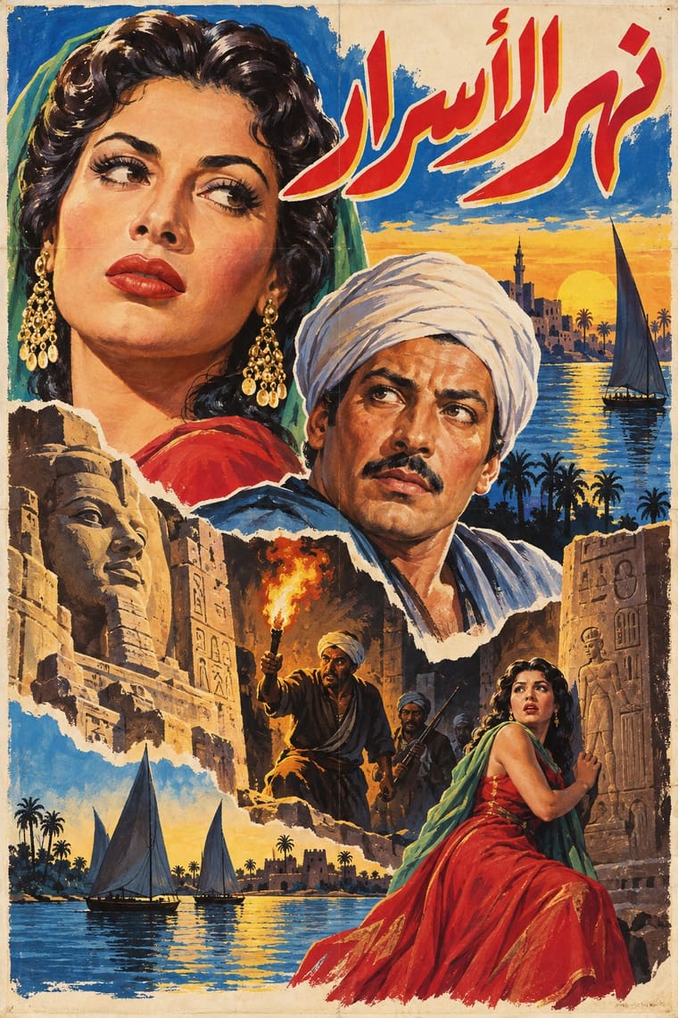
Egyptian Painted Film Poster × International Typographic Style
Place one painted Arabic title and star head on a neutral grid with grotesque credits to make the clash of melodrama and order the subject.
Mix them and make something Egyptian Painted Film Poster International Typographic Style
01
What each style brings
Each part of the design comes from the style with the stronger say in it, and each style gives at least two.
Egyptian Painted Film Poster International Typographic Style
- Type from Egyptian Painted Film Poster
- Colour from International Typographic Style
- Form from Egyptian Painted Film Poster
- Composition from International Typographic Style
-
Egyptian Painted Film Poster avoids modular grid: this is where the two pull against each other, which is the point of the contrast.
- Surface from Egyptian Painted Film Poster
02
The type
Open fonts standing in for each style’s own type, which is often hand-drawn or commercial.
Display · Egyptian Painted Film Poster
Form
Rakkas, standing in for Hand-painted Arabic calligraphic title logotypes
Text · International Typographic Style
A post-war refinement of the New Typography in which the mathematical grid, objective photography and neo-grotesque sans-serifs were used to communicate with clarity and neutrality. Taught at the Basel and Zurich schools, it became the default language of international corporate and institutional communication.
Inter; International Typographic Style used Akzidenz-Grotesk and Helvetica
03
The colours
The ground and leading colours come from International Typographic Style, with a counter-accent from Egyptian Painted Film Poster. The ink reads on the ground at 4.5:1 or more.
Egyptian Painted Film Poster International Typographic Style
-
#f2f0e9ground · 36% -
#111111ink · 14% -
#e1251baccent · 18% -
#f2c230accent · 14% -
#1f4e9caccent · 10% -
#7a7a7aaccent · 8%
As CSS
:root {
  --ground: #f2f0e9;
  --ink: #111111;
  --accent-1: #e1251b;
  --accent-2: #f2c230;
  --accent-3: #1f4e9c;
  --accent-4: #7a7a7a;
  --font-display: "Rakkas", cursive;
  --font-text: "Inter", sans-serif;
}
04
The two styles

05
More combinations
With Egyptian Painted Film Poster
- Hand-Painted Bollywood Poster Pairs well · Share floating star heads and painted title logos across a film-heritage programme, setting Arabic calligraphic titles beside Devanagari and Nastaʿlīq ones.
- Belle Époque Lithographic Poster Pairs well · Both are colour-lithographed street posters; borrow the Belle Époque's flat colour and single animated figure to calm a crowded star montage.
- Cairo–Beirut Arab Modernist Book & Periodical Design Pairs well · Combine the cinema poster's glamorous painted title with the book designers' rough line and folk borders for a Cairo identity that spans screen and print.
- Hong Kong Cinema Poster (Shaw Brothers and Golden Harvest era) Pairs well · Another painted studio-era film poster; borrow its heroic face scale and melodrama.
- Giallo Mondadori Covers (I Libri Gialli) Pairs well · Both paint a lurid, cinematic moment of crime or melodrama for a mass public; the poster's calligraphic logotype and floating heads can loosen the giallo's sober capitals.
- Thai Hand-Painted Film Poster and Billboard Pairs well · Another painted cinema-advertising tradition built on a crowded montage of faces, a parallel rather than a documented influence; borrow its scale contrast between star and scene.
- Yeşilçam Film Poster (Turkish Hand-Painted Afiş) Pairs well · Both put painted star heads above a melodramatic scene. Pair them to compare Latin-script Istanbul lettering with Arabic calligraphic titles.
- Mexican Calendar Chromo (Cromos calendáricos) Contrasts · Both paint the stars of a national cinema's golden age, but the Egyptian poster collages star heads under huge calligraphic titles, while the chromo paints one unified scene and keeps its lettering to a small band below.
With International Typographic Style
- Art Nouveau Contrasts · Ornamental curves against an orthogonal grid make a strong deliberate tension.
- Brutalist Web Design Pairs well · Strip the grid to raw HTML defaults to get a rawer, contemporary take on Swiss honesty.
- Psychedelic Poster Contrasts · Its exact opposite on legibility; borrow one swirling element to break a too-cold Swiss layout.
- Japanese Postwar Modernism Pairs well · Add Japanese restraint and emblematic colour fields to the grid for warmth without losing order.
- American Traditional Tattoo Flash Contrasts · Rational grid and sans-serif against sentimental, hand-lettered emblems: one flash motif on a Swiss layout makes a sharp contrast.
- Graffiti & Hip-Hop Graphics Contrasts · Put a single tag or throw-up over a strict Swiss grid to stage the clash between institutional order and a street voice.
- Pop Art Graphics Contrasts · Set one loud appropriated Pop image inside a strict grid with a neutral grotesque so the irony reads as deliberate rather than chaotic.
- Italian Painted Film Poster (Rome Studios) Contrasts · Grid, restraint and photographic objectivity are the opposite of a crowded painted montage.