Style combination · Contrasts
Corporate Identity Modernism × Stencil Street Art
Stencil art borrows the repetition and reach of branding to mock it, as OBEY parodies advertising; a black figure sprayed beside a clean corporate mark makes the question of who owns public space visible.
Mix them and make something Corporate Identity Modernism Stencil Street Art
01
What each style brings
Each part of the design comes from the style with the stronger say in it, and each style gives at least two.
Corporate Identity Modernism Stencil Street Art
- Type from Corporate Identity Modernism
- Colour from Stencil Street Art
- Form from Corporate Identity Modernism
- Composition from Corporate Identity Modernism
- Surface from Stencil Street Art
-
Corporate Identity Modernism avoids photocopy & distress: this is where the two pull against each other, which is the point of the contrast.
02
The type
Open fonts standing in for each style’s own type, which is often hand-drawn or commercial.
Text · Stencil Street Art
Pictures cut rather than drawn: a photograph is reduced to two or three flat tones, cut into card and sprayed onto a wall, usually uninvited, so one hard-edged figure appears in the street, in black with at most one accent colour. Foreshadowed by Ernest Pignon-Ernest's Hiroshima silhouettes (1966), it took shape in 1978 in Amsterdam's punk scene (Hugo Kaagman) and São Paulo (Alex Vallauri), was taken up in Paris by Blek le Rat in the early 1980s, and went global after 2000 with Banksy's satirical stencils and Shepard Fairey's Obey posters and Obama 'Hope' portrait.
Special Elite; Stencil Street Art used Hand-cut stencil capitals, bridged where the counters would otherwise fall out and Industrial and military marking stencils
03
The colours
The ground and leading colours come from Stencil Street Art, with a counter-accent from Corporate Identity Modernism. The ink reads on the ground at 4.5:1 or more.
Corporate Identity Modernism Stencil Street Art
-
#e6e2d8ground · 36% -
#111111ink · 14% -
#d3212daccent · 18% -
#1f3a4daccent · 14% -
#0a4fa0accent · 10% -
#8f8a82accent · 8%
As CSS
:root {
  --ground: #e6e2d8;
  --ink: #111111;
  --accent-1: #d3212d;
  --accent-2: #1f3a4d;
  --accent-3: #0a4fa0;
  --accent-4: #8f8a82;
  --font-display: "Inter Tight", sans-serif;
  --font-text: "Special Elite", monospace;
}
Use it with care
Stencil Street Art: Spraying a wall without the owner's consent is vandalism or criminal damage in most jurisdictions, so get permission or a legal wall; a brand faking street stencils is no exception (IBM's 2001 'Peace, Love, and Linux' sidewalk stencils led to arrests and more than US$120,000 in fines). Most stencils start from someone else's photograph, as the AP's dispute over Fairey's Hope poster showed (settled 2011): shoot or license the source image, and do not pass off a pastiche as a Banksy, whose work is authenticated only by Pest Control. Do not use photographs of real victims, or places of real suffering such as separation walls and war ruins, as props for a brand or a joke; by Banksy's own account, a Palestinian man at the West Bank barrier told him they did not want the wall made beautiful.
04
The two styles
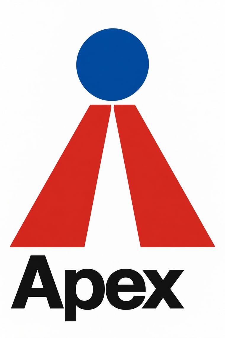
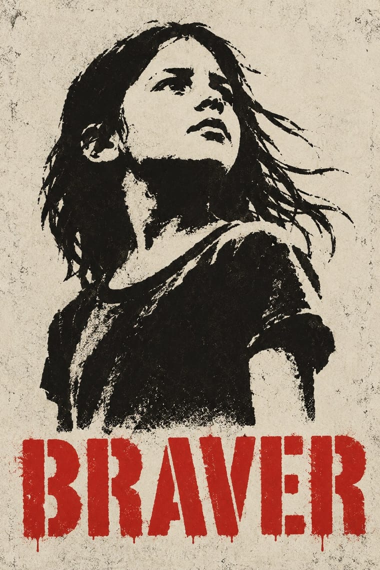
05
More combinations
With Corporate Identity Modernism
- Corporate Memphis Contrasts · Its successor trades abstract authority for rubbery friendliness; compare the two to decide how institutional or human a brand should feel.
- Generative & Dynamic Identities Pairs well · Keep the manual's mark, colour and grid as constants and let generative rules vary one parameter, so the system still reads as one company.
- Flat Design Pairs well · Flat UI inherits these reductive marks; reuse their clear-space and colour-code discipline when scaling icons across screens.
- Punk & DIY Zine Contrasts · Punk's ransom-note lettering is the anti-manual; one torn, xeroxed element against a corporate grid reads instantly as critique.
- Plakatstil / Sachplakat Pairs well · Its brand-name-plus-object formula prefigures logo-led identity; pair it with a modernist grid for confident product campaigns.
- Risograph & Indie Print Culture Contrasts · Exact Pantone-matched corporate colour is the opposite of riso's drifting inks; use the contrast to signal independence.
- Contemporary Arabic & Dual-Script Type Design Pairs well · Roll a matched Arabic–Latin family through a standards manual so both scripts carry the identity with equal authority.
- Milanese Industrial Modernism (Olivetti, Pirelli, Studio Boggeri) Contrasts · American corporate identity policed one mark through a manual, while Milan let artists vary the language; compare the two when deciding how strict a brand system should be.
With Stencil Street Art
- Graffiti & Hip-Hop Graphics Contrasts · Both use spray paint in the street, but graffiti makes the writer's name a freehand, many-coloured letter-sculpture with 3D blocks and fades; stencil art sprays a reproducible photographic picture in black. Decide which one the brief needs before mixing them.
- Punk & DIY Zine Pairs well · Stencilling grew out of punk (Kaagman's fanzine scene, Crass's Underground slogans); pair a sprayed figure with xerox collage and ransom-note lettering for a flyer or sleeve with the same anti-authority edge.
- Russian Constructivism Pairs well · Fairey's Obey posters borrow Soviet propaganda's red, black and cream and its heroic portrait; give a stencilled face a red bar and a one-word slogan for agitprop with a knowing twist.
- Pop Art Graphics Pairs well · Both repeat an appropriated photograph through a stencil; add Pop's serial grid or one off-register accent colour to turn a single street figure into a print edition.
- Lambe-Lambe Posters (Brazilian Paste-Up Street Posters) Pairs well · Both descend from or sit beside graffiti culture in the street; pair a pasted series with a painted element only where a project needs both.
- Chinese Paper-Cut (Jianzhi) Pairs well · Both depend on bridges that hold every island of the design to the sheet; give a spray stencil the paper-cut's folded symmetry and saw-tooth texture.
- BUGA UP Billboard Alteration Contrasts · Stencils bring their own imagery to the wall; BUGA UP takes the wall's existing imagery and turns it.
- Extinction Rebellion Graphics Pairs well · ESP spread the symbol as a street artist before XR adopted it, chalking it on Brick Lane and putting up posters and tiles around East London; pair XR's one-colour emblem and short slogans with stencil street art's hard-edged sprayed figures for walls and pavements.