Style combination · Contrasts
Chinese Paper-Cut × Kamon
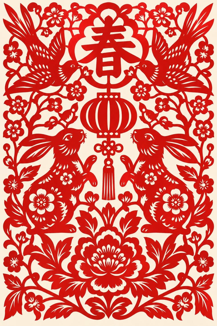
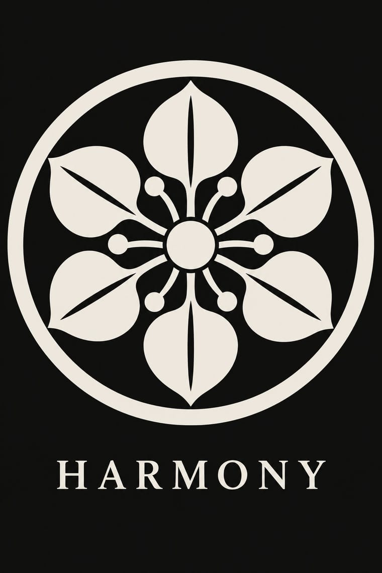
Kamon reduce an emblem to a spare roundel silhouette; paper-cut fills the same roundel with saw-tooth texture and pierced pattern, so set restraint against abundance.
01
What each style brings
Each part of the design comes from the style with the stronger say in it, and each style gives at least two.
Chinese Paper-Cut (Jianzhi) Kamon (Japanese Family Crests)
- Type from Chinese Paper-Cut
- Colour from Kamon
- Form from Chinese Paper-Cut
- Composition from Kamon
- Surface from Chinese Paper-Cut
02
The type
Open fonts standing in for each style’s own type, which is often hand-drawn or commercial.
Display · Chinese Paper-Cut
Fiesta
Shippori Mincho; Chinese Paper-Cut used Double happiness (囍) cut from folded red paper for weddings, the doubled character mirrored across the fold and Fu (福) and other auspicious characters cut as solid, bridged glyphs for the New Year
Text · Chinese Paper-Cut
China's folk art of cut paper, made mostly by rural women and passed from mother to daughter, and by town guilds and workshops. A sheet, usually red, is cut with scissors or a knife into a silhouette that holds together; folding before cutting gives mirror and radial symmetry, and saw-tooth and crescent notches stand in for texture. Window flowers, wedding characters, lucky animals and embroidery patterns dress windows, beds and ceilings for festivals, weddings and prayers. Yuxian (Hebei) knife-cuts are dyed in many colours; Foshan backs cut metal foil (copper or gold) with coloured paper.
Shippori Mincho; Chinese Paper-Cut used Double happiness (囍) cut from folded red paper for weddings, the doubled character mirrored across the fold and Fu (福) and other auspicious characters cut as solid, bridged glyphs for the New Year
03
The colours
The ground and leading colours come from Kamon, with a counter-accent from Chinese Paper-Cut. The ink reads on the ground at 4.5:1 or more.
Chinese Paper-Cut (Jianzhi) Kamon (Japanese Family Crests)
-
#f3efe6ground · 36% -
#121212ink · 14% -
#b38f3daccent · 18% -
#8c2d25accent · 14% -
#e0558aaccent · 10% -
#1d2b47accent · 8%
As CSS
:root {
  --ground: #f3efe6;
  --ink: #121212;
  --accent-1: #b38f3d;
  --accent-2: #8c2d25;
  --accent-3: #e0558a;
  --accent-4: #1d2b47;
  --font-display: "Shippori Mincho", serif;
  --font-text: "Shippori Mincho", serif;
}
Use it with care
Chinese Paper-Cut (Jianzhi): Paper-cutting is a living craft, practised mostly by rural women who learn it from their mothers, and some cuts serve ritual ends, from invoking rain and warding off evil to calling back the spirit of the dead at funerals. Commission, buy from or credit named cutters and regional workshops rather than tracing their designs, keep auspicious characters correct and legible, do not use funerary or ritual cuts as festive decoration, and treat Miao embroidery-pattern cuts as part of a minority community's dress rather than a free motif bank. Use 囍 (double happiness) only for weddings, not as a generic Chinese luck motif; a 福 hung upside down at New Year is deliberate (倒福, a pun on 'fortune arrives'), so do not correct it, and do not flip other characters.
Kamon (Japanese Family Crests): Mon are inherited marks of particular families, shrines, temples and institutions. Only the imperial chrysanthemum is named in Japanese law: the Trademark Act (art. 4(1)(i)) bars registering it or anything like it. The government's paulownia, though the official emblem of the Prime Minister and Cabinet, was never given the same legal restrictions, while famous crests registered as trademarks, such as Mitsubishi's three diamonds, are protected as marks. Do not use the chrysanthemum, the government paulownia, or any identifiable family's, shrine's or temple's crest as decoration or as a brand. Imperial emblems can also recall Japan's wartime empire for audiences in Korea and China. The manji (卍), a standard crest (the Hachisuka clan; the temple crest of Sensō-ji), is read in the West as the Nazi swastika: avoid it outside a Japanese context that explains it. Draw new crests by the tradition's rules instead of borrowing real ones, and commission or credit working monsho uwaeshi, who still draw and paint crests by hand.
04
The two styles
05
More combinations
With Chinese Paper-Cut
- Guna Mola Contrasts · Molas cut through stacked layers of cloth and stitch the edges, so colour builds in echo bands; paper-cut stays one flat layer of colour seen against light.
- Stencil Street Art Pairs well · Both depend on bridges that hold every island of the design to the sheet; give a spray stencil the paper-cut's folded symmetry and saw-tooth texture.
- Nianhua & Chinese Folk Print Pairs well · Both dress the home for the New Year; hang a single red window cut beside a dense, keylined door-god print so flat void and crowded colour work together.
- Guochao (China-Chic National Trend) Pairs well · Guochao packaging borrows red cut-paper silhouettes; keep the real cut logic (joined lines, folded symmetry, correct auspicious characters) instead of a generic filigree texture.
- Swedish Painted Wall Hangings (Dalmålning, Bonadsmålning and Kurbits) Pairs well · A looser parallel: domestic wall decoration filled with symbolic flora, though cut paper rather than painted.
- Mithila (Madhubani) Painting Contrasts · Both are folk arts made mostly by rural women for weddings and other rites, with fish and lotus among their auspicious signs, but paper-cut is a silhouette, usually red, cut from one sheet and folded for mirror symmetry, while Mithila draws an outline and fills it with colour, hatching or rings until no ground is left. Use one of them, not a blend of the two.
- Javanese Wayang Kulit (Tatah Sungging) Contrasts · Both draw with holes cut through a flat sheet, but paper-cuts are usually folded, symmetrical and one-coloured, while a wayang figure is in profile, painted and gilded on both faces, and made to move.
- Kinngait (Cape Dorset) Inuit Printmaking Contrasts · Both are flat silhouettes with notches and cut patterns inside; paper-cut folds the sheet for exact mirror symmetry and fills the shape with lace, while Kinngait draws freehand, keeps a few incised marks and lets stencil colour grade inside the shape, often darkest at its tips.
With Kamon
- Ukiyo-e Woodblock Prints Pairs well · Kabuki actors had their own mon, and actor prints show them on the costume, as on the sleeve of Ichikawa Yaozō III in a print of 1796; pair a flat crest with ukiyo-e figures to identify characters without captions.
- Islamic Geometric & Calligraphic Tradition Contrasts · Both are built with compass and straight edge, but girih tiles the whole surface without end while a mon closes one motif inside a ring; borrow the tessellation for a ground and the crest for the single sign on it.
- Corporate Identity Modernism Pairs well · A mon already behaves like a corporate mark (one colour, scalable, placed in fixed positions), as Mitsubishi's three diamonds show; use crest construction rules to build a logo family with codified variants for subsidiaries.
- Ma & Wabi-sabi Aesthetics Contrasts · Both set a single sign in emptiness, but wabi-sabi wants it off-centre, irregular and brush-marked while a mon is exact, symmetric and compass-drawn; set a crest's geometry against wabi-sabi's rough, quiet grounds when packaging or interiors need that tension.
- Japanese Postwar Modernism Pairs well · Postwar Japanese designers drew on kamon for their single emblematic symbols; pair a compass-drawn crest with a grotesque or Gothic caption on an empty field for an identity that is plainly modern but rooted.
- Northwest Coast Formline Design Contrasts · Both are hereditary crest systems, but formline fills a red-and-black field with split, swelling creatures while a mon is a tiny symmetric silhouette in emptiness; compare them to decide between abundance and reduction.
- Japonisme Pairs well · Through Japonisme, mon fed late-19th-century Western pattern design, Louis Vuitton's monogram among them; borrow a crest's compass-built flat silhouette for a Western repeat or monogram, drawn new rather than copied from a real family.
- European Heraldry Contrasts · Both mark kinship with hereditary emblems varied in small codified ways, but a mon is a one-colour silhouette drawn round a centre, while a coat of arms is a shield of contrasting tinctures read by the rule of tincture.