Style combination · Pairs well
Book Blob × Modern Calligraphy and Brush Lettering
The handwritten 'a novel' under the big capitals is a brush-script accent. Take it from a real modern calligrapher rather than a stock script font so the one personal line actually feels personal.
Mix them and make something Book Blob Modern Calligraphy and Brush Lettering
01
What each style brings
Each part of the design comes from the style with the stronger say in it, and each style gives at least two.
Book Blob (Abstract Colour-Blob Literary Fiction Cover) Modern Calligraphy and Brush Lettering
- Type from Modern Calligraphy and Brush Lettering
- Colour from Book Blob
- Form from Book Blob
- Composition from Modern Calligraphy and Brush Lettering
-
Book Blob avoids generous white space: this is where the two pull against each other.
- Surface from Modern Calligraphy and Brush Lettering
02
The type
Open fonts standing in for each style’s own type, which is often hand-drawn or commercial.
Display · Modern Calligraphy and Brush Lettering
Together
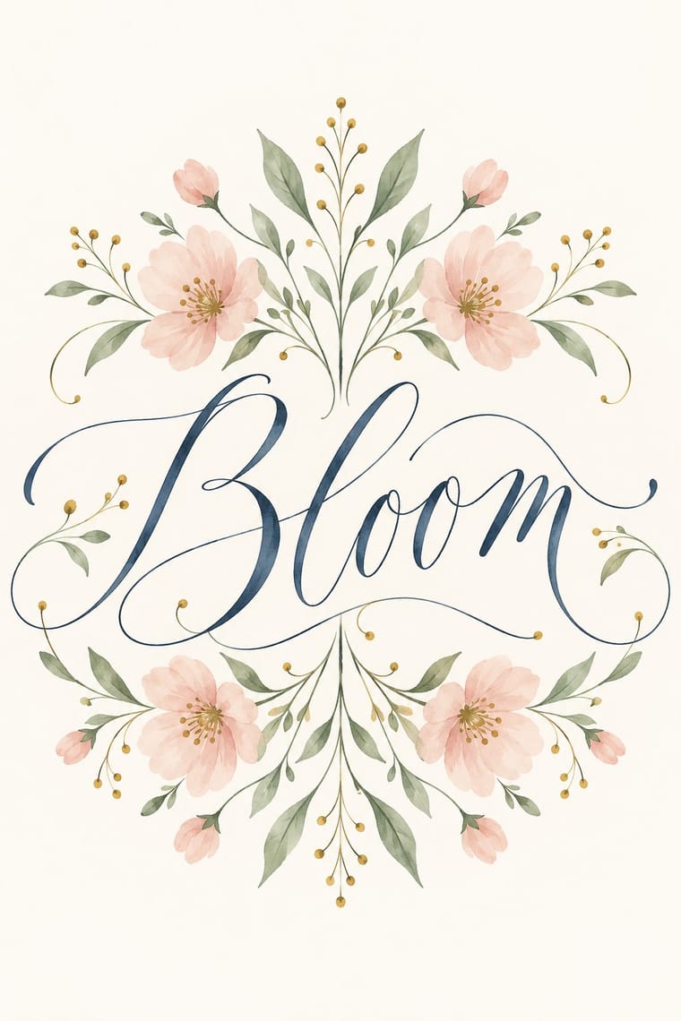
Kaushan Script, standing in for Brush-pen script (brush lettering): thick downstrokes and thin upstrokes from felt-tip brush pens, brushes and paint pens, often in watercolour
Text · Book Blob
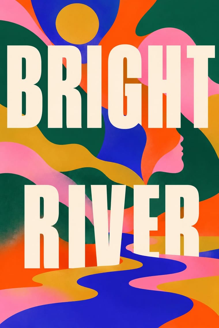
The default jacket of US literary fiction around 2019–2023: soft, overlapping blobs of saturated colour fill the cover edge to edge (cobalt, pink, orange-red, deep green, mustard). If you look twice, a profile, an eye or a braid may appear. Over them sit a big title in spaced white or cream sans capitals and a small handwritten 'a novel'. It was designed to stay legible as a phone thumbnail and to look good on Instagram. Jeva Lange was delighted by its clashing colours, but Print called it a safe, reliably marketable look, used disproportionately for books by women of colour and debut authors.
Newsreader; Book Blob used Large spaced capitals in a sturdy sans, white or cream, one or two words to a line across the width and Spaced sans capitals with round, slightly hand-drawn shapes, staggered left and right down the cover
03
The colours
The ground and leading colours come from Book Blob, with a counter-accent from Modern Calligraphy and Brush Lettering. The ink reads on the ground at 4.5:1 or more.
Book Blob (Abstract Colour-Blob Literary Fiction Cover) Modern Calligraphy and Brush Lettering
-
#f4e8d6ground · 36% -
#074e34ink · 14% -
#ff4a03accent · 18% -
#c6a45aaccent · 14% -
#dba729accent · 10% -
#2f3b52accent · 8%
As CSS
:root {
  --ground: #f4e8d6;
  --ink: #074e34;
  --accent-1: #ff4a03;
  --accent-2: #c6a45a;
  --accent-3: #dba729;
  --accent-4: #2f3b52;
  --font-display: "Kaushan Script", cursive;
  --font-text: "Newsreader", serif;
}
Use it with care
Book Blob (Abstract Colour-Blob Literary Fiction Cover): These jackets are the in-copyright work of named, living designers and illustrators: borrow the method, not a particular cover. Print (2021) read the look as a 'safe' route taken disproportionately for women of colour and debut authors, who deserve covers 'that wouldn't have been created for anyone else'. If you use the blob for such a book, draw the shapes from that book's own story so the cover does not become a mere demographic signal.
Modern Calligraphy and Brush Lettering: Modern calligraphy is a living trade of freelance calligraphers who sell wedding commissions, workshops and scanned alphabets: commission or license a hand instead of tracing a calligrapher's published names, quotes or practice sheets, and never present a generated hand as the work of a named letterer. Image models write pseudo-script with missing, doubled or garbled letters, so have every word written by hand or checked letter by letter before it goes on an invitation or a sign.
04
The two styles
05
More combinations
With Book Blob
- Finnish Bold Print (Marimekko Modernism) Pairs well · Marimekko's big organic shapes in flat, saturated colour, printed edge to edge, are a crisp, hard-edged cousin of the blob's soft fields. Borrow their scale and confident cut edges when blurred blobs feel too vague.
- Corporate Memphis Contrasts · Its contemporary in flat, polychrome blobs and inclusive warmth, but Corporate Memphis draws whole faceless figures as small vignettes on white. The blob dissolves the figure into a full-bleed field and leaves only a profile or an eye. Choose the blob when a single person's inner life matters more than a scene.
- Penguin Paperback Design (Three Bands to the Marber Grid) Contrasts · Penguin's bands and grid made every book look like its publisher on purpose. The blob made books from rival houses look like one another, so the cover signals comparable titles rather than an imprint. Borrow a house grid when a series identity should outlast the season's trend.
- DTC 'Blanding' / Millennial Minimalism Contrasts · Both are phone-era formulas that critics mocked for making everything look alike, but blanding sells a product: one muted colour, lowercase sans, an isolated object on white space. The blob sells a story: clashing colour runs edge to edge and a figure is only hinted at. Use blanding when the thing itself should be seen, and the blob when the reader should project onto the cover.
- Risograph & Indie Print Culture Pairs well · Detransition, Baby already uses grain to warm its digital colour. Print the blobs as two or three overprinted riso inks to get real overlaps and speckle, and to take the formula away from the glossy bestseller table.
With Modern Calligraphy and Brush Lettering
- Korean Commercial Calligraphy (Kaelligeurapi) Contrasts · Both make one hand-written word the whole design, but kaelligeurapi brushes Hangul in black with dry, pooled strokes that picture the word's meaning, while modern calligraphy writes a looping Latin script in soft colour for an occasion.
- Hand-Painted Signage & Vernacular Lettering Pairs well · For welcome boards, menus and shop windows, take the sign writer's brush discipline and spacing so the bouncy script stays legible at a distance.
- Slow-Living Editorial (the Kinfolk Look) Pairs well · Set one written name or headline over Kinfolk's humanist-serif text, white margins and soft natural-light photographs, so the hand carries the feeling and the type carries the reading.
- DTC 'Blanding' / Millennial Minimalism Contrasts · The same years' pastels and white space, but blanding speaks in a lowercase geometric sans and seamless product photographs that made brands look interchangeable, while modern calligraphy writes one name by hand for one occasion. Choose between a brand's frictionless sameness and a personal hand.
- Art Nouveau Pairs well · Borrow Art Nouveau's whiplash vines and framed florals to give the loose script and painted leaves a drawn structure, for an invitation that is ornate without a badge or a rule.
- Hipster Artisanal Revival Contrasts · Hipster branding locked a script accent inside a one-ink badge with tracked capitals, crossed arrows and an 'Est.' date; modern calligraphy drops the badge and the irony and lets the script fill a pale page in pastel and gold. Choose between heritage pastiche and a personal, romantic hand.
- Sketchnoting and Graphic Recording Contrasts · Decorative lettering as the point versus lettering subordinated to structure and summary.
- Illustrated Rom-Com Book Cover (Cartoon Couple Cover) Pairs well · Borrow its brush and pointed-pen scripts for the title, as The Kiss Quotient and The Wedding Date did, to tip a cover toward sweetness and the wedding plot; pair the script with block capitals to keep it readable small.
All 10 combinations with Modern Calligraphy and Brush Lettering