Style combination · Contrasts
Book Blob × Penguin Paperback Design
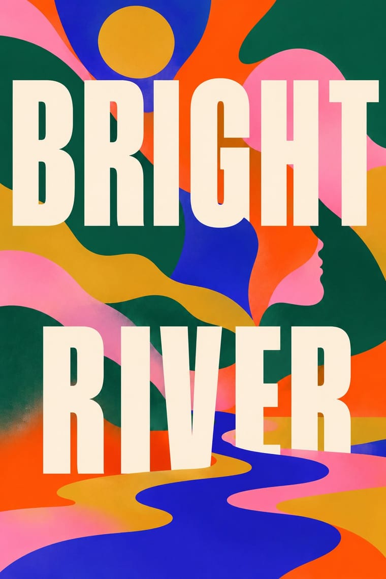
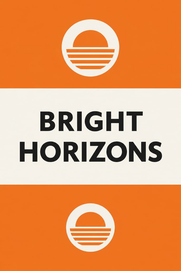
Penguin's bands and grid made every book look like its publisher on purpose. The blob made books from rival houses look like one another, so the cover signals comparable titles rather than an imprint. Borrow a house grid when a series identity should outlast the season's trend.
Mix them and make something Book Blob Penguin Paperback Design
01
What each style brings
Each part of the design comes from the style with the stronger say in it, and each style gives at least two.
Book Blob (Abstract Colour-Blob Literary Fiction Cover) Penguin Paperback Design (Three Bands to the Marber Grid)
- Type from Book Blob
- Colour from Penguin Paperback Design
- Form from Penguin Paperback Design
- Composition from Penguin Paperback Design
-
Book Blob avoids framed panels: this is where the two pull against each other, which is the point of the contrast.
- Surface from Book Blob
02
The type
Open fonts standing in for each style’s own type, which is often hand-drawn or commercial.
Display · Book Blob
Together
Bricolage Grotesque; Book Blob used Large spaced capitals in a sturdy sans, white or cream, one or two words to a line across the width and Spaced sans capitals with round, slightly hand-drawn shapes, staggered left and right down the cover
Text · Penguin Paperback Design
The cover system of Penguin Books, London, from 1935 until Germano Facetti left in 1972. Edward Young's cover set author and title in Gill Sans on a white band between two bands of one colour naming the genre: orange for fiction, green for crime. Genre colours and type-only covers came from Hamburg's Albatross paperbacks. Jan Tschichold (1947-49) fixed type positions and redrew the penguin; Erik Ellegaard Frederiksen's vertical grid, adopted by Hans Schmoller in 1951, made room for a picture; Romek Marber's 1961 grid put the type in a ruled top strip and a picture in two-thirds of the cover.
Fira Sans; Penguin Paperback Design used Gill Sans and Akzidenz-Grotesk
03
The colours
The ground and leading colours come from Penguin Paperback Design, with a counter-accent from Book Blob. The ink reads on the ground at 4.5:1 or more.
Book Blob (Abstract Colour-Blob Literary Fiction Cover) Penguin Paperback Design (Three Bands to the Marber Grid)
-
#f6f3eaground · 36% -
#1a1a1aink · 14% -
#ef7d22accent · 18% -
#ff4a03accent · 14% -
#c8285faccent · 10% -
#2f8a4eaccent · 8%
As CSS
:root {
  --ground: #f6f3ea;
  --ink: #1a1a1a;
  --accent-1: #ef7d22;
  --accent-2: #ff4a03;
  --accent-3: #c8285f;
  --accent-4: #2f8a4e;
  --font-display: "Bricolage Grotesque", sans-serif;
  --font-text: "Fira Sans", sans-serif;
}
Use it with care
Book Blob (Abstract Colour-Blob Literary Fiction Cover): These jackets are the in-copyright work of named, living designers and illustrators: borrow the method, not a particular cover. Print (2021) read the look as a 'safe' route taken disproportionately for women of colour and debut authors, who deserve covers 'that wouldn't have been created for anyone else'. If you use the blob for such a book, draw the shapes from that book's own story so the cover does not become a mere demographic signal.
Penguin Paperback Design (Three Bands to the Marber Grid): The Penguin name and penguin symbol belong to the publisher, which still reissues its classic grid covers, and many cover photographs and drawings remain in their makers' copyright: draw your own emblem, do not combine an orange or green three-band cover with a bird emblem and a publisher cartouche so that it passes for Penguin, and never present a new design as a Penguin book.
04
The two styles
05
More combinations
With Book Blob
- Finnish Bold Print (Marimekko Modernism) Pairs well · Marimekko's big organic shapes in flat, saturated colour, printed edge to edge, are a crisp, hard-edged cousin of the blob's soft fields. Borrow their scale and confident cut edges when blurred blobs feel too vague.
- Corporate Memphis Contrasts · Its contemporary in flat, polychrome blobs and inclusive warmth, but Corporate Memphis draws whole faceless figures as small vignettes on white. The blob dissolves the figure into a full-bleed field and leaves only a profile or an eye. Choose the blob when a single person's inner life matters more than a scene.
- DTC 'Blanding' / Millennial Minimalism Contrasts · Both are phone-era formulas that critics mocked for making everything look alike, but blanding sells a product: one muted colour, lowercase sans, an isolated object on white space. The blob sells a story: clashing colour runs edge to edge and a figure is only hinted at. Use blanding when the thing itself should be seen, and the blob when the reader should project onto the cover.
- Risograph & Indie Print Culture Pairs well · Detransition, Baby already uses grain to warm its digital colour. Print the blobs as two or three overprinted riso inks to get real overlaps and speckle, and to take the formula away from the glossy bestseller table.
- Modern Calligraphy and Brush Lettering Pairs well · The handwritten 'a novel' under the big capitals is a brush-script accent. Take it from a real modern calligrapher rather than a stock script font so the one personal line actually feels personal.
With Penguin Paperback Design
- GOV.UK Design (GDS Style) Pairs well · Both are British systems that set one sans in fixed positions on white and let rules build the hierarchy; GOV.UK refuses pictures and gives each colour one job, so borrow Penguin's one colour per series when a text-led service has to sort many sections at a glance.
- International Typographic Style Pairs well · Facetti and Marber already brought Standard and Helvetica, a rule and ranged-left type to the paperback; borrow a Swiss modular grid to extend the Penguin top strip into a full series system for books or podcasts.
- London Transport Design Pairs well · Both are British systems with a fixed emblem and a Johnston-to-Gill humanist sans; pair London Transport's commissioned pictorial art with Penguin's genre colour bands when one identity has to carry many varied items.
- Vicente Rojo & Mexican Editorial Modernism Pairs well · Rojo's Ediciones Era covers share the white ground, fine rules and one image in a fixed field; combine them for a literary list that needs both a rigid frame and grainy, two-ink photographs.
- Bengali Modernist Book Cover (Prachchhad) Contrasts · Contemporary opposites in literary covers: Signet Press drew a new hand-lettered title for every book, Penguin set the same typeface in the same place on every one; choose by whether the series or the single title should lead.
- Hauntology & Ghost Box Design Contrasts · Ghost Box quotes the ruled Penguin band over a saturated field as an eerie, ironic memory; use the original when the template should simply sort and sell books, and Ghost Box when it should haunt.
- Giallo Mondadori Covers (I Libri Gialli) Contrasts · Penguin coded crime with green bands and type only; Mondadori coded it with yellow and a painted window. Borrow Penguin's fixed type positions to tidy a giallo template, or a painted window to warm a banded one.
- Pulp Magazine Cover Pairs well · The paperback cover is the later successor on the newsstand and bookstall; it trades the shouting masthead and painted peril for a restrained, systematic cover.