Style combination · Contrasts
DTC 'Blanding' × Modern Calligraphy and Brush Lettering
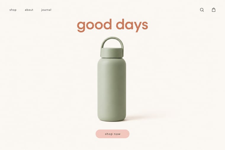
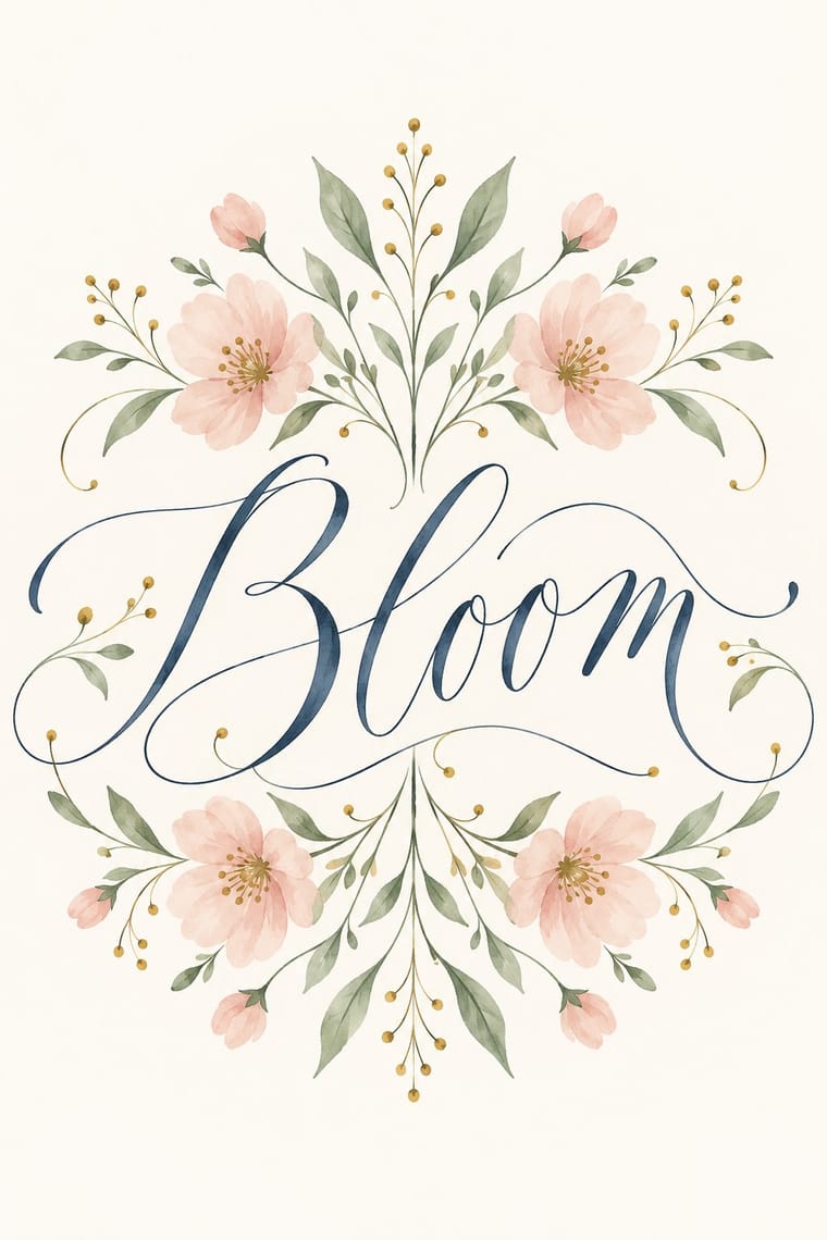
The same years' pastels and white space, but blanding speaks in a lowercase geometric sans and seamless product photographs that made brands look interchangeable, while modern calligraphy writes one name by hand for one occasion. Choose between a brand's frictionless sameness and a personal hand.
Mix them and make something DTC 'Blanding' Modern Calligraphy and Brush Lettering
01
What each style brings
Each part of the design comes from the style with the stronger say in it, and each style gives at least two.
DTC 'Blanding' / Millennial Minimalism Modern Calligraphy and Brush Lettering
- Type from Modern Calligraphy and Brush Lettering
- Colour from DTC 'Blanding'
- Form from Modern Calligraphy and Brush Lettering
- Composition from DTC 'Blanding'
- Surface from Modern Calligraphy and Brush Lettering
02
The type
Open fonts standing in for each style’s own type, which is often hand-drawn or commercial.
Display · Modern Calligraphy and Brush Lettering
Kin
Kaushan Script, standing in for Brush-pen script (brush lettering): thick downstrokes and thin upstrokes from felt-tip brush pens, brushes and paint pens, often in watercolour
Text · DTC 'Blanding'
The friendly, frictionless minimalism of 2010s direct-to-consumer start-ups, built for the phone screen, the Instagram feed and the unboxing. Lowercase geometric or neo-grotesque wordmarks, one muted signature colour such as millennial pink, sage or terracotta, seamless-backdrop product photography and chatty copy made mattresses, razors and suitcases look interchangeable, a sameness critics called 'blanding' before brands swung to colourful maximalism around 2021–2022.
Hanken Grotesk; DTC 'Blanding' used Circular and Graphik
03
The colours
The ground and leading colours come from DTC 'Blanding', with a counter-accent from Modern Calligraphy and Brush Lettering. The ink reads on the ground at 4.5:1 or more.
DTC 'Blanding' / Millennial Minimalism Modern Calligraphy and Brush Lettering
-
#faf7f2ground · 39% -
#2b2b2bink · 15% -
#d27c5daccent · 20% -
#f4cfc8accent · 15% -
#a9b8a1accent · 11%
As CSS
:root {
  --ground: #faf7f2;
  --ink: #2b2b2b;
  --accent-1: #d27c5d;
  --accent-2: #f4cfc8;
  --accent-3: #a9b8a1;
  --font-display: "Kaushan Script", cursive;
  --font-text: "Hanken Grotesk", sans-serif;
}
Use it with care
Modern Calligraphy and Brush Lettering: Modern calligraphy is a living trade of freelance calligraphers who sell wedding commissions, workshops and scanned alphabets: commission or license a hand instead of tracing a calligrapher's published names, quotes or practice sheets, and never present a generated hand as the work of a named letterer. Image models write pseudo-script with missing, doubled or garbled letters, so have every word written by hand or checked letter by letter before it goes on an invitation or a sign.
04
The two styles
05
More combinations
With DTC 'Blanding'
- Scandinavian Functionalism Pairs well · Shares a warm, domestic restraint; borrow Nordic materials and craft photography to give a pastel system more texture and credibility.
- Neo-Brutalism Contrasts · The post-blanding swing: thick outlines, clashing brights and hard shadows are the quickest way out of pastel sameness.
- Neoclassical Book Typography Contrasts · Luxury's other reduction: a single Didone wordmark signals heritage where the lowercase sans signals approachability.
- Corporate Memphis Pairs well · Its illustration-led sibling; add a few flat vector figures when seamless-backdrop photography alone feels too cold.
- Minimalist Graphic Design Contrasts · Its austere parent: swap pastel and chatty copy back to monochrome and silence when a brand needs authority rather than friendliness.
- Natural Wine Label Art Contrasts · Blanding sells a frictionless, agency-made brand in lowercase geometric sans and pastels; the natural wine label sells a person through an untrained drawing. Use the contrast to decide whether a product should feel designed or made.
- Hipster Artisanal Revival Contrasts · Where this dressed new firms as old ones, blanding dressed them as frictionless and new, with lowercase geometric sans, pastels and white space; set the two side by side to place a brand between heritage and novelty.
- Guochao (China-Chic National Trend) Contrasts · Western direct-to-consumer brands strip identity to pastel sans-serif minimalism; guochao sells ornament and heritage instead, so use one to test the other.
With Modern Calligraphy and Brush Lettering
- Korean Commercial Calligraphy (Kaelligeurapi) Contrasts · Both make one hand-written word the whole design, but kaelligeurapi brushes Hangul in black with dry, pooled strokes that picture the word's meaning, while modern calligraphy writes a looping Latin script in soft colour for an occasion.
- Hand-Painted Signage & Vernacular Lettering Pairs well · For welcome boards, menus and shop windows, take the sign writer's brush discipline and spacing so the bouncy script stays legible at a distance.
- Slow-Living Editorial (the Kinfolk Look) Pairs well · Set one written name or headline over Kinfolk's humanist-serif text, white margins and soft natural-light photographs, so the hand carries the feeling and the type carries the reading.
- Art Nouveau Pairs well · Borrow Art Nouveau's whiplash vines and framed florals to give the loose script and painted leaves a drawn structure, for an invitation that is ornate without a badge or a rule.
- Hipster Artisanal Revival Contrasts · Hipster branding locked a script accent inside a one-ink badge with tracked capitals, crossed arrows and an 'Est.' date; modern calligraphy drops the badge and the irony and lets the script fill a pale page in pastel and gold. Choose between heritage pastiche and a personal, romantic hand.
- Sketchnoting and Graphic Recording Contrasts · Decorative lettering as the point versus lettering subordinated to structure and summary.
- Illustrated Rom-Com Book Cover (Cartoon Couple Cover) Pairs well · Borrow its brush and pointed-pen scripts for the title, as The Kiss Quotient and The Wedding Date did, to tip a cover toward sweetness and the wedding plot; pair the script with block capitals to keep it readable small.
- 'Good Morning' Greeting Images (WhatsApp Forward Vernacular) Contrasts · Both put a script greeting among flowers; set the bounce-lettered name on a quiet white card to see how much the forward gains, or loses, by filling every corner.
All 10 combinations with Modern Calligraphy and Brush Lettering