Style combination · Pairs well
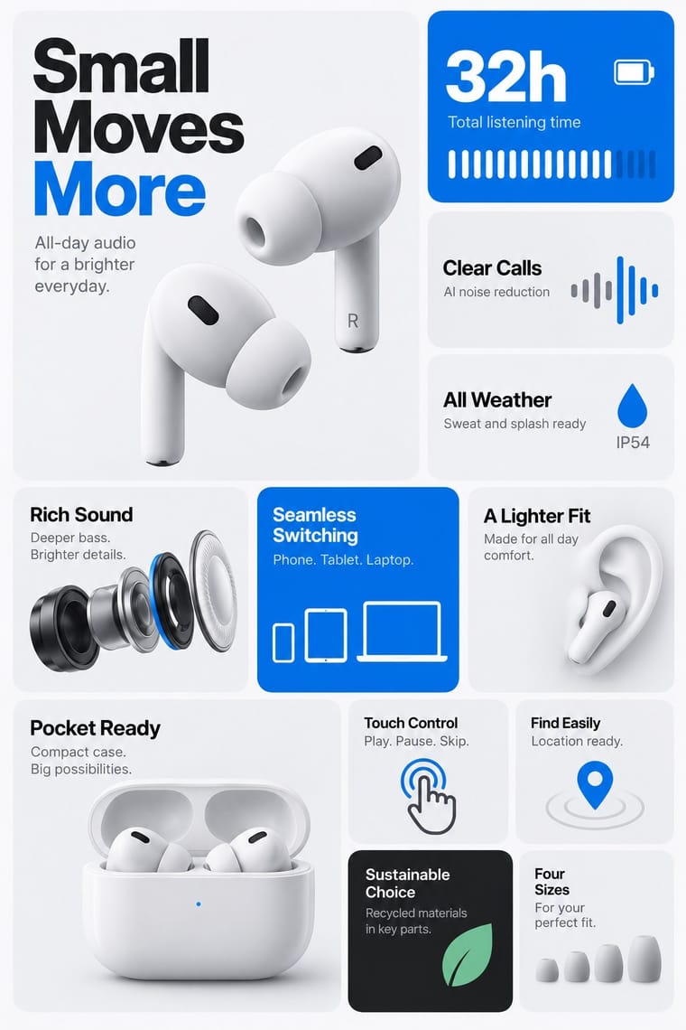
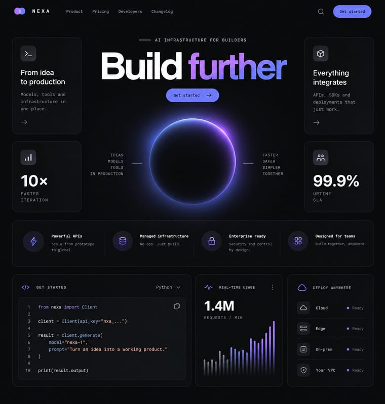
Bento Feature-Grid Design × Dark Tech Minimalism
Set the tiles on a near-black ground with hairline borders to get the dark SaaS variant of the same mosaic.
Mix them and make something Bento Feature-Grid Design Dark Tech Minimalism
01
What each style brings
Each part of the design comes from the style with the stronger say in it, and each style gives at least two.
Bento Feature-Grid Design Dark Tech Minimalism
- Type from Dark Tech Minimalism
- Colour from Dark Tech Minimalism
- Form from Bento Feature-Grid Design
- Composition from Bento Feature-Grid Design
- Surface from Dark Tech Minimalism
02
The type
Open fonts standing in for each style’s own type, which is often hand-drawn or commercial.
Text · Dark Tech Minimalism
The dark, restrained aesthetic of developer tools and SaaS landing pages since about 2019: near-black grounds, grey type ramps, a neutral grotesque such as Inter, hairline borders, soft radial glows and bento grids of crisp product screenshots. Informally named after Linear's website and shared by Vercel, Raycast and many imitators, it borrows the look of code editors to signal precision and premium engineering.
Inter; Dark Tech Minimalism used Inter and Geist
03
The colours
The ground and leading colours come from Dark Tech Minimalism, with a counter-accent from Bento Feature-Grid Design. The ink reads on the ground at 4.5:1 or more.
Bento Feature-Grid Design Dark Tech Minimalism
-
#08090aground · 36% -
#f7f8f8ink · 14% -
#a855f7accent · 18% -
#0071e3accent · 14% -
#5e6ad2accent · 10% -
#6e6e73accent · 8%
As CSS
:root {
  --ground: #08090a;
  --ink: #f7f8f8;
  --accent-1: #a855f7;
  --accent-2: #0071e3;
  --accent-3: #5e6ad2;
  --accent-4: #6e6e73;
  --font-display: "Inter", sans-serif;
  --font-text: "Inter", sans-serif;
}
04
The two styles
05
More combinations
With Bento Feature-Grid Design
With Dark Tech Minimalism
- Generative & Dynamic Identities Pairs well · Run a generative shader or particle field behind the hero to replace stock imagery with live, on-brand texture.
- Corporate Memphis Contrasts · Dark tech minimalism displaced Corporate Memphis on SaaS sites; reintroduce one illustration only if the page genuinely lacks warmth.
- Neo-Brutalism Contrasts · A section of bright, outlined neo-brutalist boxes can break a monotonous dark page or signal an indie side project.
- Neo-Swiss Revival Pairs well · Borrow neo-Swiss grids and big, tightly tracked grotesque headlines to give dark product pages editorial structure.
- Newsroom Data Graphics & Scrollytelling Contrasts · The dark dashboard shows unannotated metrics in tiles for people who already know what to look for; the newsroom chart sits on white and tells a general reader in words what the data shows. Add a finding title and one annotation when a dashboard has to explain itself.
- Glassmorphism Pairs well · On near-black grounds, a single glass pane with a 1px light border and a soft glow adds depth without clutter.
- Rave & Acid House Graphics Contrasts · Both live on black, but one whispers and one shouts; borrow a single neon gradient to wake up a restrained dark interface.
- Synthwave / Outrun Contrasts · Both live on dark grounds, but dark tech minimalism keeps gradients faint and drops nostalgia and ornament; switch to it when the neon sunset would shout over the content.