Style combination · Contrasts
Bento Feature-Grid Design × Corporate Memphis
Replace diagram tiles with rubbery figure illustration to see how much the mosaic depends on evidence-led content.
Mix them and make something Bento Feature-Grid Design Corporate Memphis
01
What each style brings
Each part of the design comes from the style with the stronger say in it, and each style gives at least two.
Bento Feature-Grid Design Corporate Memphis
- Type from Corporate Memphis
- Colour from Corporate Memphis
- Form from Corporate Memphis
- Composition from Bento Feature-Grid Design
- Surface from Bento Feature-Grid Design
02
The type
Open fonts standing in for each style’s own type, which is often hand-drawn or commercial.
Text · Bento Feature-Grid Design
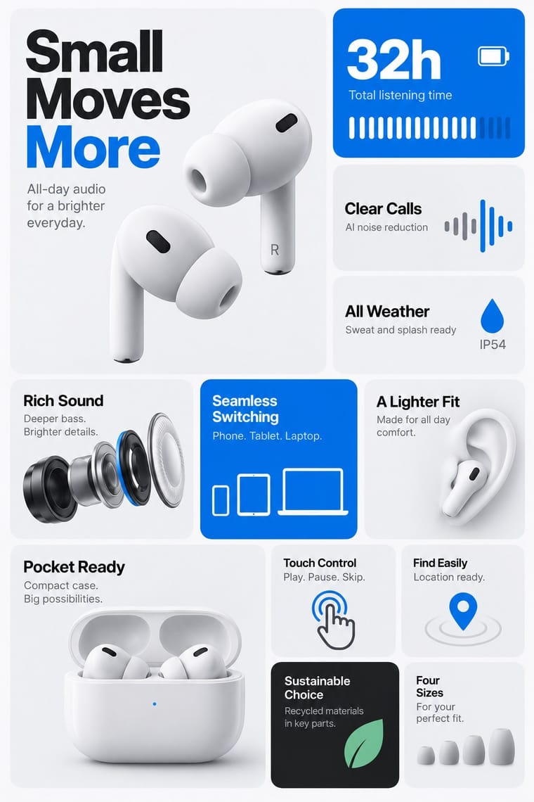
A feature-presentation layout that tells one product story as a mosaic of unequal rounded compartments on a shared grid. Each tile carries a short headline plus a photograph, statistic, screenshot or diagram. Examples cluster around product slides and SaaS pages from about 2020-2021. Parented to material-design rather than flat-design because its unit is the spaced card, and tiles may carry photography, gradients and shadows. The palette is an Apple-slide example.
Inter; Bento Feature-Grid Design used Inter and SF Pro
03
The colours
The ground and leading colours come from Corporate Memphis, with a counter-accent from Bento Feature-Grid Design. The ink reads on the ground at 4.5:1 or more.
Bento Feature-Grid Design Corporate Memphis
-
#ffffffground · 36% -
#2f2e41ink · 14% -
#ffc857accent · 18% -
#0071e3accent · 14% -
#6c63ffaccent · 10% -
#6e6e73accent · 8%
As CSS
:root {
  --ground: #ffffff;
  --ink: #2f2e41;
  --accent-1: #ffc857;
  --accent-2: #0071e3;
  --accent-3: #6c63ff;
  --accent-4: #6e6e73;
  --font-display: "Hanken Grotesk", sans-serif;
  --font-text: "Inter", sans-serif;
}
04
The two styles

05
More combinations
With Bento Feature-Grid Design
With Corporate Memphis
- Polish Poster School Contrasts · Polish poster metaphor and painterly ambiguity show how much illustration can say once it stops being generic.
- Risograph & Indie Print Culture Pairs well · Add riso grain and two spot inks to the figures to escape the over-familiar SaaS sheen and give them printed warmth.
- DTC 'Blanding' / Millennial Minimalism Pairs well · Its photo-led start-up sibling: pair Corporate Memphis figures with blanding's pastel ground and geometric sans when a brand needs both people and product.
- Brutalist Web Design Contrasts · Brutalism's raw honesty is the opposite of this friendly gloss; reach for it when a brand needs credibility over cheer.
- Memphis Design Contrasts · The original's real colour clash, irony and Sottsass or Du Pasquier patterns are the foil to generic confetti blobs; borrow one genuine Memphis pattern to give the illustration an edge.
- Rubber-Hose Revival (Cartoon Mascot Graphics) Contrasts · Both draw stretched figures in flat colour, but the revival gives each brand its own outlined, nostalgic mascot where Corporate Memphis uses interchangeable faceless people.
- CalArts Style (Rounded Cartoon Character Design) Pairs well · Both use flat fills and simplified figures; borrow its pastel UI-illustration palette, but keep faces and expressions, which Corporate Memphis drops.
- Data Humanism Contrasts · Both aim to feel warm and human, but Corporate Memphis draws generic faceless figures for mood, while data humanism draws the specific data of specific people. Replace stock warmth with a drawing of real data when a brand needs sincerity.