Style combination · Pairs well
Bengali Modernist Book Cover × Iranian Modernist Graphic Design
Both make the script the protagonist of the cover; borrow Iranian stacking and interlocking to push a Bengali title even further.
Mix them and make something Bengali Modernist Book Cover Iranian Modernist Graphic Design
01
What each style brings
Each part of the design comes from the style with the stronger say in it, and each style gives at least two.
Bengali Modernist Book Cover (Prachchhad) Iranian Modernist Graphic Design
- Type from Iranian Modernist Graphic Design
- Colour from Bengali Modernist Book Cover
- Form from Bengali Modernist Book Cover
- Composition from Iranian Modernist Graphic Design
- Surface from Bengali Modernist Book Cover
02
The type
Open fonts standing in for each style’s own type, which is often hand-drawn or commercial.
Text · Bengali Modernist Book Cover
A literary book-jacket culture that began at Calcutta's Signet Press in 1943, where Satyajit Ray and later Purnendu Pattrea made the hand-drawn Bengali title the main image of the cover. Qayyum Chowdhury and AKM Abdur Rouf carried it on in Dhaka. Stretched and interlocked letters, bold brush contours taken from pata scrolls, Kalighat and alpana, and two or three flat colours on pale stock give poetry, fiction and translations a modern face that is unmistakably Bengali.
Schibsted Grotesk; Bengali Modernist Book Cover used Hand-drawn Bangla (Bengali) display lettering with stretched matra and Bengali calligraphy
03
The colours
The ground and leading colours come from Bengali Modernist Book Cover, with a counter-accent from Iranian Modernist Graphic Design. The ink reads on the ground at 4.5:1 or more.
Bengali Modernist Book Cover (Prachchhad) Iranian Modernist Graphic Design
-
#f1e8d2ground · 36% -
#1a1a1aink · 14% -
#d9a62eaccent · 18% -
#c23b22accent · 14% -
#a8652aaccent · 10% -
#22406eaccent · 8%
As CSS
:root {
  --ground: #f1e8d2;
  --ink: #1a1a1a;
  --accent-1: #d9a62e;
  --accent-2: #c23b22;
  --accent-3: #a8652a;
  --accent-4: #22406e;
  --font-display: "Rakkas", cursive;
  --font-text: "Schibsted Grotesk", sans-serif;
}
04
The two styles
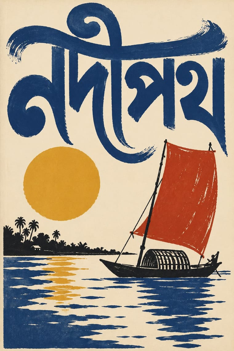
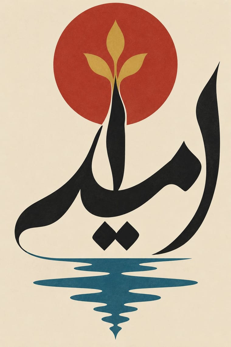
05
More combinations
With Bengali Modernist Book Cover
- Indian Institutional Modernism (NID) Contrasts · NID's compact institutional symbols and sans logotypes are the public-sector foil to these illustrated literary jackets; use the contrast to separate an institution's voice from its publishing arm.
- Kalighat Pat & Battala Bazaar Prints Pairs well · Go back to the Kalighat brush line and Battala woodcut for the figure, then let a drawn Bengali title carry the modern layout.
- American Mid-Century Modernism Pairs well · Combine mid-century flat cut-paper shapes and asymmetry with hand-drawn Bengali lettering for a literary jacket that works in two scripts.
- Santiniketan & Bengal School Graphics Pairs well · Satyajit Ray studied at Kala Bhavana from 1940 to 1942 before designing Signet Press covers; pair Santiniketan's brush line and earth colours with the prachchhad's hand-drawn Bengali titles.
- Republican Chinese Book Cover Design (Lu Xun & Tao Yuanqing) Pairs well · A parallel literary cover culture two decades later: hand-drawn titles, two or three flat inks and pale stock, with Bengali letters and folk contours in place of Chinese characters and Han reliefs.
- Penguin Paperback Design (Three Bands to the Marber Grid) Contrasts · Contemporary opposites in literary covers: Signet Press drew a new hand-lettered title for every book, Penguin set the same typeface in the same place on every one; choose by whether the series or the single title should lead.
With Iranian Modernist Graphic Design
- Polish Poster School Pairs well · Combine the Polish school's painted metaphor with Persian lettering for a conceptual cultural poster.
- International Typographic Style Contrasts · Iranian designers deliberately sidestepped the Swiss grid; set neutral Latin type against expressive Persian letters to dramatise system versus script.
- Cairo–Beirut Arab Modernist Book & Periodical Design Pairs well · Tehran's Kanoon and Beirut's Dar al-Fata al-Arabi were parallel 1970s children's-publishing cultures; combine Persian calligraphic covers with Arab picture-book drawing for a regional series.
- Islamic Geometric & Calligraphic Tradition Pairs well · Use girih geometry as the hidden construction grid for stretched and interlocked calligraphic letters.
- Square Kufic (Bannāʾī) Pairs well · Persian Wikipedia records bannāʾī in modern posters, logos and letterheads, and the atlas's Iranian modernist entry counts it among its Persian scripts; pair a square-Kufic title block with a Nastaʿlīq line and one flat figure for a Persian cultural poster.
- Persian Popular Narrative (Lithographs & Coffeehouse Painting) Pairs well · Farshid Mesghali collaged coloured clippings of Qajar lithograph illustrations for a poster for the Tehran International Festival of Films for Children and Young Adults (dated November 1967 by Marzolph); crop and enlarge a hatched lithograph figure inside a modernist, white-ground layout.
- Greek Tourism Modernism (EOT) Contrasts · Both are 1960s national modernisms that turned heritage into modern posters: Tehran built it from calligraphic letterforms, EOT from photographed antiquities under a single word of sans; compare them to choose between letter-led and object-led heritage modernism.
- Turkish Modernist Poster & Graphic Design Contrasts · Its Iranian contemporary also learned from the Polish poster, but built its posters on Persian calligraphy and miniature; after the 1928 alphabet reform Turkish designers worked in Latin letters and quoted Kufic only as a reduced sign. Choose Tehran when the letterform should be the protagonist, Istanbul when a drawn figure should be.