Style combination · Contrasts
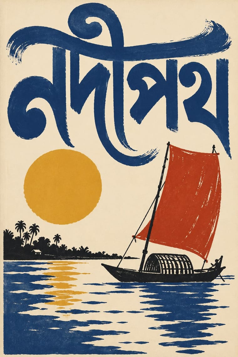
Bengali Modernist Book Cover × Indian Institutional Modernism
NID's compact institutional symbols and sans logotypes are the public-sector foil to these illustrated literary jackets; use the contrast to separate an institution's voice from its publishing arm.
Calcutta's lettering-led literary jackets are the hand-made counterpart to institutional symbols and grids; contrast them to decide how personal a cultural identity should feel.
Mix them and make something Bengali Modernist Book Cover Indian Institutional Modernism
01
What each style brings
Each part of the design comes from the style with the stronger say in it, and each style gives at least two.
Bengali Modernist Book Cover (Prachchhad) Indian Institutional Modernism (NID)
- Type from Bengali Modernist Book Cover
- Colour from Bengali Modernist Book Cover
- Form from Indian Institutional Modernism
- Composition from Indian Institutional Modernism
- Surface from Bengali Modernist Book Cover
02
The type
Open fonts standing in for each style’s own type, which is often hand-drawn or commercial.
Display · Bengali Modernist Book Cover
Tomorrow
Rozha One, standing in for Hand-drawn Bangla (Bengali) display lettering with stretched matra
Text · Indian Institutional Modernism
The design culture of independent India's public institutions, banks and broadcasters. It was shaped by Charles and Ray Eames's India Report (1958) and by the National Institute of Design (1961), whose Bauhaus- and Ulm-derived teaching drew on visiting designers such as Armin Hofmann, Adrian Frutiger and Ivan Chermayeff. It produced compact geometric symbols, bilingual Latin–Devanagari logotypes and systematic identities that gave the young nation a modern public face drawn from Indian forms.
Inter; Indian Institutional Modernism used Devanagari and Gurmukhi and regional-script logotypes
03
The colours
The ground and leading colours come from Bengali Modernist Book Cover, with a counter-accent from Indian Institutional Modernism. The ink reads on the ground at 4.5:1 or more.
Bengali Modernist Book Cover (Prachchhad) Indian Institutional Modernism (NID)
-
#f1e8d2ground · 36% -
#1a1a1aink · 14% -
#d9a62eaccent · 18% -
#f26a21accent · 14% -
#c23b22accent · 10% -
#22409aaccent · 8%
As CSS
:root {
  --ground: #f1e8d2;
  --ink: #1a1a1a;
  --accent-1: #d9a62e;
  --accent-2: #f26a21;
  --accent-3: #c23b22;
  --accent-4: #22409a;
  --font-display: "Rozha One", serif;
  --font-text: "Inter", sans-serif;
}
04
The two styles

05
More combinations
With Bengali Modernist Book Cover
- Iranian Modernist Graphic Design Pairs well · Both make the script the protagonist of the cover; borrow Iranian stacking and interlocking to push a Bengali title even further.
- Kalighat Pat & Battala Bazaar Prints Pairs well · Go back to the Kalighat brush line and Battala woodcut for the figure, then let a drawn Bengali title carry the modern layout.
- American Mid-Century Modernism Pairs well · Combine mid-century flat cut-paper shapes and asymmetry with hand-drawn Bengali lettering for a literary jacket that works in two scripts.
- Santiniketan & Bengal School Graphics Pairs well · Satyajit Ray studied at Kala Bhavana from 1940 to 1942 before designing Signet Press covers; pair Santiniketan's brush line and earth colours with the prachchhad's hand-drawn Bengali titles.
- Republican Chinese Book Cover Design (Lu Xun & Tao Yuanqing) Pairs well · A parallel literary cover culture two decades later: hand-drawn titles, two or three flat inks and pale stock, with Bengali letters and folk contours in place of Chinese characters and Han reliefs.
- Penguin Paperback Design (Three Bands to the Marber Grid) Contrasts · Contemporary opposites in literary covers: Signet Press drew a new hand-lettered title for every book, Penguin set the same typeface in the same place on every one; choose by whether the series or the single title should lead.
With Indian Institutional Modernism
- Hand-Painted Bollywood Poster Contrasts · Set a hand-painted film poster's melodrama beside a reductive public-sector mark to contrast popular and institutional India.
- Isotype Pictorial Statistics Pairs well · Add Isotype counting figures to the symbol system for public-information campaigns that work across literacy levels.
- Corporate Identity Modernism Pairs well · Use corporate modernism's standards-manual discipline to roll a bilingual Indian mark out consistently across every script.
- Indian Calendar & Bazaar Art Contrasts · Bazaar calendar art's glossy deities and crowded borders are what NID modernism reacted against; quote one for a deliberate high-low clash.
- Mithila (Madhubani) Painting Pairs well · Set one bordered Mithila panel, credited to its painter, inside the quiet grid and white space of NID modernism, so the dense line work becomes the single focal point of an otherwise restrained Indian layout.
- Santiniketan & Bengal School Graphics Contrasts · Independent India's next public face, from NID, swapped hand-painted figures and illumination for geometric symbols and sans-serif logotypes; the pair marks the turn from craft nationalism to systematic identity.
- Indian Pop-Kitsch Design (Desi Kitsch) Contrasts · Happily Unmarried commissioned designers trained at NID and NIFT; set a restrained NID-style grid and sans serif against one loud kitsch icon to show the two faces of Indian design school culture.