Style combination · Pairs well
Corporate Identity Modernism × Ottoman Tughra
Treat the tughra as an early counterpart of the corporate mark: one owned sign carried across decrees, coins, seals, gates and stamps. Borrow corporate modernism's discipline of application, but draw a new Arabic-script mark with a calligrapher rather than reducing a historical tughra to a logo.
Mix them and make something Corporate Identity Modernism Ottoman Tughra
01
What each style brings
Each part of the design comes from the style with the stronger say in it, and each style gives at least two.
Corporate Identity Modernism Ottoman Tughra & Dîvânî Chancery Calligraphy
- Type from Ottoman Tughra
- Colour from Corporate Identity Modernism
- Form from Ottoman Tughra
- Composition from Corporate Identity Modernism
- Surface from Corporate Identity Modernism
02
The type
Open fonts standing in for each style’s own type, which is often hand-drawn or commercial.
Display · Ottoman Tughra
Notice
Cinzel, standing in for Celî dîvânî, the monumental form for panels and inscriptions, mastered by the leading dîvânî calligraphers such as Sâmi Efendi and Kâmil Akdik; after the 1928 alphabet reform it lived on in a few celî dîvânî panels by famous calligraphers of the last generation, and dîvânî is still taught in Cairo
Text · Corporate Identity Modernism
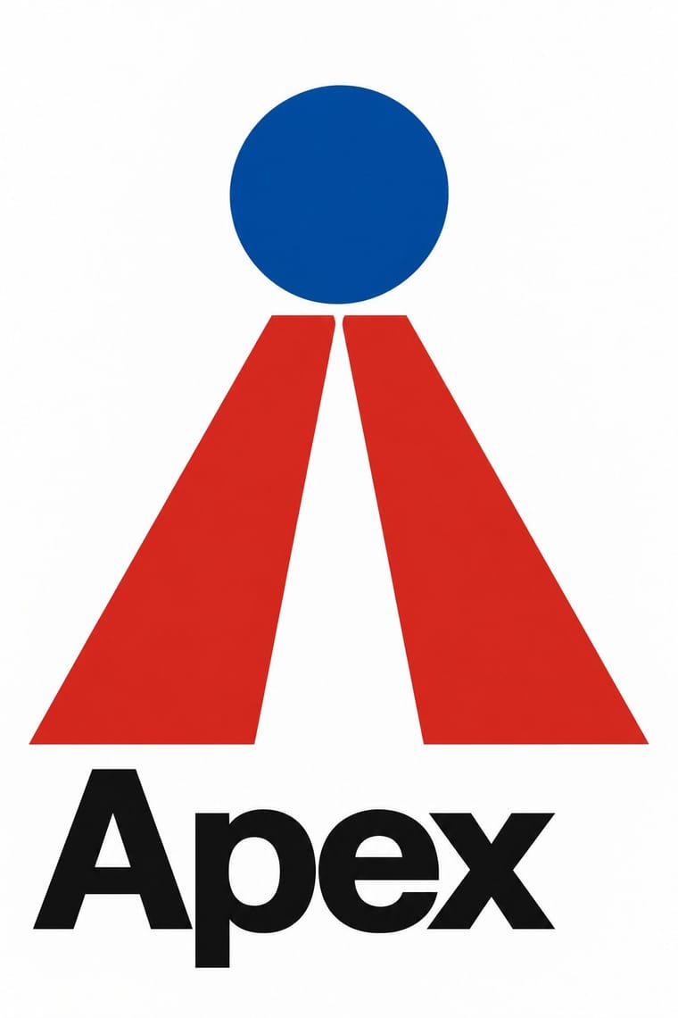
Modernist reduction applied to corporate communication. A company's whole public face (trademark, logotype, stationery, packaging, vehicles and signage) was unified by an abstract symbol, a single typeface and one colour, all policed by a graphic standards manual. Pioneered by Paul Rand, Chermayeff & Geismar, Unimark and Lippincott & Margulies, it made the reductive mark and the grid the visual language of multinational business and government.
Inter; Corporate Identity Modernism used Helvetica and Univers
03
The colours
The ground and leading colours come from Corporate Identity Modernism, with a counter-accent from Ottoman Tughra. The ink reads on the ground at 4.5:1 or more.
Corporate Identity Modernism Ottoman Tughra & Dîvânî Chancery Calligraphy
-
#ffffffground · 36% -
#111111ink · 14% -
#d7261eaccent · 18% -
#2e4ea6accent · 14% -
#bf9a52accent · 10% -
#a4a9adaccent · 8%
As CSS
:root {
  --ground: #ffffff;
  --ink: #111111;
  --accent-1: #d7261e;
  --accent-2: #2e4ea6;
  --accent-3: #bf9a52;
  --accent-4: #a4a9ad;
  --font-display: "Cinzel", serif;
  --font-text: "Inter", sans-serif;
}
Use it with care
Ottoman Tughra & Dîvânî Chancery Calligraphy: A tughra is the personal mark of one sovereign and spells his name with a prayer for victory: do not redraw a historical sultan's tughra as a brand logo, product stamp or decorative texture, do not present a new design as a historical one, and never fill the form with invented pseudo-Arabic. The calligraphy behind the tughra and Dîvânî, hüsn-i hat, is a living craft passed on through apprenticeship (UNESCO Representative List, 2021), so commission a hattat for a new tughra and have every word read by a fluent reader of Ottoman Turkish. The tughra is also a sign of Ottoman rule: where that rule is remembered as conquest, as in parts of the Balkans, Greece, Armenia and the Arab world, or is invoked by nationalist politics, it can read as a claim to that rule, so check how the audience will read it. The tughra form is also used for sacred texts, such as Qur'anic verses, hadith and the names of the founders of Sufi orders, and Popov showed a 'tughra of Allah' in Kazan; such compositions follow the parent tradition's rules: never crop, distort or mirror them, and keep them off floors, footwear and throwaway surfaces.
04
The two styles
05
More combinations
With Corporate Identity Modernism
- Corporate Memphis Contrasts · Its successor trades abstract authority for rubbery friendliness; compare the two to decide how institutional or human a brand should feel.
- Generative & Dynamic Identities Pairs well · Keep the manual's mark, colour and grid as constants and let generative rules vary one parameter, so the system still reads as one company.
- Flat Design Pairs well · Flat UI inherits these reductive marks; reuse their clear-space and colour-code discipline when scaling icons across screens.
- Punk & DIY Zine Contrasts · Punk's ransom-note lettering is the anti-manual; one torn, xeroxed element against a corporate grid reads instantly as critique.
- Plakatstil / Sachplakat Pairs well · Its brand-name-plus-object formula prefigures logo-led identity; pair it with a modernist grid for confident product campaigns.
- Risograph & Indie Print Culture Contrasts · Exact Pantone-matched corporate colour is the opposite of riso's drifting inks; use the contrast to signal independence.
- Contemporary Arabic & Dual-Script Type Design Pairs well · Roll a matched Arabic–Latin family through a standards manual so both scripts carry the identity with equal authority.
- Milanese Industrial Modernism (Olivetti, Pirelli, Studio Boggeri) Contrasts · American corporate identity policed one mark through a manual, while Milan let artists vary the language; compare the two when deciding how strict a brand system should be.
With Ottoman Tughra
- Contemporary Arabic & Dual-Script Type Design Pairs well · Keep hand-drawn calligraphy for the mark itself and set the running text in a well-made contemporary Arabic typeface with a matched Latin companion, instead of imitating Dîvânî in body text.
- Kamon (Japanese Family Crests) Contrasts · Kamon are compact, symmetric roundels of plants and objects in one flat colour, the tughra a sprawling, asymmetric word-mark; both show how one owned mark can travel across documents, cloth, objects and buildings.
- Early Turkish Republican Graphic Design Contrasts · The end of the sultanate in 1922 retired the tughra (its last on stamps that year), and the Republic replaced Arabic script with the Latin alphabet in 1928; its hand-lettered Latin posters are the deliberate opposite of the chancery's sultanic calligraphy.
- European Heraldry Contrasts · Both mark a sovereign's identity and authority, but heraldry does it with charges and tinctures on a shield and the tughra with the ruler's name alone; compare them to decide whether an identity should be pictured or written.
- Square Kufic (Bannāʾī) Contrasts · Square Kufic binds Arabic letters to a square grid of straight strokes; the tughra frees them into sweeping loops and tall shafts. Use the grid for a modular, tiled emblem and the tughra for a single flourishing signature.
- Islamic Geometric & Calligraphic Tradition Contrasts · The parent tradition repeats girih and arabesque edge to edge across a whole surface; the tughra concentrates the same calligraphy and illumination into one owned mark on an empty sheet. Choose the tughra when a design needs a single emblem, and the parent when it needs a field.
- Chinese Calligraphy & Seal Carving (Shufa & Zhuanke) Contrasts · The tughra makes a ruler's written name the giant emblem of a document; the Chinese seal keeps the name small, square and red beside the writing, so decide whether the signature is the picture or the counterweight.