Style combination · Contrasts
European Heraldry × Ottoman Tughra
Both mark a sovereign's identity and authority, but heraldry does it with charges and tinctures on a shield and the tughra with the ruler's name alone; compare them to decide whether an identity should be pictured or written.
Mix them and make something European Heraldry Ottoman Tughra
01
What each style brings
Each part of the design comes from the style with the stronger say in it, and each style gives at least two.
European Heraldry Ottoman Tughra & Dîvânî Chancery Calligraphy
- Type from Ottoman Tughra
- Colour from European Heraldry
- Form from European Heraldry
-
Ottoman Tughra avoids stylised figuration: this is where the two pull against each other, which is the point of the contrast.
- Composition from Ottoman Tughra
- Surface from European Heraldry
02
The type
Open fonts standing in for each style’s own type, which is often hand-drawn or commercial.
Display · Ottoman Tughra
Atlas
Cinzel, standing in for Celî dîvânî, the monumental form for panels and inscriptions, mastered by the leading dîvânî calligraphers such as Sâmi Efendi and Kâmil Akdik; after the 1928 alphabet reform it lived on in a few celî dîvânî panels by famous calligraphers of the last generation, and dîvânî is still taught in Cairo
Text · European Heraldry
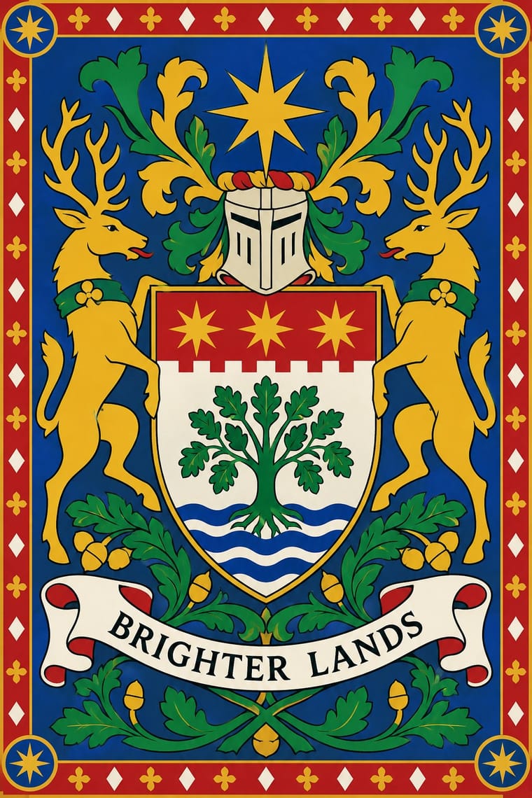
The hereditary identifying devices of medieval Europe's knights and seals, codified into a rule-bound grammar still used by states, cities, churches, universities and families. A coat of arms is defined by its written blazon, not by a drawing: a few flat tinctures (two metals, five colours and the furs) that keep metal off metal and colour off colour, a shield divided by bold ordinaries, and stylised charges in fixed poses, redrawn by every age in its own idiom and combined by impalement and quartering.
Libre Caslon Text; European Heraldry used Gothic book and cursive hands naming the bearer above or beside each shield in medieval rolls of arms and armorials, as 'die coninc van denmarke' beside the Danish flag in the Gelre Armorial and Mottoes lettered on a scroll beneath the shield
03
The colours
The ground and leading colours come from European Heraldry, with a counter-accent from Ottoman Tughra. The ink reads on the ground at 4.5:1 or more.
European Heraldry Ottoman Tughra & Dîvânî Chancery Calligraphy
-
#f4f1e8ground · 36% -
#141414ink · 14% -
#e8b923accent · 18% -
#2e4ea6accent · 14% -
#b5121baccent · 10% -
#bf9a52accent · 8%
As CSS
:root {
  --ground: #f4f1e8;
  --ink: #141414;
  --accent-1: #e8b923;
  --accent-2: #2e4ea6;
  --accent-3: #b5121b;
  --accent-4: #bf9a52;
  --font-display: "Cinzel", serif;
  --font-text: "Libre Caslon Text", serif;
}
Use it with care
European Heraldry: A coat of arms belongs to a particular bearer, lineage or (in Polish heraldry) clan, not to everyone with a surname: in Scotland it can belong to only one person at a time and the Court of the Lord Lyon can fine those who usurp arms and have the offending items removed or destroyed, state arms are protected against unauthorised registration and use as trademarks under Article 6ter of the Paris Convention, and many European cities and universities protect their arms as trademarks. Design new arms by the rules of the tradition rather than copying a real family's, city's or state's arms for decoration or branding, and do not present invented arms as a family's historic coat of arms. Crusader and Templar shields and knights with crosses on their chests or shields have also become far-right insignia (Charlottesville 2017, the US Capitol 2021), and neo-Nazis use an eagle loosely based on German coats of arms, though not every eagle derives from it; check how a cross, an eagle or a crusading knight will read before using it, and avoid pairing them with militant or ethnic-nationalist themes.
Ottoman Tughra & Dîvânî Chancery Calligraphy: A tughra is the personal mark of one sovereign and spells his name with a prayer for victory: do not redraw a historical sultan's tughra as a brand logo, product stamp or decorative texture, do not present a new design as a historical one, and never fill the form with invented pseudo-Arabic. The calligraphy behind the tughra and Dîvânî, hüsn-i hat, is a living craft passed on through apprenticeship (UNESCO Representative List, 2021), so commission a hattat for a new tughra and have every word read by a fluent reader of Ottoman Turkish. The tughra is also a sign of Ottoman rule: where that rule is remembered as conquest, as in parts of the Balkans, Greece, Armenia and the Arab world, or is invoked by nationalist politics, it can read as a claim to that rule, so check how the audience will read it. The tughra form is also used for sacred texts, such as Qur'anic verses, hadith and the names of the founders of Sufi orders, and Popov showed a 'tughra of Allah' in Kazan; such compositions follow the parent tradition's rules: never crop, distort or mirror them, and keep them off floors, footwear and throwaway surfaces.
04
The two styles
05
More combinations
With European Heraldry
- Hipster Artisanal Revival Contrasts · The craft badge borrows heraldry's air of lineage with an 'Est.' date and crossed arrows on kraft paper, while a real coat of arms is a granted or inherited, blazoned identity in strong tinctures; set the two side by side to show the difference between quoting heritage and holding it.
- Corporate Identity Modernism Pairs well · A coat of arms already is an identity defined by a specification rather than one drawing, applied to seals, banners, buildings and documents; Finnish municipal arms of the 1950s show how its flat two-tincture discipline reads as a modern mark, so use blazon-like rules to write a logo that can be redrawn without losing itself.
- Gothic Blackletter & Fraktur Tradition Pairs well · Medieval armorials name their shields in Gothic hands and German heraldic artists such as Otto Hupp also drew Fraktur; pair a flat Gothic shield with a blackletter name or motto for a certificate, diploma or civic document, checking how the broken script will read politically.
- Kamon (Japanese Family Crests) Contrasts · Both are hereditary emblem systems that began in the twelfth century and mark kinship by small codified variations, but a mon is a single-colour silhouette drawn round a centre while a coat of arms is a shield of contrasting tinctures read by the rule of tincture; compare them to choose between a one-ink crest and a coloured, partitioned one.
- Ultras Graphics (Curva Banners and Tifo) Contrasts · Both raise colours and emblems over a fighting company, but heraldry codifies one bearer's arms by rule, while a curva borrows the city's arms, a skull or a film villain for one afternoon and paints it the size of a stand; choose between a fixed blazon and a crowd-made, temporary emblem.
- Tarot de Marseille Woodcut Cards Pairs well · The Emperor's and Empress's eagle shields and the maker's escutcheon on the 2 of Coupes come from armory; pair heraldic tinctures and charges with a tarot figure for a crest-like card or label.
- Natural Wine Label Art Contrasts · The crest is the device of the classic château label that natural wine replaced with a face or an animal; put one heraldic charge beside a doodle to show which side of the wine world a bottle stands on.
- Emblem Book (Motto, Picture & Epigram) Contrasts · Alciato's book opens with the arms of the Duchy of Milan, but a coat of arms identifies a bearer by the rules of blazon, while an emblem is a freely invented moral riddle that needs its motto and verse; use arms to identify and an emblem to argue.
With Ottoman Tughra
- Contemporary Arabic & Dual-Script Type Design Pairs well · Keep hand-drawn calligraphy for the mark itself and set the running text in a well-made contemporary Arabic typeface with a matched Latin companion, instead of imitating Dîvânî in body text.
- Kamon (Japanese Family Crests) Contrasts · Kamon are compact, symmetric roundels of plants and objects in one flat colour, the tughra a sprawling, asymmetric word-mark; both show how one owned mark can travel across documents, cloth, objects and buildings.
- Corporate Identity Modernism Pairs well · Treat the tughra as an early counterpart of the corporate mark: one owned sign carried across decrees, coins, seals, gates and stamps. Borrow corporate modernism's discipline of application, but draw a new Arabic-script mark with a calligrapher rather than reducing a historical tughra to a logo.
- Early Turkish Republican Graphic Design Contrasts · The end of the sultanate in 1922 retired the tughra (its last on stamps that year), and the Republic replaced Arabic script with the Latin alphabet in 1928; its hand-lettered Latin posters are the deliberate opposite of the chancery's sultanic calligraphy.
- Square Kufic (Bannāʾī) Contrasts · Square Kufic binds Arabic letters to a square grid of straight strokes; the tughra frees them into sweeping loops and tall shafts. Use the grid for a modular, tiled emblem and the tughra for a single flourishing signature.
- Islamic Geometric & Calligraphic Tradition Contrasts · The parent tradition repeats girih and arabesque edge to edge across a whole surface; the tughra concentrates the same calligraphy and illumination into one owned mark on an empty sheet. Choose the tughra when a design needs a single emblem, and the parent when it needs a field.
- Chinese Calligraphy & Seal Carving (Shufa & Zhuanke) Contrasts · The tughra makes a ruler's written name the giant emblem of a document; the Chinese seal keeps the name small, square and red beside the writing, so decide whether the signature is the picture or the counterweight.