Style combination · Contrasts
Generative-AI Image Aesthetic × Risograph
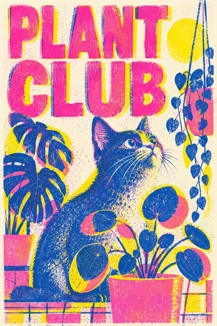
Riso grain, two inks and misregistration are everything AI gloss is not; run generated images through riso to restore texture and authorship.
Mix them and make something Generative-AI Image Aesthetic Risograph
01
What each style brings
Each part of the design comes from the style with the stronger say in it, and each style gives at least two.
Generative-AI Image Aesthetic Risograph & Indie Print Culture
- Type from Risograph
- Colour from Risograph
- Form from Generative-AI Image Aesthetic
- Composition from Generative-AI Image Aesthetic
- Surface from Risograph
02
The type
Open fonts standing in for each style’s own type, which is often hand-drawn or commercial.
Display · Risograph
Yay!
Inter Tight, standing in for Neo-grotesques set large (e.g. Akzidenz-Grotesk, Helvetica)
Text · Generative-AI Image Aesthetic
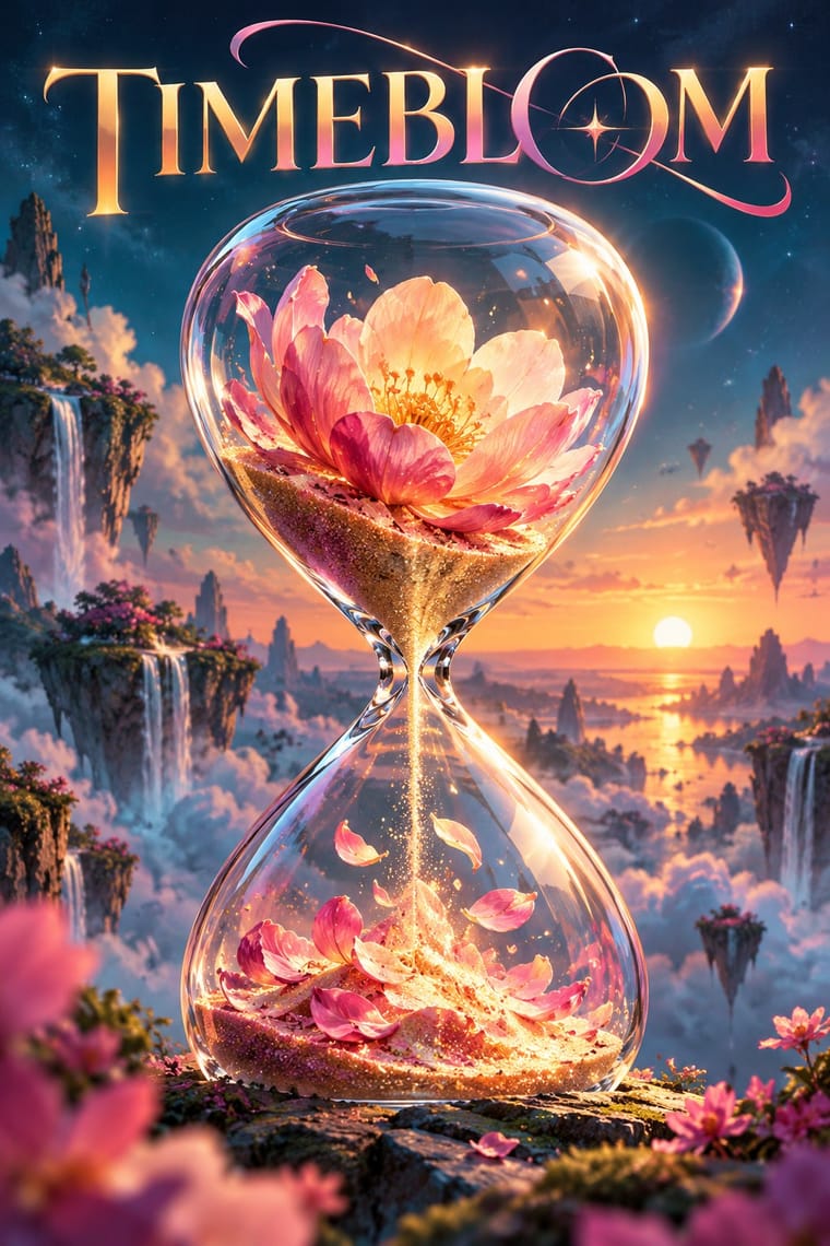
The house look of pictures synthesised by text-to-image diffusion models since 2022. It is a frictionless, over-polished realism of airbrushed skin, cinematic rim light, shallow depth of field and centred hero subjects, able to render impossible hybrids with photographic plausibility or mimic any named style on demand. Its tells are garbled pseudo-text, extra fingers and melting detail; its mass production for engagement earned it the name 'slop'.
Space Grotesk; Generative-AI Image Aesthetic used Model-generated pseudo-lettering and Sans headlines overlaid in post with system or brand fonts
03
The colours
The ground and leading colours come from Risograph, with a counter-accent from Generative-AI Image Aesthetic. The ink reads on the ground at 4.5:1 or more.
Generative-AI Image Aesthetic Risograph & Indie Print Culture
-
#f4f1eaground · 36% -
#3255a4ink · 14% -
#ff48b0accent · 18% -
#f39a3daccent · 14% -
#f15060accent · 10% -
#c43d7daccent · 8%
As CSS
:root {
  --ground: #f4f1ea;
  --ink: #3255a4;
  --accent-1: #ff48b0;
  --accent-2: #f39a3d;
  --accent-3: #f15060;
  --accent-4: #c43d7d;
  --font-display: "Inter Tight", sans-serif;
  --font-text: "Space Grotesk", sans-serif;
}
Use it with care
Generative-AI Image Aesthetic: Diffusion models are trained on scraped images, often without artists' consent, and 'in the style of' prompts can imitate living illustrators and studios. Do not prompt with living artists' names, disclose AI generation, check for garbled text and anatomical errors, and commission illustrators when authorship matters. Purely generated images may not be protected by copyright: the US Copyright Office refused registration for Théâtre D'opéra Spatial in 2023.
04
The two styles
05
More combinations
With Generative-AI Image Aesthetic
- Vaporwave Pairs well · Vaporwave's ironic distance is the antidote to AI's earnest polish; frame generated images as found kitsch to make the artificiality the point.
- Generative & Dynamic Identities Contrasts · Rule-based generative identity designs the system and accepts abstract variation; AI imagery averages toward realism, so decide which kind of 'generative' a brief needs.
- Surrealist Graphics Pairs well · Prompts imitate surrealist dream logic; study Magritte's restraint so a generated hybrid feels intended rather than averaged.
- NFT Profile-Picture Collections (CryptoPunks to Bored Apes) Contrasts · PFP sets recombine hand-drawn trait layers with a simple script, while diffusion models synthesise every pixel; decide whether the authored layer drawing or the model's polish should show.
- Biobrand (Organic Biotech CGI) Contrasts · Generative images share the glossy gradient surface but lack a controlled product system; the biobrand fixes one authored render in a restrained layout.
- Northwest Coast Formline Design Contrasts · Generated 'Northwest Coast' imagery breaks both the formline grammar and crest ownership; when a project needs this language, commission a Northwest Coast artist instead of prompting a model.
- Lo-fi Anime Aesthetic Contrasts · Lofi Girl's policy rules out AI generation, AI upscaling and AI avatars resembling its characters in favour of handcrafted frames; keep the loop hand-animated and the room specific so it does not slide into glossy, averaged diffusion realism.
- 'Good Morning' Greeting Images (WhatsApp Forward Vernacular) Pairs well · Its over-polished glow and centred, impossibly perfect subjects match the dewy sweetness of a good-morning rose; check generated lettering letter by letter.
With Risograph
- Corporate Identity Modernism Contrasts · Exact Pantone-matched corporate colour is the opposite of riso's drifting inks; use the contrast to signal independence.
- Neo-Swiss Revival Pairs well · Print neo-Swiss grids in two fluorescent riso inks to soften their rigour with grain and overprint.
- Y2K Futurism Contrasts · Glossy chrome renders are everything a riso cannot print; set frictionless screen gloss against tactile grain for deliberate friction.
- WPA Silkscreen Posters Pairs well · WPA silkscreen's flat, separated colour translates directly to riso drums; borrow its layered spot-colour scenes.
- Literatura de Cordel Woodcut Pairs well · Print a cordel-style woodcut on a riso in one ink on tinted stock to keep the pocket-chapbook economy for zines and poetry pamphlets.
- Cubist Pictorial Space Pairs well · Print synthetic-Cubist planes as overlapping flat riso inks so the overprints do the faceting for you.
- Leningrad Avant-Garde Picture Book Pairs well · Today's riso picture books share the few flat inks, bare paper and speckled texture; print a Lebedev-style sequence of floating figures in two or three riso inks.
- Die Neue Typographie Pairs well · Two-colour riso printing suits its black-plus-red restraint for low-budget editorial and posters.