Style combination · Pairs well
Celtic Revival Illumination × Narbut School
Another national revival that rebuilds a native ornament and hand-lettering tradition as an identity system.
Mix them and make something Celtic Revival Illumination Narbut School
01
What each style brings
Each part of the design comes from the style with the stronger say in it, and each style gives at least two.
Celtic Revival Illumination & Lettering Narbut School (Ukrainian Baroque Revival Graphics)
- Type from Narbut School
- Colour from Narbut School
- Form from Celtic Revival Illumination
- Composition from Celtic Revival Illumination
- Surface from Celtic Revival Illumination
02
The type
Open fonts standing in for each style’s own type, which is often hand-drawn or commercial.
Display · Narbut School
Again
Federant; Narbut School used Narbut's hand-drawn Ukrainian Baroque lettering and initials and Hand-drawn Cossack-baroque title lettering on charters and banknotes
Text · Celtic Revival Illumination
Ornament and lettering of the Celtic Revival in Ireland, Scotland and the Isle of Man, modelled on Insular gospel books such as Kells and on carved stone crosses. Text sits in closed, symmetrical frames of knotwork, key pattern, spirals and interlaced beasts, its letters drawn in insular forms, knotted into the ornament or set in Gaelic type, in deep flat colours on vellum or paper. Its makers carried it from illuminated books and addresses to a nationalist memorial book, Gaelic League mastheads, magazines, the Irish Free State's first stamps and Liberty silver.
EB Garamond; Celtic Revival Illumination used Hand-drawn lettering after the majuscule and half-uncial of the Insular manuscripts, drawn into the ornament and Archibald Knox's interlaced Celtic lettering, drawn so densely into the ornament that it must be studied to be read
03
The colours
The ground and leading colours come from Narbut School, with a counter-accent from Celtic Revival Illumination. The ink reads on the ground at 4.5:1 or more.
Celtic Revival Illumination & Lettering Narbut School (Ukrainian Baroque Revival Graphics)
-
#f1ead8ground · 36% -
#111111ink · 14% -
#c9a227accent · 18% -
#7a1f1aaccent · 14% -
#2f4a73accent · 10% -
#1f5a3daccent · 8%
As CSS
:root {
  --ground: #f1ead8;
  --ink: #111111;
  --accent-1: #c9a227;
  --accent-2: #7a1f1a;
  --accent-3: #2f4a73;
  --accent-4: #1f5a3d;
  --font-display: "Federant", sans-serif;
  --font-text: "EB Garamond", serif;
}
Use it with care
Celtic Revival Illumination & Lettering: Its models are Christian gospel books and crosses, and many of its emblems are national and partisan: Leabhar na hAiséirghe is a memorial to the republican dead of 1916–23, including the Civil War, and the Celtic Cross stamp was adapted from a Sinn Féin label, so do not use these as neutral 'Irish' decoration where nationalist imagery is contested, as in Northern Ireland. The 1922 Map of Ireland stamp left out the border, and some in Northern Ireland and Britain read it as a claim to the northern counties, so an undivided map of the island is itself a political statement. A square cross interlocked with or surrounded by a circle is a widespread white-supremacist symbol, while the traditional Celtic cross has a long vertical shaft, so draw the cross accordingly and check knotwork marks in context. 'Celtic' and 'Irish' are not exclusive labels for Kells-type ornament: Insular art was made across Britain and Ireland, the Lindisfarne Gospels in Northumbria, and Kells itself possibly begun on Iona. George Bain died in 1968, so his drawings remain in copyright in the UK until the end of 2038: construct new knots by his methods rather than tracing his plates, and have any Irish or Scottish Gaelic text checked by a fluent reader.
04
The two styles
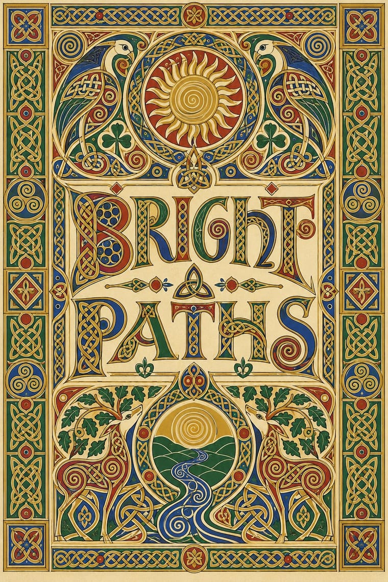
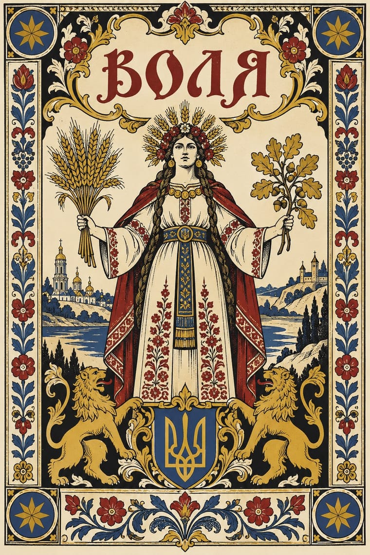
05
More combinations
With Celtic Revival Illumination
- Mir iskusstva Book Art Pairs well · A parallel national revival of the same decades: both turned medieval and folk ornament into the borders and initials of a modern book; combine for a heritage storybook framed in old ornament.
- Bezalel School Pairs well · Another national illumination of the 1900s–1920s, with hand-drawn national letters, jewel colours and gold inside heavy symmetrical frames; compare how each built a national art from ancient ornament.
- Gothic Blackletter & Fraktur Tradition Contrasts · The other national script of the same decades: Fraktur set German text until its ban in 1941, as Gaelic type set Irish until the mid-twentieth century; set the dark, broken gothic weave against the round, open insular letter.
- International Typographic Style Contrasts · Its exact opposite: hand-built, symmetrical, ornament-filled national pages against an asymmetric grid, neutral sans-serif and white space; borrow one knotted initial to warm a strict grid.
- Ethiopian Ge'ez Manuscript & Haräg Illumination Pairs well · Another Christian manuscript tradition that marks its divisions with interlace: set a haräg band of interlace and chequers beside a Celtic knotwork frame to compare a varied headpiece with a closed, compartmented border.
- Islamic Geometric & Calligraphic Tradition Pairs well · Both build sacred pages from interlaced strapwork constructed geometrically and framed symmetrically; set a Celtic knot border beside a girih panel to compare closed knotwork with an endless star tiling.
- Glasgow Style Contrasts · Scotland in the same years, but Glasgow stretched space, emptied it and set a few rosebuds on long verticals, while the Celtic Revival fills its compartments densely with knotwork; choose air or density.
- Armenian Manuscript Illumination Pairs well · Both build letters out of animals and interlace; set a bird-letter initial beside a knotted Celtic one to compare an initial made of whole birds with one made of interlaced beasts.
With Narbut School
- Lubok Popular Print Contrasts · Popular, coloured woodcut exuberance against Narbut's academic, restrained black line.
- Ukrainian Wartime Graphics (Saint Javelin, War Stamps and Be Brave Like Ukraine) Pairs well · A later revival (2022 onward) that draws on Ukrainian national imagery; not an influence on Narbut.
- Mir iskusstva Book Art Pairs well · Share the lineage of line drawing and bookish framing; Narbut turns it toward heraldry and state identity.
- International Typographic Style Contrasts · A gridded, ornament-free neutrality opposite to symmetric heraldic ornament.