Style combination · Pairs well
L'Association and French Alternative Comics × Risograph
Give a black-and-white comic a one- or two-ink Risograph cover to bring its small-press book design into today's indie print culture.
Mix them and make something L'Association and French Alternative Comics Risograph
01
What each style brings
Each part of the design comes from the style with the stronger say in it, and each style gives at least two.
L'Association and French Alternative Comics Risograph & Indie Print Culture
- Type from L'Association and French Alternative Comics
- Colour from Risograph
-
L'Association and French Alternative Comics avoids fluorescent & neon: this is where the two pull against each other.
- Form from L'Association and French Alternative Comics
- Composition from L'Association and French Alternative Comics
- Surface from Risograph
02
The type
Open fonts standing in for each style’s own type, which is often hand-drawn or commercial.
Display · L'Association and French Alternative Comics
Hello
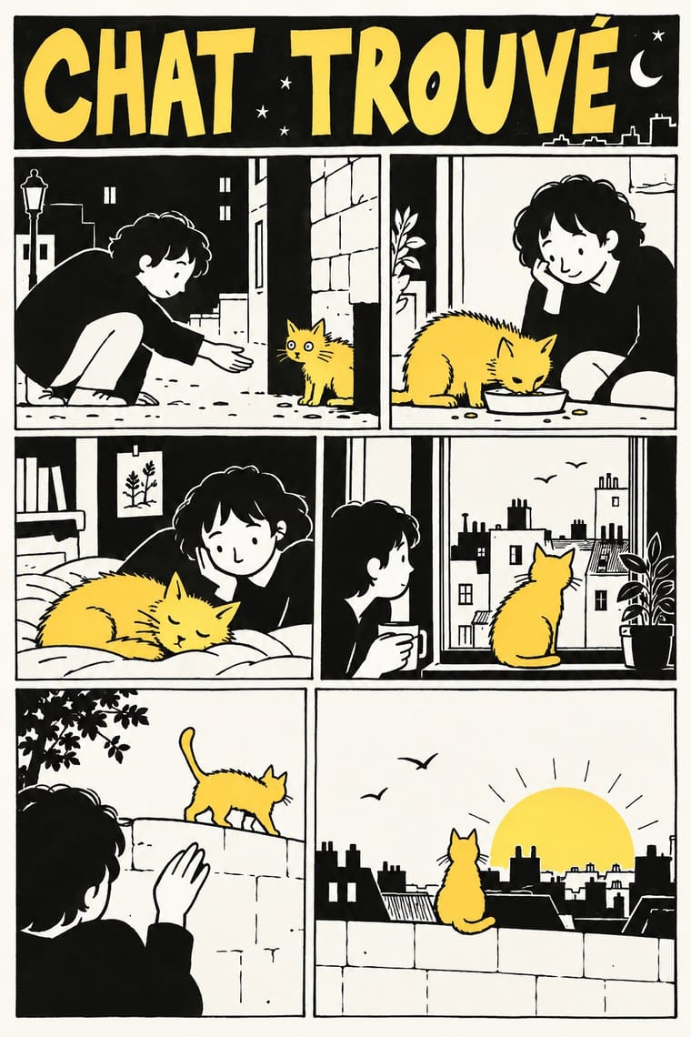
Londrina Solid, standing in for Captions and balloons lettered by hand in each author's own writing: slanted mixed-case handwriting in David B.'s caption boxes (Le Cheval blême, L'Ascension du Haut Mal), even capitals in Satrapi's (Persepolis), loose felt-tip capitals in Trondheim's balloons (Lapinot)
Text · Risograph
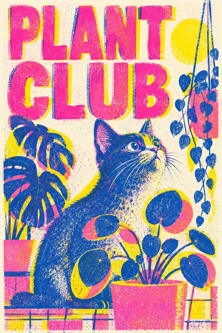
A contemporary culture of zines, art books, posters and prints made on Japanese Risograph stencil duplicators, whose soy-based spot inks (fluorescent pink, yellow, blue, teal) are laid down one drum at a time. Designers embrace the machine's limits: translucent overprints, slight misregistration, grainy coverage and coarse halftones give flat illustration and type a warm, handmade vibrancy at low cost.
Inter; Risograph used Neo-grotesques set large and Monospace and typewriter faces
03
The colours
The ground and leading colours come from Risograph, with a counter-accent from L'Association and French Alternative Comics. The ink reads on the ground at 4.5:1 or more.
L'Association and French Alternative Comics Risograph & Indie Print Culture
-
#f4f1eaground · 36% -
#3255a4ink · 14% -
#ff48b0accent · 18% -
#ffb200accent · 14% -
#f15060accent · 10% -
#7cc7d9accent · 8%
As CSS
:root {
  --ground: #f4f1ea;
  --ink: #3255a4;
  --accent-1: #ff48b0;
  --accent-2: #ffb200;
  --accent-3: #f15060;
  --accent-4: #7cc7d9;
  --font-display: "Londrina Solid", cursive;
  --font-text: "Inter", sans-serif;
}
Use it with care
L'Association and French Alternative Comics: The leading authors are living, named people and much of the work is memoir of real events, so never ask an image model for a named author's hand, and never attribute invented pages or opinions to them; Persepolis tells a real Iranian childhood under revolution and war, so do not lift its veiled schoolgirls as generic shorthand for Iran or for Muslim women; and David B.'s monsters in L'Ascension du Haut Mal are one family's account of epilepsy, not a generic image of illness or disability.
04
The two styles
05
More combinations
With L'Association and French Alternative Comics
- Métal hurlant Science-Fiction Comics (Mœbius, Druillet & Les Humanoïdes Associés) Contrasts · Luminous colour, vast science-fiction vistas and painterly spreads against small black-and-white books about dreams, illness and family: the two poles of adult French comics.
- Ligne Claire (Franco-Belgian Clear Line) Contrasts · The colour adventure album with an even contour and researched backgrounds is exactly what these black-and-white memoirs in personal hands were made against; set a page of each side by side to show the break.
- Expressionist Woodcut Graphics Pairs well · Borrow the woodcut's harsh black masses and distorted figures, as Satrapi's drawing drew on German Expressionism, to give a black-and-white memoir page more weight.
- Story Manga (Postwar Japanese Comics) Contrasts · Both are black and white, but manga builds grey from screentone and motion from speed lines; here there is no grey at all, only solid black, white and patterned fills.
- Arab Independent Comics (Samandal, TokTok, Lab619, Skefkef) Pairs well · A younger many-handed small-press scene that also prints mostly in black ink; one of its Beirut titles won Angoulême's alternative comics prize in 2019. Pair the French book design with its dialect lettering and Risograph colour.
- Underground Comix Pairs well · A later French-language small-press scene, one of whose founders turned to psychedelic and autobiographical comics after discovering Crumb and Shelton, keeps the black ink and the single author's hand but clears the crowding and the shock; borrow its book design to give a comix page a calmer format.
With Risograph
- Corporate Identity Modernism Contrasts · Exact Pantone-matched corporate colour is the opposite of riso's drifting inks; use the contrast to signal independence.
- Neo-Swiss Revival Pairs well · Print neo-Swiss grids in two fluorescent riso inks to soften their rigour with grain and overprint.
- Y2K Futurism Contrasts · Glossy chrome renders are everything a riso cannot print; set frictionless screen gloss against tactile grain for deliberate friction.
- WPA Silkscreen Posters Pairs well · WPA silkscreen's flat, separated colour translates directly to riso drums; borrow its layered spot-colour scenes.
- Literatura de Cordel Woodcut Pairs well · Print a cordel-style woodcut on a riso in one ink on tinted stock to keep the pocket-chapbook economy for zines and poetry pamphlets.
- Cubist Pictorial Space Pairs well · Print synthetic-Cubist planes as overlapping flat riso inks so the overprints do the faceting for you.
- Leningrad Avant-Garde Picture Book Pairs well · Today's riso picture books share the few flat inks, bare paper and speckled texture; print a Lebedev-style sequence of floating figures in two or three riso inks.
- Die Neue Typographie Pairs well · Two-colour riso printing suits its black-plus-red restraint for low-budget editorial and posters.