Style combination · Contrasts
L'Association and French Alternative Comics × Ligne Claire
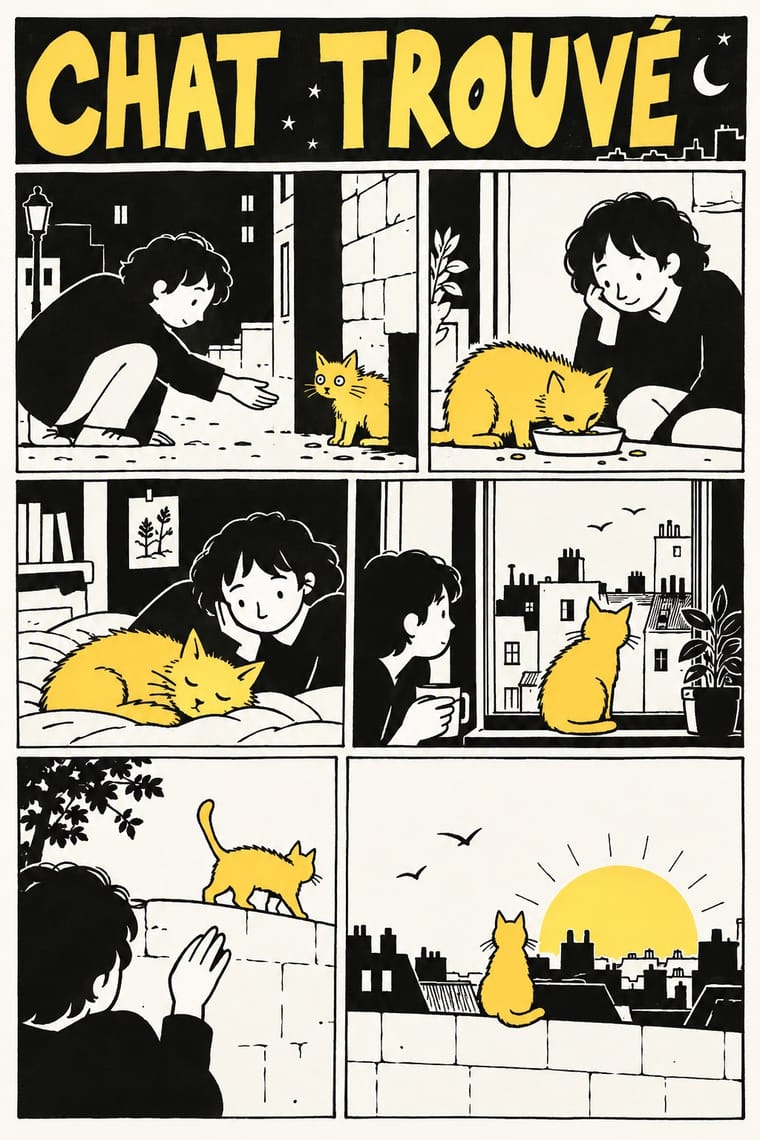
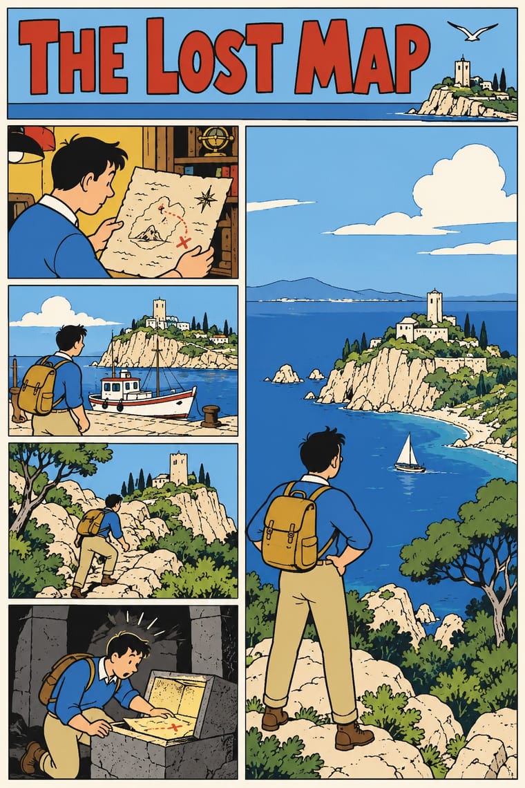
The colour adventure album with an even contour and researched backgrounds is exactly what these black-and-white memoirs in personal hands were made against; set a page of each side by side to show the break.
Mix them and make something L'Association and French Alternative Comics Ligne Claire
01
What each style brings
Each part of the design comes from the style with the stronger say in it, and each style gives at least two.
L'Association and French Alternative Comics Ligne Claire (Franco-Belgian Clear Line)
- Type from L'Association and French Alternative Comics
- Colour from Ligne Claire
-
L'Association and French Alternative Comics avoids full polychrome: this is where the two pull against each other, which is the point of the contrast.
- Form from Ligne Claire
- Composition from L'Association and French Alternative Comics
- Surface from L'Association and French Alternative Comics
02
The type
Open fonts standing in for each style’s own type, which is often hand-drawn or commercial.
Display · L'Association and French Alternative Comics
Wow
Londrina Solid, standing in for Captions and balloons lettered by hand in each author's own writing: slanted mixed-case handwriting in David B.'s caption boxes (Le Cheval blême, L'Ascension du Haut Mal), even capitals in Satrapi's (Persepolis), loose felt-tip capitals in Trondheim's balloons (Lapinot)
Text · Ligne Claire
The comic drawing style of Hergé's Tintin and the Brussels school, named 'klare lijn' by Joost Swarte in 1977. One even, unhatched contour closes every figure and object, and flat, bright colour fills it without shading. Caricatural characters stand in researched, realistically drawn streets, machines and landscapes, all evenly lit and equally legible. Revived from the late 1970s by Swarte, Chaland, Floc'h and Ted Benoit, it left the album page for posters, record sleeves, magazine covers, murals and advertising, often in a knowing 1950s-retro key.
Comic Neue; Ligne Claire used Bold hand-drawn capitals for titles and Heavy hand-drawn display capitals
03
The colours
The ground and leading colours come from Ligne Claire, with a counter-accent from L'Association and French Alternative Comics. The ink reads on the ground at 4.5:1 or more.
L'Association and French Alternative Comics Ligne Claire (Franco-Belgian Clear Line)
-
#fbf6e9ground · 36% -
#1a1a1aink · 14% -
#f0b73aaccent · 18% -
#ffb200accent · 14% -
#d8352aaccent · 10% -
#7cc7d9accent · 8%
As CSS
:root {
  --ground: #fbf6e9;
  --ink: #1a1a1a;
  --accent-1: #f0b73a;
  --accent-2: #ffb200;
  --accent-3: #d8352a;
  --accent-4: #7cc7d9;
  --font-display: "Londrina Solid", cursive;
  --font-text: "Comic Neue", cursive;
}
Use it with care
L'Association and French Alternative Comics: The leading authors are living, named people and much of the work is memoir of real events, so never ask an image model for a named author's hand, and never attribute invented pages or opinions to them; Persepolis tells a real Iranian childhood under revolution and war, so do not lift its veiled schoolgirls as generic shorthand for Iran or for Muslim women; and David B.'s monsters in L'Ascension du Haut Mal are one family's account of epilepsy, not a generic image of illness or disability.
Ligne Claire (Franco-Belgian Clear Line): Tintin and his companions and Blake and Mortimer are copyrighted characters whose rights are actively enforced (Hergé's by Tintinimaginatio, called Moulinsart until 2022), and Swarte, Floc'h and Meulen are working artists: draw your own characters, settings and lettering in the shared idiom, never ask an image model for these artists or characters by name, and never present a generated picture as theirs. The style's clarity does not neutralise its early content: Tintin in the Congo caricatures Congolese people as childlike in a colonial frame, and The Shooting Star, serialised in the German-controlled Le Soir in 1941–42, made its villain an antisemitic caricature of a Jewish financier (renamed in 1954). Simplify every character with the same economy as the lead, and never use exaggerated lips, noses, skin colour or dress as ethnic markers.
04
The two styles
05
More combinations
With L'Association and French Alternative Comics
- Métal hurlant Science-Fiction Comics (Mœbius, Druillet & Les Humanoïdes Associés) Contrasts · Luminous colour, vast science-fiction vistas and painterly spreads against small black-and-white books about dreams, illness and family: the two poles of adult French comics.
- Risograph & Indie Print Culture Pairs well · Give a black-and-white comic a one- or two-ink Risograph cover to bring its small-press book design into today's indie print culture.
- Expressionist Woodcut Graphics Pairs well · Borrow the woodcut's harsh black masses and distorted figures, as Satrapi's drawing drew on German Expressionism, to give a black-and-white memoir page more weight.
- Story Manga (Postwar Japanese Comics) Contrasts · Both are black and white, but manga builds grey from screentone and motion from speed lines; here there is no grey at all, only solid black, white and patterned fills.
- Arab Independent Comics (Samandal, TokTok, Lab619, Skefkef) Pairs well · A younger many-handed small-press scene that also prints mostly in black ink; one of its Beirut titles won Angoulême's alternative comics prize in 2019. Pair the French book design with its dialect lettering and Risograph colour.
- Underground Comix Pairs well · A later French-language small-press scene, one of whose founders turned to psychedelic and autobiographical comics after discovering Crumb and Shelton, keeps the black ink and the single author's hand but clears the crowding and the shock; borrow its book design to give a comix page a calmer format.
With Ligne Claire
- Lianhuanhua Picture-Story Books Contrasts · Both tell stories in outlined drawings; lianhuanhua gives each pocket-sized page one framed black-ink picture with a caption and keeps colour for the cover, ligne claire fills tiered multi-panel pages with balloons and flat, bright colour, caricatural figures in realistic settings.
- Push Pin Style Contrasts · Push Pin also draws in outline and flat colour, but mixes revived Victorian and Art Nouveau display faces, ornament and distortion; switch to ligne claire for one disciplined line, no ornament and evenly legible scenes.
- Flat Design Pairs well · Flat, unshaded fields translate directly to screen; add ligne claire's even outline and documented settings to flat UI illustration for scenes with more narrative and character, keeping ligne claire's perspective, which flat design avoids.
- Googie & Atomic Age Pairs well · The 1980s revival's 'atomic style' (Swarte's 1977 name for the 1950s Marcinelle school of Spirou, above all Jijé's early work, which Ever Meulen and Yves Chaland remade, with Franquin among Chaland's models; its figures rounder and more dynamic than Hergé's static, schematic line) drew on the optimism and futurism of the 1950s; Googie's boomerangs, starbursts, atoms and roadside signs suit a clear-line street scene or poster, drawn with ligne claire's even contour.
- Pop Art Graphics Contrasts · Hergé admired Roy Lichtenstein, but pop art blows single comic panels up, with enlarged Ben-Day dots and irony; choose ligne claire when the picture should tell a story legibly across a page, in flat, dot-free colour, rather than comment on mass media.
- City Pop Illustration Pairs well · Eizin Suzuki drew his city-pop sleeves and FM Station covers in a ligne-claire manner likened to Hergé's, rendering gradation in solid lines; pair them for a sunlit resort or street scene drawn in clear line under a deep blue sky, keeping ligne claire's unshaded colour.
- Korean Webtoon Graphics Contrasts · Both tell stories in outlined character art; webtoon scrolls one vertical strip on a phone with painterly gradients and brushwork, ligne claire tiers framed panels on a printed page in flat, unshaded colour.
- Ukiyo-e Woodblock Prints Pairs well · Hergé absorbed Chinese and Japanese woodcuts while researching The Blue Lotus, some of his seascapes recall Hokusai and Hiroshige, and the style was also influenced by Japan's shin-hanga prints; borrow ukiyo-e's waves, skies and outlined flat colour for a clear-line landscape.