Style combination · Contrasts
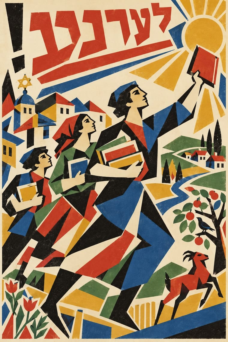
Russian Constructivism × Kultur-Lige
Lissitzky's next step: grotesque type, rules and photomontage replaced the drawn letter and folk motif; compare them to decide between a handmade, culturally rooted page and a machine-age one.
Mix them and make something Russian Constructivism Kultur-Lige
01
What each style brings
Each part of the design comes from the style with the stronger say in it, and each style gives at least two.
Russian Constructivism Kultur-Lige & Yiddish Avant-Garde Book Design
- Type from Russian Constructivism
- Colour from Russian Constructivism
- Form from Kultur-Lige
- Composition from Russian Constructivism
- Surface from Kultur-Lige
02
The type
Open fonts standing in for each style’s own type, which is often hand-drawn or commercial.
Display · Russian Constructivism
Tomorrow
Archivo Black, standing in for Soviet heavy grotesques (rubleny shrift)
Text · Kultur-Lige
The Yiddish modernist book of the Kultur-Lige, the secular Jewish culture league founded in Kyiv in 1918, and its circle: El Lissitzky, Issachar Ber Ryback, Iosif Chaikov, Boris Aronson and others, who sought a new Jewish art in the shtetl synagogues and tombstones they had recorded and in Cubo-Futurism and Suprematism. In children's books and poetry, hand-drawn Hebrew-alphabet letters are built into faceted folk pictures in flat lithographic colour or black line.
Jost; Kultur-Lige used The scribe's square Hebrew script (ktav ashuri), written by a sofer for Sikhes khulin (1917), whose 'wonderful' style Lissitzky set out to match in his illustrations and Lissitzky's hand-drawn Yiddish verses lithographed into each picture of Had Gadya (1919), the refrain running along the margins and closing in a circle at the foot
03
The colours
The ground and leading colours come from Russian Constructivism, with a counter-accent from Kultur-Lige. The ink reads on the ground at 4.5:1 or more.
Russian Constructivism Kultur-Lige & Yiddish Avant-Garde Book Design
-
#efe6d2ground · 36% -
#141414ink · 14% -
#d1261caccent · 18% -
#dca533accent · 14% -
#c9b28aaccent · 10% -
#6b6b66accent · 8%
As CSS
:root {
  --ground: #efe6d2;
  --ink: #141414;
  --accent-1: #d1261c;
  --accent-2: #dca533;
  --accent-3: #c9b28a;
  --accent-4: #6b6b66;
  --font-display: "Archivo Black", sans-serif;
  --font-text: "Jost", sans-serif;
}
Use it with care
Kultur-Lige & Yiddish Avant-Garde Book Design: These books quote sacred forms: Hebrew letters, the divine name (written in Had Gadya), scroll formats and scribal square script, synagogue art and tombstone inscriptions. Do not use the letters as decorative glyphs or mirror them; have any Yiddish or Hebrew written and checked by a fluent reader, and keep divine names and scroll and tombstone forms off throwaway or commercial items. The movement was secular and Yiddishist, a modern Jewish culture in Yiddish backed by Jewish socialist parties, Folkists and left-wing Zionists, not the Hebrew, Zionist art of Bezalel and not religious art, so do not present it as a generic 'Jewish look', and do not reduce its folk figures to stereotyped shtetl types. Many of its people were persecuted: Ryback's father was killed in the pogroms, and Hofshteyn, Markish, Bergelson and Kvitko were executed in Moscow on 12 August 1952. Chagall (d. 1985) and Chaikov (d. 1979) are still in copyright: draw your own letters and figures rather than reproducing their pages.
04
The two styles
05
More combinations
With Russian Constructivism
- Punk & DIY Zine Pairs well · Punk borrowed Constructivist red-and-black agitprop; combine photomontage with xerox grit for protest graphics.
- International Typographic Style Pairs well · Tame Constructivist diagonals with a Swiss grid for informational work that still feels urgent.
- Art Deco Contrasts · Deco used similar geometry to sell luxury; set the two side by side to decide whether a layout should glamorise or agitate.
- Belle Époque Lithographic Poster Contrasts · Sensual drawn figures versus photomontaged workers: use the contrast to choose between seduction and mobilisation.
- ROSTA Windows Contrasts · In the same revolutionary years the ROSTA windows used stencilled cartoon frames and rhymed captions instead of photomontage and set grotesques; compare them to choose between folk legibility and machine-age form.
- Suprematism Pairs well · Add photomontage and heavy grotesque slogans to Suprematist floating planes to turn pure form into a message.
- British Style Press (The Face, i-D and Arena) Pairs well · Brody's source: take Rodchenko's diagonals, heavy bars and huge constructed letters, swap agitprop for fashion and club culture, and you get a Face spread.
- Mavo Pairs well · Borrow Constructivism's heavy bars and one red ink to steady a Mavo page, but keep Mavo's hand-drawn characters and abstract machine linocuts instead of a single clear slogan.
With Kultur-Lige
- Bezalel School Contrasts · Two Jewish national arts of the same years with hand-drawn Hebrew letters: Bezalel's Zionist, biblical pictures in gilded symmetrical frames in Jerusalem, and the Kultur-Lige's secular Yiddish children's books in faceted avant-garde planes in Kyiv; never merge them into one 'Jewish style'.
- Russian Futurist Book Contrasts · Its parent in method: artists drawing the whole page and printing it by lithography in small runs. The Futurist book is Cyrillic, mostly black and deliberately crude; the Kultur-Lige book is in Yiddish, earnest, and at its most ambitious in colour, and builds its pages from the Hebrew letter and synagogue ornament.
- Suprematism Pairs well · Lissitzky moved from one to the other in 1919, giving Had Gadya a Suprematist inner jacket; set a folk figure and a drawn verse against a few floating planes to keep a story inside an abstract page.
- Leningrad Avant-Garde Picture Book Contrasts · The Leningrad picture book that followed is in Russian, uses flat cut-paper figures floating on white and drops folk ornament; choose the Kultur-Lige page when letters and ornament must carry a culture's memory.