Style combination · Pairs well
Japanese Postwar Modernism × Vienna Secession
Both reduce motifs to emblematic flat shapes in a calm field; combine them for elegant cultural posters.
Mix them and make something Japanese Postwar Modernism Vienna Secession
01
What each style brings
Each part of the design comes from the style with the stronger say in it, and each style gives at least two.
Japanese Postwar Modernism Vienna Secession
- Type from Vienna Secession
- Colour from Japanese Postwar Modernism
- Form from Vienna Secession
- Composition from Japanese Postwar Modernism
- Surface from Vienna Secession
02
The type
Open fonts standing in for each style’s own type, which is often hand-drawn or commercial.
Display · Vienna Secession
Form
Federant; Vienna Secession used Alfred Roller's elongated, interlocking block capitals and Koloman Moser's geometric display lettering
Text · Japanese Postwar Modernism
Building on the New Typography that Hiromu Hara and the Nippon Kobo circle had absorbed in the 1930s, Japan's postwar graphic designers fused the grid, sans-serif and objective photography of European modernism with indigenous traditions of family crests (kamon), asymmetry and charged emptiness (ma). From the Graphic '55 exhibition and the Nippon Design Center to Yusaku Kamekura's Tokyo 1964 Olympic posters, it produced bold emblematic symbols, luminous flat colour fields and photography of startling precision.
Zen Kaku Gothic New; Japanese Postwar Modernism used Gothic and Mincho
03
The colours
The ground and leading colours come from Japanese Postwar Modernism, with a counter-accent from Vienna Secession. The ink reads on the ground at 4.5:1 or more.
Japanese Postwar Modernism Vienna Secession
-
#f4f1eaground · 36% -
#111111ink · 14% -
#d7261eaccent · 18% -
#b8913aaccent · 14% -
#a3282aaccent · 10% -
#1d3c78accent · 8%
As CSS
:root {
  --ground: #f4f1ea;
  --ink: #111111;
  --accent-1: #d7261e;
  --accent-2: #b8913a;
  --accent-3: #a3282a;
  --accent-4: #1d3c78;
  --font-display: "Federant", sans-serif;
  --font-text: "Zen Kaku Gothic New", sans-serif;
}
04
The two styles
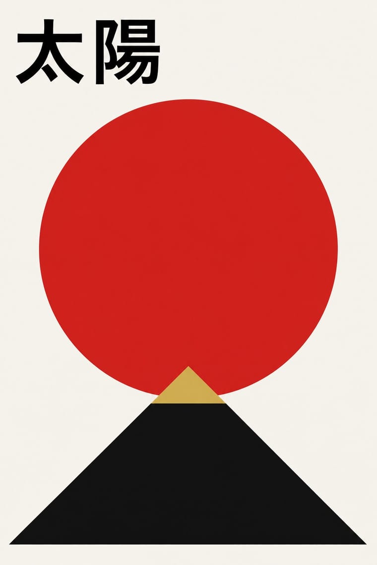
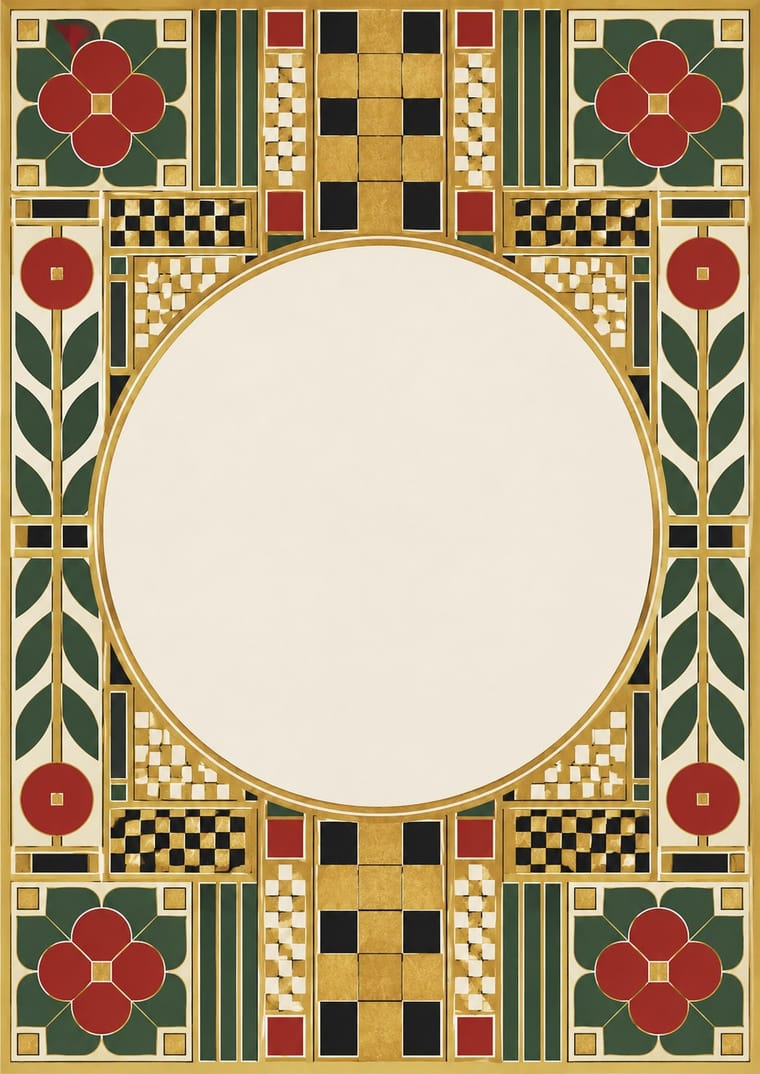
05
More combinations
With Japanese Postwar Modernism
- Angura Theatre Poster Contrasts · Tadanori Yokoo's angura theatre posters broke with this school; set one beside a Kamekura poster to calibrate restraint against overload.
- Kawaii Design Contrasts · Kawaii shows the soft, crowded face of Japanese visual culture; use the contrast to tune a brand between gravitas and charm.
- Minimalist Graphic Design Pairs well · Muji-era minimalism grew from this school; enlarge the empty field further and reduce the emblem to a whisper.
- International Typographic Style Pairs well · Graft a single emblematic disc or crest onto a Swiss grid to add focus and warmth without breaking its order.
- Hong Kong East–West Graphic Modernism Pairs well · Take its single emblem on an empty field, then add a bilingual Chinese–English lockup and one ink stroke to move the poster from Tokyo to Hong Kong.
- Finnish Bold Print (Marimekko Modernism) Pairs well · Japanese postwar emblematic colour fields share the reduction of nature to a few flat silhouettes, and two of Marimekko's leading designers, Katsuji Wakisaka and Fujiwo Ishimoto, came from Japan; pair one Japanese-style emblem with a Marimekko-scale repeat for a calm, nature-led identity.
- Yuru-chara (Japanese Local Mascot Design) Contrasts · Postwar Japanese identities give institutions abstract, grid-built marks; a yuru-chara gives a prefecture a face, a name and a body that walks into festivals and shakes hands.
- Taishō Roman & Lyrical Illustration Contrasts · Postwar modernism replaced this sentimental figure with emblems and empty fields; set one against the other to calibrate warmth against austerity.
With Vienna Secession
- Art Nouveau Contrasts · Set French whiplash against the Viennese square to show the turn from organic to geometric ornament within one decorative idiom.
- Art Deco Pairs well · Carry the Secession's squares, chequers and gold into Deco's stepped geometry for a luxurious but disciplined look.
- Glasgow Style Pairs well · Vienna learned from Glasgow in 1900; combine Mackintosh's attenuated verticals with Secession squares and gold for refined cultural branding.
- Josef Frank and Svenskt Tenn Botanical Prints Contrasts · Frank came out of Vienna, but his loose, asymmetric plant repeats are the opposite of the Secession's geometric, symmetrical ornament; compare a Wiener Werkstätte grid pattern with his free-growing trees.
- Nieuwe Kunst (Dutch Art Nouveau) Pairs well · Both pulled Art Nouveau toward geometry, symmetry and strict repetition in the same years; add Vienna's black, white and gold and its white margins to the Dutch earth-colour repeat for a more open page.
- Mir iskusstva Book Art Contrasts · Both enclose pictures in symmetrical frames, but Vienna squared the frame into grids and bars while the Russian book filled a wide border with folk and rococo motifs; pick geometric order or narrative ornament.
- Bezalel School Contrasts · Both put pictures inside symmetrical ornamental frames, but Vienna squared the frame into grids and bars while Bezalel filled it with Middle Eastern filigree, carpet and metalwork motifs.
- Wendingen & Amsterdam School Typography Contrasts · Both square their capitals into dense blocks inside symmetrical frames, but Vienna draws them by hand while Wendingen builds them from type metal; use the comparison to decide whether a heading should look drawn or assembled.