Style combination · Pairs well
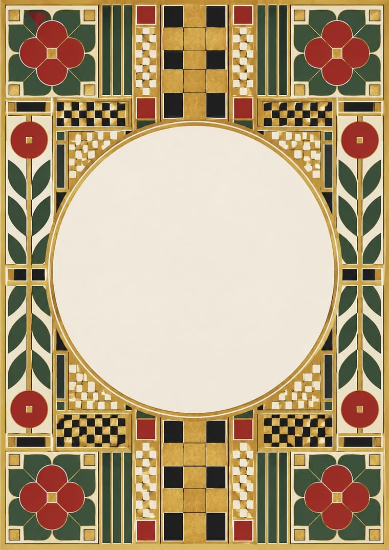
Glasgow Style × Vienna Secession
Vienna learned from Glasgow in 1900; combine Mackintosh's attenuated verticals with Secession squares and gold for refined cultural branding.
01
What each style brings
Each part of the design comes from the style with the stronger say in it, and each style gives at least two.
Glasgow Style Vienna Secession
- Type from Glasgow Style
- Colour from Glasgow Style
- Form from Glasgow Style
- Composition from Vienna Secession
- Surface from Vienna Secession
02
The type
Open fonts standing in for each style’s own type, which is often hand-drawn or commercial.
Display · Glasgow Style
Light
Poiret One; Glasgow Style used Charles Rennie Mackintosh's attenuated hand lettering and ITC Rennie Mackintosh
Text · Vienna Secession
The Viennese break with academic art led by Gustav Klimt, Koloman Moser, Josef Hoffmann and Alfred Roller, which pulled Art Nouveau toward the square, the grid and the flat plane. Its exhibition posters, the journal Ver Sacrum and Wiener Werkstätte graphics enclose stylised figures and dense geometric lettering in rectangular frames, in black, white and gold, with severe symmetrical clarity.
Libre Caslon Text; Vienna Secession used Alfred Roller's elongated, interlocking block capitals and Koloman Moser's geometric display lettering
03
The colours
The ground and leading colours come from Glasgow Style, with a counter-accent from Vienna Secession. The ink reads on the ground at 4.5:1 or more.
Glasgow Style Vienna Secession
-
#f4f1eaground · 36% -
#1d1b1aink · 14% -
#c9768eaccent · 18% -
#b8913aaccent · 14% -
#8e7aa8accent · 10% -
#a3282aaccent · 8%
As CSS
:root {
  --ground: #f4f1ea;
  --ink: #1d1b1a;
  --accent-1: #c9768e;
  --accent-2: #b8913a;
  --accent-3: #8e7aa8;
  --accent-4: #a3282a;
  --font-display: "Poiret One", sans-serif;
  --font-text: "Libre Caslon Text", serif;
}
04
The two styles
05
More combinations
With Glasgow Style
- Minimalist Graphic Design Pairs well · Mackintosh's white grounds and sparse ornament translate cleanly to minimal layouts; add one rose motif as a signature accent.
- Victorian Letterpress & Wood Type Contrasts · Use Victorian clutter as a foil to show how Glasgow's restraint and verticality cleared the page.
- Celtic Revival Illumination & Lettering Contrasts · Scotland in the same years, but Glasgow stretched space, emptied it and set a few rosebuds on long verticals, while the Celtic Revival fills its compartments densely with knotwork; choose air or density.
With Vienna Secession
- Art Nouveau Contrasts · Set French whiplash against the Viennese square to show the turn from organic to geometric ornament within one decorative idiom.
- Art Deco Pairs well · Carry the Secession's squares, chequers and gold into Deco's stepped geometry for a luxurious but disciplined look.
- Japanese Postwar Modernism Pairs well · Both reduce motifs to emblematic flat shapes in a calm field; combine them for elegant cultural posters.
- Josef Frank and Svenskt Tenn Botanical Prints Contrasts · Frank came out of Vienna, but his loose, asymmetric plant repeats are the opposite of the Secession's geometric, symmetrical ornament; compare a Wiener Werkstätte grid pattern with his free-growing trees.
- Nieuwe Kunst (Dutch Art Nouveau) Pairs well · Both pulled Art Nouveau toward geometry, symmetry and strict repetition in the same years; add Vienna's black, white and gold and its white margins to the Dutch earth-colour repeat for a more open page.
- Mir iskusstva Book Art Contrasts · Both enclose pictures in symmetrical frames, but Vienna squared the frame into grids and bars while the Russian book filled a wide border with folk and rococo motifs; pick geometric order or narrative ornament.
- Bezalel School Contrasts · Both put pictures inside symmetrical ornamental frames, but Vienna squared the frame into grids and bars while Bezalel filled it with Middle Eastern filigree, carpet and metalwork motifs.
- Wendingen & Amsterdam School Typography Contrasts · Both square their capitals into dense blocks inside symmetrical frames, but Vienna draws them by hand while Wendingen builds them from type metal; use the comparison to decide whether a heading should look drawn or assembled.