Style combination · Pairs well
Indian Institutional Modernism × Mithila Painting
Set one bordered Mithila panel, credited to its painter, inside the quiet grid and white space of NID modernism, so the dense line work becomes the single focal point of an otherwise restrained Indian layout.
Mix them and make something Indian Institutional Modernism Mithila Painting
01
What each style brings
Each part of the design comes from the style with the stronger say in it, and each style gives at least two.
Indian Institutional Modernism (NID) Mithila (Madhubani) Painting
- Type from Indian Institutional Modernism
- Colour from Indian Institutional Modernism
- Form from Mithila Painting
-
Indian Institutional Modernism avoids abundant decoration: this is where the two pull against each other.
- Composition from Indian Institutional Modernism
- Surface from Mithila Painting
02
The type
Open fonts standing in for each style’s own type, which is often hand-drawn or commercial.
Text · Mithila Painting
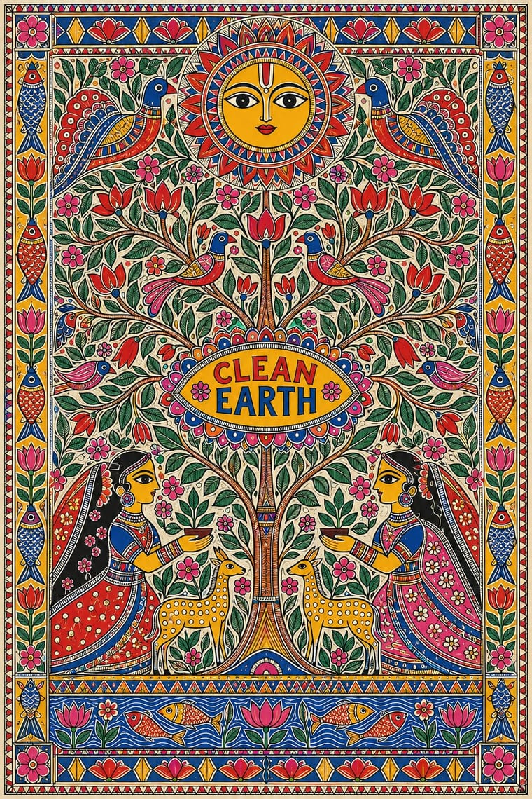
Women's ritual wall and floor painting from Mithila in north Bihar and Nepal's Terai, attested from at least the 14th century, seen by W. G. Archer after the 1934 earthquake and photographed in 1940, and moved to paper for sale in the 1966–67 drought. Line comes first: figures and borders are drawn, often as double outlines, then filled with flat colour (bharni), fine hatching (kachni) or tattoo-derived rings (godna) until no ground is left empty. Wedding-chamber kohbar images, deities, epics and, later, village life and world events fill sheets closed by border bands.
Fira Sans; Mithila Painting used Hand-written artist's names, villages and occasional titles in Devanagari or Latin script, added with the outlining nib along a margin or inside the border band and For accompanying Hindi or Maithili text in graphic work, a sturdy even-stroke Devanagari text face (for example Mukta or Hind) set outside the bordered painting rather than over its filled ground
03
The colours
The ground and leading colours come from Indian Institutional Modernism, with a counter-accent from Mithila Painting. The ink reads on the ground at 4.5:1 or more.
Indian Institutional Modernism (NID) Mithila (Madhubani) Painting
-
#fbfaf6ground · 36% -
#1a1a1aink · 14% -
#f26a21accent · 18% -
#e9b21baccent · 14% -
#22409aaccent · 10% -
#c8281eaccent · 8%
As CSS
:root {
  --ground: #fbfaf6;
  --ink: #1a1a1a;
  --accent-1: #f26a21;
  --accent-2: #e9b21b;
  --accent-3: #22409a;
  --accent-4: #c8281e;
  --font-display: "Inter Tight", sans-serif;
  --font-text: "Fira Sans", sans-serif;
}
Use it with care
Mithila (Madhubani) Painting: Mithila painting is the living craft and livelihood of named painters, mostly women, across many castes in Madhubani district and southern Nepal, and 'Madhubani paintings' is a registered Geographical Indication of Bihar (2006–07): do not label machine-printed, traced or AI-generated images as Madhubani or Mithila painting, never add a painter's name or signature to generated work, and commission, buy from or credit painters by name instead. Kohbar and aripana images are made for marriages, births and other rites and many sheets show Hindu deities still worshipped, so do not crop, distort or put them on disposable or demeaning goods. Godna painting and the figure of Raja Salhesh belong to the Dalit Dusadh community's history of claiming a place their painting was once denied; do not treat them as generic tribal pattern or erase whose tradition they are. Godna painting also draws on the tattoo art of Nat (Natin) women; credit that source too. Use 'Mithila painting' as the inclusive name: 'Madhubani' is the Bihar GI name, so do not label work by Maithil painters in Nepal, such as those of Janakpur, as Madhubani or Indian.
04
The two styles

05
More combinations
With Indian Institutional Modernism
- Hand-Painted Bollywood Poster Contrasts · Set a hand-painted film poster's melodrama beside a reductive public-sector mark to contrast popular and institutional India.
- Bengali Modernist Book Cover (Prachchhad) Contrasts · Calcutta's lettering-led literary jackets are the hand-made counterpart to institutional symbols and grids; contrast them to decide how personal a cultural identity should feel.
- Isotype Pictorial Statistics Pairs well · Add Isotype counting figures to the symbol system for public-information campaigns that work across literacy levels.
- Corporate Identity Modernism Pairs well · Use corporate modernism's standards-manual discipline to roll a bilingual Indian mark out consistently across every script.
- Indian Calendar & Bazaar Art Contrasts · Bazaar calendar art's glossy deities and crowded borders are what NID modernism reacted against; quote one for a deliberate high-low clash.
- Santiniketan & Bengal School Graphics Contrasts · Independent India's next public face, from NID, swapped hand-painted figures and illumination for geometric symbols and sans-serif logotypes; the pair marks the turn from craft nationalism to systematic identity.
- Indian Pop-Kitsch Design (Desi Kitsch) Contrasts · Happily Unmarried commissioned designers trained at NID and NIFT; set a restrained NID-style grid and sans serif against one loud kitsch icon to show the two faces of Indian design school culture.
With Mithila Painting
- Uli & Nsibidi Line and Sign Tradition Contrasts · Both are women's wall-painting traditions led by line, but uli sets a few swelling lines and named motifs asymmetrically on open ground, so the gaps count, while Mithila closes a symmetrical, bordered field and fills every gap. Set them side by side to show restraint against abundance.
- Kalighat Pat & Battala Bazaar Prints Contrasts · Both are eastern Indian popular pictures of deities, but Kalighat sweeps a few brushed figures across an empty sheet while Mithila outlines everything and fills every gap; set them side by side to show sparse brush against dense line.
- Batik Pattern Tradition Contrasts · Batik spreads a resist-dyed repeat evenly across cloth; Mithila builds a unique, hand-drawn composition around a centre and closes it with borders. Borrow one or the other, not both, to keep pattern and picture distinct.
- Chinese Paper-Cut (Jianzhi) Contrasts · Both are folk arts made mostly by rural women for weddings and other rites, with fish and lotus among their auspicious signs, but paper-cut is a silhouette, usually red, cut from one sheet and folded for mirror symmetry, while Mithila draws an outline and fills it with colour, hatching or rings until no ground is left. Use one of them, not a blend of the two.
- Data Humanism Pairs well · Both treat hand-drawn hatching, dots and repeated small marks as content; a kachni-style legend or border can give a hand-drawn chart a South Asian line vocabulary, provided a Mithila painter is commissioned for it.
- Indian Calendar & Bazaar Art Contrasts · Calendar art models its gods with gradients, gloss and illusionistic space; Mithila draws the same deities as flat outlined shapes on a packed ground. Use the contrast to separate devotional realism from devotional pattern.