Style combination · Pairs well
Fantasy User Interface × VTuber Avatar and Stream Graphics
For a science-fiction or AI persona in the manner of Kizuna AI, frame the avatar with HUD-style rings, brackets and hairline panels as its overlay, keeping the warm character in front of the cold interface.
Mix them and make something Fantasy User Interface VTuber Avatar and Stream Graphics
01
What each style brings
Each part of the design comes from the style with the stronger say in it, and each style gives at least two.
Fantasy User Interface (FUI) & Sci-Fi HUD VTuber Avatar and Stream Graphics
- Type from VTuber Avatar and Stream Graphics
- Colour from Fantasy User Interface
- Form from Fantasy User Interface
- Composition from Fantasy User Interface
- Surface from VTuber Avatar and Stream Graphics
02
The type
Open fonts standing in for each style’s own type, which is often hand-drawn or commercial.
Display · VTuber Avatar and Stream Graphics
Future
Mochiy Pop One; VTuber Avatar and Stream Graphics used Heavy, simple bold lettering for thumbnails and A custom name logo drawn for each character
Text · Fantasy User Interface
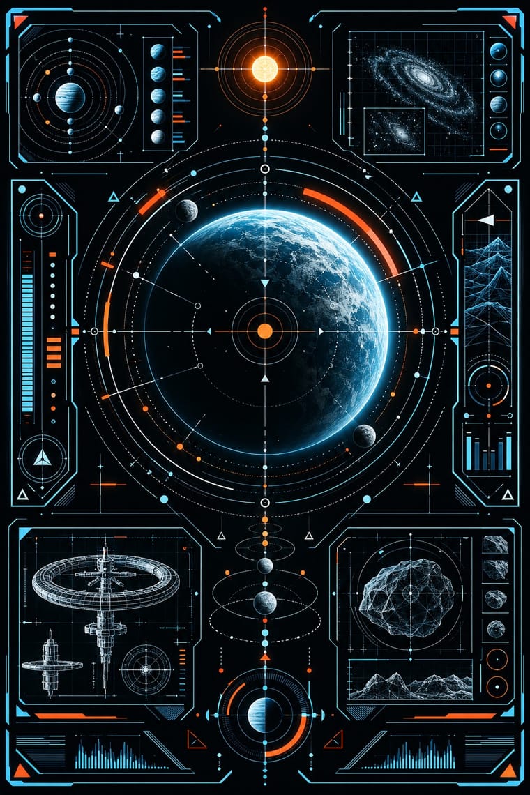
Fantasy user interfaces are the screen graphics of films and series: computer screens, holograms and helmet HUDs made to be watched for a few seconds, not used. From Minority Report and The Bourne Identity (2002) to Marvel's Iron Man HUDs, Mark Coleran, Cantina Creative and Territory Studio set glowing cyan and amber hairlines on black or clear glass. The screens carry concentric rings, targeting brackets, wireframe models, maps and dense micro-text in tracked capitals and monospace, packed to the edges around an open centre. Everything moves, and each screen has one big 'read'.
IBM Plex Mono; Fantasy User Interface used Squared, extended sans in the line of Microgramma (Aldo Novarese & Alessandro Butti, 1952) and Eurostile (Novarese, Nebiolo, 1962), science fiction's screen face since the Eurostile Bold Extended displays of 2001: A Space Odyssey (1968) and Blender (Nik Thoenen, 2003), an angular geometric sans that team member Navarro Parker named as the UI font of Oblivion
03
The colours
The ground and leading colours come from Fantasy User Interface, with a counter-accent from VTuber Avatar and Stream Graphics. The ink reads on the ground at 4.5:1 or more.
Fantasy User Interface (FUI) & Sci-Fi HUD VTuber Avatar and Stream Graphics
-
#04070bground · 36% -
#e4f6ffink · 14% -
#ff9d2eaccent · 18% -
#ffd84daccent · 14% -
#ff3b30accent · 10% -
#5bc8f5accent · 8%
As CSS
:root {
  --ground: #04070b;
  --ink: #e4f6ff;
  --accent-1: #ff9d2e;
  --accent-2: #ffd84d;
  --accent-3: #ff3b30;
  --accent-4: #5bc8f5;
  --font-display: "Mochiy Pop One", sans-serif;
  --font-text: "IBM Plex Mono", monospace;
}
Use it with care
Fantasy User Interface (FUI) & Sci-Fi HUD: FUI is built to be watched for seconds, not used. When the look moves into a real product, game or dashboard, keep the single read, size micro-text and contrast to WCAG rather than to a cinema screen, and keep flashing scans and blinking alerts to three flashes or fewer per second. Never present invented data as real data. Its targeting reticles, facial recognition and surveillance feeds come from military and intelligence imagery, so think about what they glamourise before using them on civilian or campaign work.
VTuber Avatar and Stream Graphics: VTuber characters are owned designs, by agencies or by the performers who commissioned them, and early contracts often gave the character's rights to the company, so performers who left had to start again as someone new: draw an original persona rather than a look-alike of Kizuna AI, Hololive or Nijisanji characters, and credit the illustrator ('mama') and the rigger ('papa'). The performer's anonymity is part of the form, so never attach a real person's face, name or photograph to an avatar or speculate about who is 'inside'. Do not default to a sexualised cute-girl type: scholars argue that avatar idols perpetuate female stereotypes and that the virtual idol industry commercialises sexism (Lu et al., CHI 2021).
04
The two styles
05
More combinations
With Fantasy User Interface
- Synthwave / Outrun Contrasts · Both glow in neon on black, but synthwave paints a nostalgic horizon with chrome and a sunset, while FUI shows a present-tense instrument. Choose synthwave for a mood and FUI when the picture has to look like it is working.
- Glassmorphism Contrasts · Glassmorphism's frosted, rounded panes are soft and meant to be used. FUI's clear glass carries hard hairlines and brackets. Take glassmorphism's blur behind an FUI panel when real users have to read it.
- Techno-Futurist Graphics Pairs well · Techno-futurism's invented corporate logos, pictograms and warning labels make convincing in-world branding for FUI screens. Use them on boot screens and on the agencies and corporations whose software the characters run.
- Generative & Dynamic Identities Pairs well · Drive FUI's maps, network graphs and counters from live data or code, so the screen's motion is real rather than a loop of invented numbers.
- Y2K Futurism Contrasts · Both float HUD-style overlays, wireframes and orbit lines, but Y2K sets them on glossy chrome, bubble forms and white voids for optimism, while FUI draws hairline instruments on black for a machine at work. Choose Y2K for a product's shine and FUI when the screen has to look busy with a task.
- Glitch Art & Datamosh Graphics Pairs well · For worn screens like Territory's Blade Runner 2049 playback, with screen burn, ghosting, colour degradation and glitches in place of clean glow, take the damage from glitch art's real file and signal faults rather than from a preset filter.
- International Typographic Style Pairs well · A strict grid and a neutral sans keep FUI's density legible; Oblivion hung every element on a dot grid. Start from Swiss order, then add rings and readouts.
- Dark Tech Minimalism Contrasts · Both put light type on black, but dark tech minimalism is a real interface that people use, sparse and quiet. FUI is staged for a camera and piles on density and glowing rings. Borrow one radial gauge for a product hero, not the whole cockpit.
With VTuber Avatar and Stream Graphics
- Emoji Pictographic Language Pairs well · Reduce the character and its motifs to small square pictographs for channel emotes and membership badges, so the community can type the persona into chat.
- Lo-fi Anime Aesthetic Contrasts · Both put an anime figure on a 24/7 YouTube screen, but lofi's figure is a looping painting turned away from the viewer; a VTuber faces the camera, lip-syncs to a real performer and reads the chat, so use lofi for background calm and VTuber graphics for presence and talk.
- Kawaii Design Contrasts · Its parent in cute character culture, but kawaii fixes a static mascot on pastel goods and print; switch to VTuber graphics when the character has to move, talk and answer a live chat, with a performer's voice and a whole stream screen around it.
- Superflat Contrasts · Both draw on anime and otaku imagery, but superflat flattens it ironically into all-over, unshaded fields; VTuber graphics play one character sincerely, with cel shading, overlap and a 2.5D rig that turns the head, as a persona fans follow from week to week.
- Danmaku Bullet-Comment Overlay Pairs well · On Bilibili and Niconico, viewers' bullet comments fly across the stream over the avatar. Leave the top lanes clear of the character's face and title, so the crowd's comments and the avatar share the screen without hiding it.
- Vocaloid Fan Illustration (Hatsune Miku Culture) Pairs well · Both use a shared, character-led look; add stream overlays and avatar frames.
- Light Novel Cover Illustration Pairs well · The same anime idiom moved onto live avatars; borrow its outlined name logos for a series mark, keep the cover's single still portrait.
- YouTube Thumbnail Style (the 'YouTube Face') Pairs well · VTubers follow the same rules for their thumbnails, a big cut-out at a third of the frame, a few outlined words, warm colours; swap the photographed face for the avatar to bring the idiom to a channel whose performer stays unseen.