Style combination · Pairs well
Emoji Pictographic Language × Kawaii Design
The atlas counts emoji among the channels through which kawaii went global (Kurita's set is a kawaii exemplar), and Pen magazine writes that kawaii culture 'gave birth to emojis'; the two share round faces and hearts. But emoji also cover neutral objects, hands, flags and symbols in saturated full colour, and live inside running text. Borrow kawaii's pastel tints and blushing cheeks to soften an emoji set for a children's product.
Mix them and make something Emoji Pictographic Language Kawaii Design
01
What each style brings
Each part of the design comes from the style with the stronger say in it, and each style gives at least two.
Emoji Pictographic Language Kawaii Design
- Type from Kawaii Design
- Colour from Kawaii Design
- Form from Emoji Pictographic Language
- Composition from Emoji Pictographic Language
- Surface from Emoji Pictographic Language
02
The type
Open fonts standing in for each style’s own type, which is often hand-drawn or commercial.
Display · Kawaii Design
Yay!
Zen Maru Gothic, standing in for Maru-ji (rounded teenage handwriting, 1970s)
Text · Emoji Pictographic Language
Pictographs typed as characters and set inline in running text. Born on Japanese mobile phones (J-Phone's 90 monochrome signs of 1997, the 176 single-colour signs that Shigetaka Kurita led for NTT DoCoMo's i-mode in 1999, on 12 x 12 pixel grids) and encoded in Unicode in 2009-2010, each emoji is one face, hand, object, food or flag centred on a square em with no ground. Unicode fixes the code point and name; each vendor draws its own full-colour version, flat, glossy or rendered in 3D, so one sign circulates in many visual dialects.
Shippori Mincho; Emoji Pictographic Language used The 12 x 12 dot external-character (gaiji) glyphs in which Japanese carriers first delivered emoji, typed into mobile mail and i-mode pages beside kana and kanji and Apple Color Emoji (2008)
03
The colours
The ground and leading colours come from Kawaii Design, with a counter-accent from Emoji Pictographic Language. The ink reads on the ground at 4.5:1 or more.
Emoji Pictographic Language Kawaii Design
-
#fff4a3ground · 36% -
#141414ink · 14% -
#e60033accent · 18% -
#f4a223accent · 14% -
#a8d8ffaccent · 10% -
#dd2e44accent · 8%
As CSS
:root {
  --ground: #fff4a3;
  --ink: #141414;
  --accent-1: #e60033;
  --accent-2: #f4a223;
  --accent-3: #a8d8ff;
  --accent-4: #dd2e44;
  --font-display: "Zen Maru Gothic", sans-serif;
  --font-text: "Shippori Mincho", serif;
}
Use it with care
Emoji Pictographic Language: Reuse emoji artwork only from the open sets and on their terms (Twemoji graphics CC BY 4.0 with attribution, OpenMoji CC BY-SA 4.0, Noto fonts SIL OFL 1.1, Fluent Emoji MIT); the platform sets are their vendors' own artwork, so do not lift their drawings into a logo or print. Remember too that a code point reaches each reader in that reader's vendor drawing, which may differ in detail, colour or even meaning from the one you chose.
04
The two styles
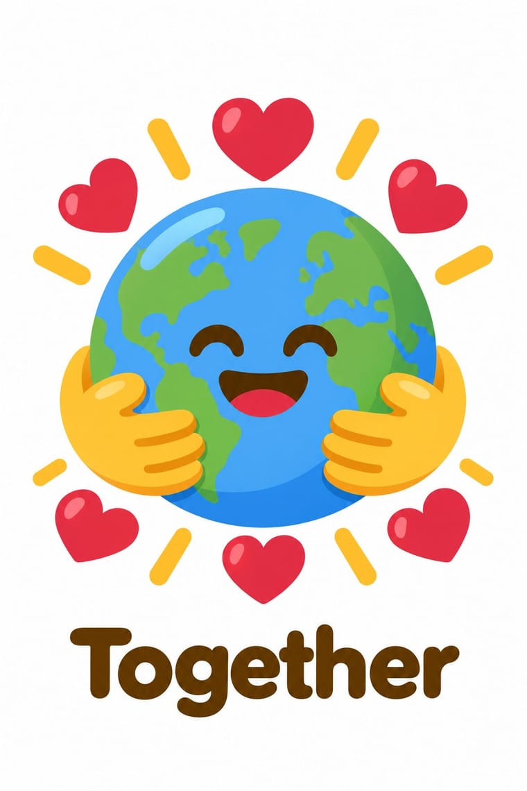
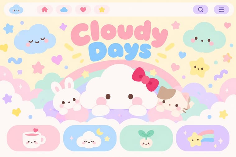
05
More combinations
With Emoji Pictographic Language
- Bitmap & Pixel Graphics Pairs well · Kurita's i-mode set was drawn on a 12 x 12 pixel grid; redraw a set on a coarse grid in a few flat colours for an early-keitai look, or set pixel emoji beside a bitmap font.
- Isotype Pictorial Statistics Contrasts · Isotype repeats identical pictograms in rows to count quantities; an emoji stands in for a word or a tone of voice inside a sentence. Use Isotype when the signs must count, emoji when they must talk.
- Story Manga (Postwar Japanese Comics) Pairs well · Kurita took manga's symbols for feeling (manpu), such as the sweat drop for nerves; lift more of manga's visual shorthand, speed lines, anger marks, sparkles, into a set's faces.
- Flat Design Pairs well · Twemoji and Fluent Flat use flat fills with no gradients or outlines, like flat UI icons; choose a flat set when emoji must sit inside a flat interface, a glossy or 3D set when they must stand out from it.
- Claymorphism & Soft 3D Contrasts · Microsoft's 3D Fluent set comes close to claymorphism's soft rendered forms, and the atlas's claymorphism entry counts the 3D Fluent set among its sources; but claymorphism builds whole interface scenes from inflated pastel shapes, while an emoji stays one sign at text size on a transparent ground. Pair a 3D emoji with clay cards only when it plays the role of an icon, not of a scene.
- VTuber Avatar and Stream Graphics Pairs well · Reduce the character and its motifs to small square pictographs for channel emotes and membership badges, so the community can type the persona into chat.
- Japanese Dense Web Design Pairs well · Emoji came out of Japan's phone web (J-Phone in 1997, i-mode in 1999), which commentators also credit with keeping these pages text-heavy; small pictographs set inline with text links add colour and signal to a dense list without taking space.
- Chat Reaction-Sticker Cartooning (LINE) Contrasts · Emoji are standardised, encoded pictographs; the shared trait is a pictorial reply, but these are authored, larger character performances.
With Kawaii Design
- Techno-Futurist Graphics Pairs well · A cute mascot inside a dense techno-corporate layout softens its satire; Groovisions' Chappie is the model.
- Grunge Typography Contrasts · Grunge's dirt and illegibility is kawaii's opposite; one cute character on a distressed texture creates knowing dissonance.
- Memphis Design Pairs well · Kawaii characters sit happily on Memphis pastel geometry; combine them for playful packaging with a little more edge.
- Dark Tech Minimalism Contrasts · Use a single pastel mascot or emoji moment to humanise a cold, dark interface without changing its structure.
- Claymorphism & Soft 3D Pairs well · Kawaii's oversized heads, minimal faces and scattered sparkles translate directly into clay volumes; use its character rules for mascots and emoji so the 3D figures stay simple and readable at small sizes.
- Moomin Graphics (Tove Jansson's Pen-Drawn World and its Licensed Afterlife) Contrasts · Its round, white characters sit near kawaii fancy goods, but they keep a hatched, melancholy world around them that kawaii fancy goods leave out.
- Superflat Contrasts · Kawaii offers sincere, simple, pastel cuteness for fancy goods; switch to Superflat when the cute should be saturated, crowded, many-eyed and ironic, a comment on consumer culture rather than a product of it.
- VTuber Avatar and Stream Graphics Contrasts · Its parent in cute character culture, but kawaii fixes a static mascot on pastel goods and print; switch to VTuber graphics when the character has to move, talk and answer a live chat, with a performer's voice and a whole stream screen around it.